Matter / GNv2
The redesign of the Matter's global navigation (GNv2) took a few iterative swings before we had solid system to work with.
With about a dozen overlapping projects in progress the aim here was to provide some stability amidst all the moving parts. What we were really designing was scaffolding robust enough to handle whatever came later.
Matter is a service that allows professionals to send and receive quick feedback from their peers and collegues. Members are able to choose from an assortment of skills and set-up recurring feedback on a cadence of their choosing. Designing the feedback process was a fun challenge but this was one the few places where I was helping improve an existing design system, instead of owning it myself.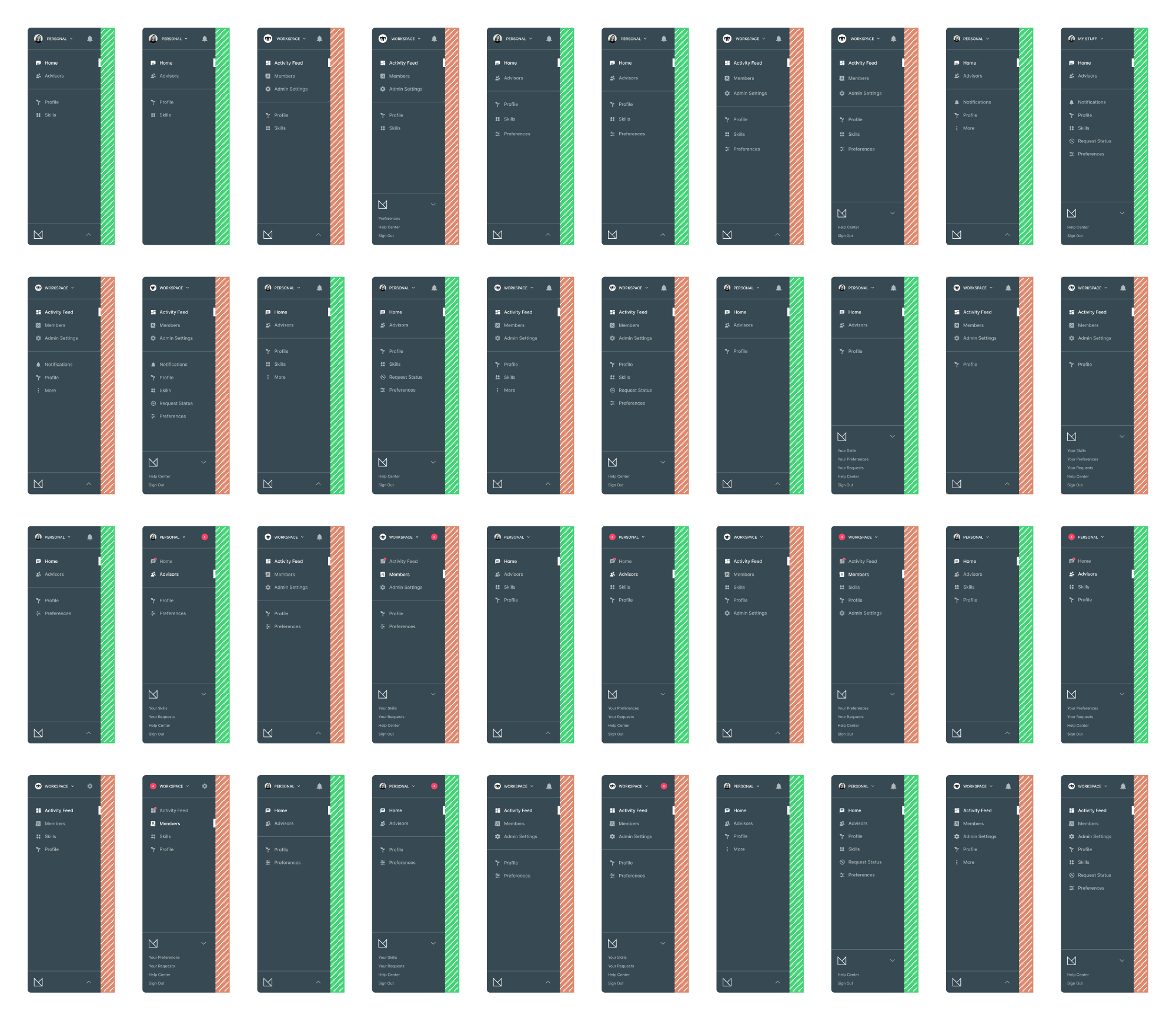
Since this was an unavoidable project that nobody wanted to take on (or even discuss) it became known internally as the "the elephant in the room".
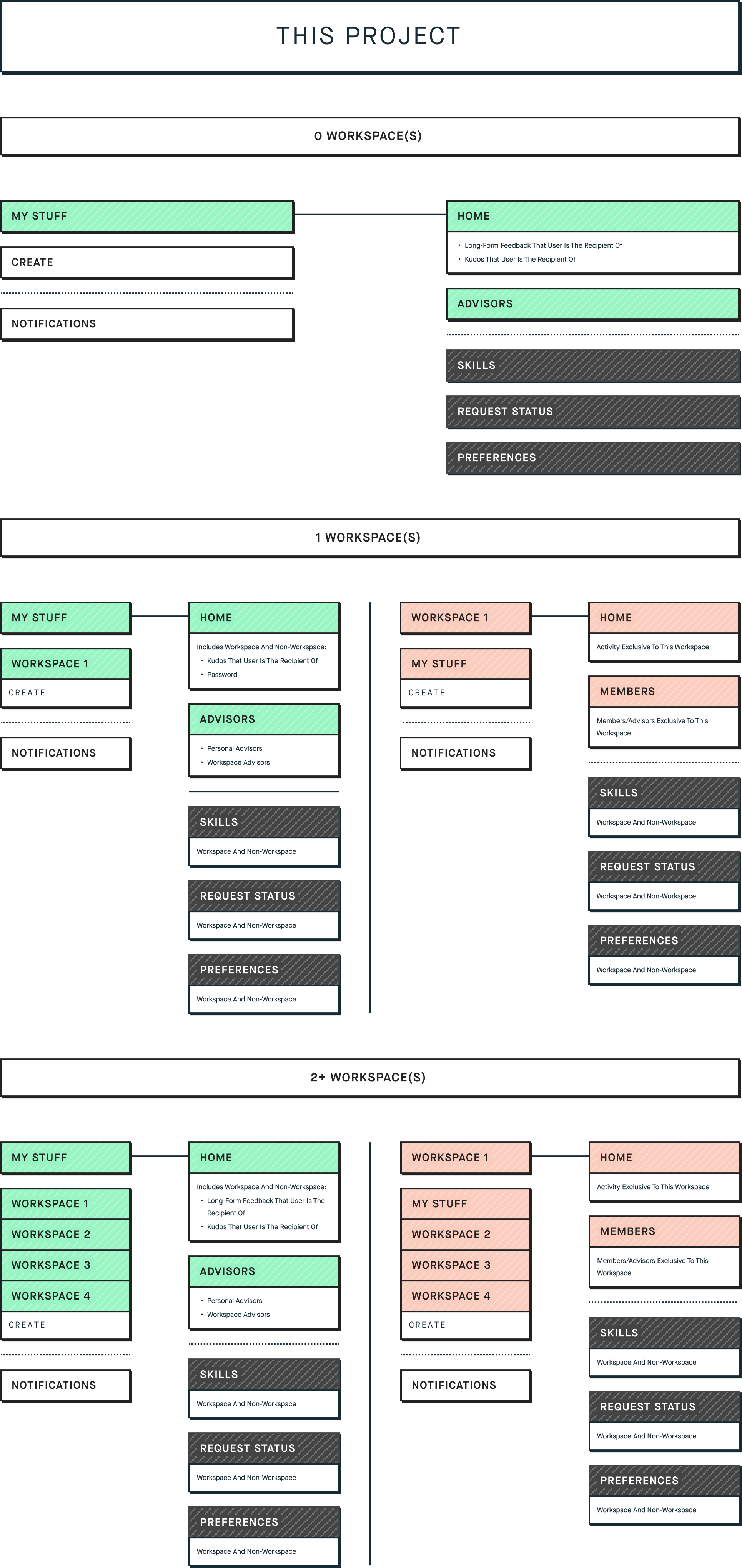
The problem arose with the introduction of workspace projects (locations within the app that catered specifically to teams) where Matter's relationship between individual and workspace experiences were blurring together causing confusion and wayfinding issues within the product.
At first, we thought a siloed structure would be beneficial in keeping feedback focused to one side or the other but the effort was futile since most feedback in users' personal space was from professional peers.
There was certain data and locations that both sides needed access to equally, which is the basis of the work here.
This was not an easy solve since a lot of users had coworkers as personal advisors and vice versa – naturally, the overlap was going to occur. With that in mind, we figured that there had to be a solution that would help untangle the UX.
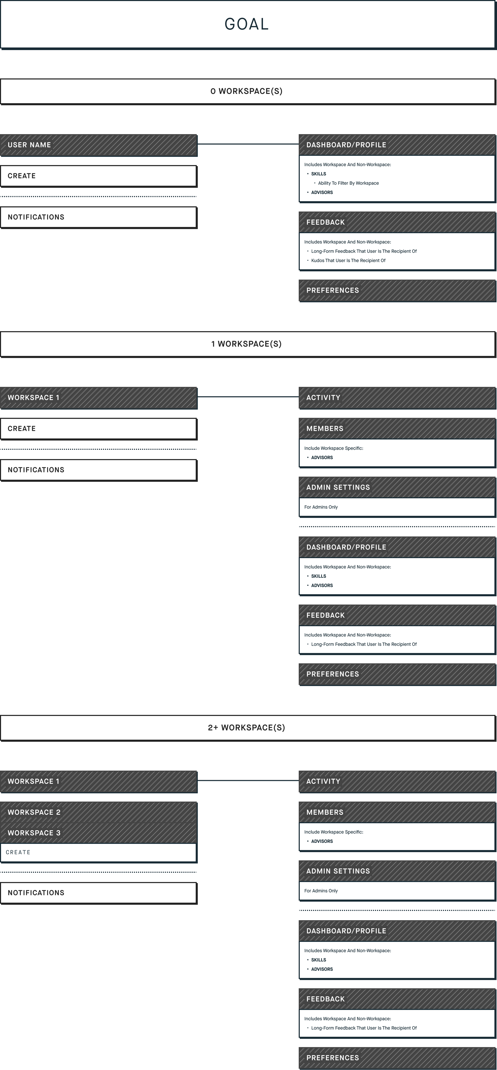
Even though it wasn't easy, it did solve a lot of issues that came with the introduction of workspaces. Eventually, the idea was to get to a point where "everything's a workspace" – a user experience where there's a seamless cohesion between all sources of feedback.
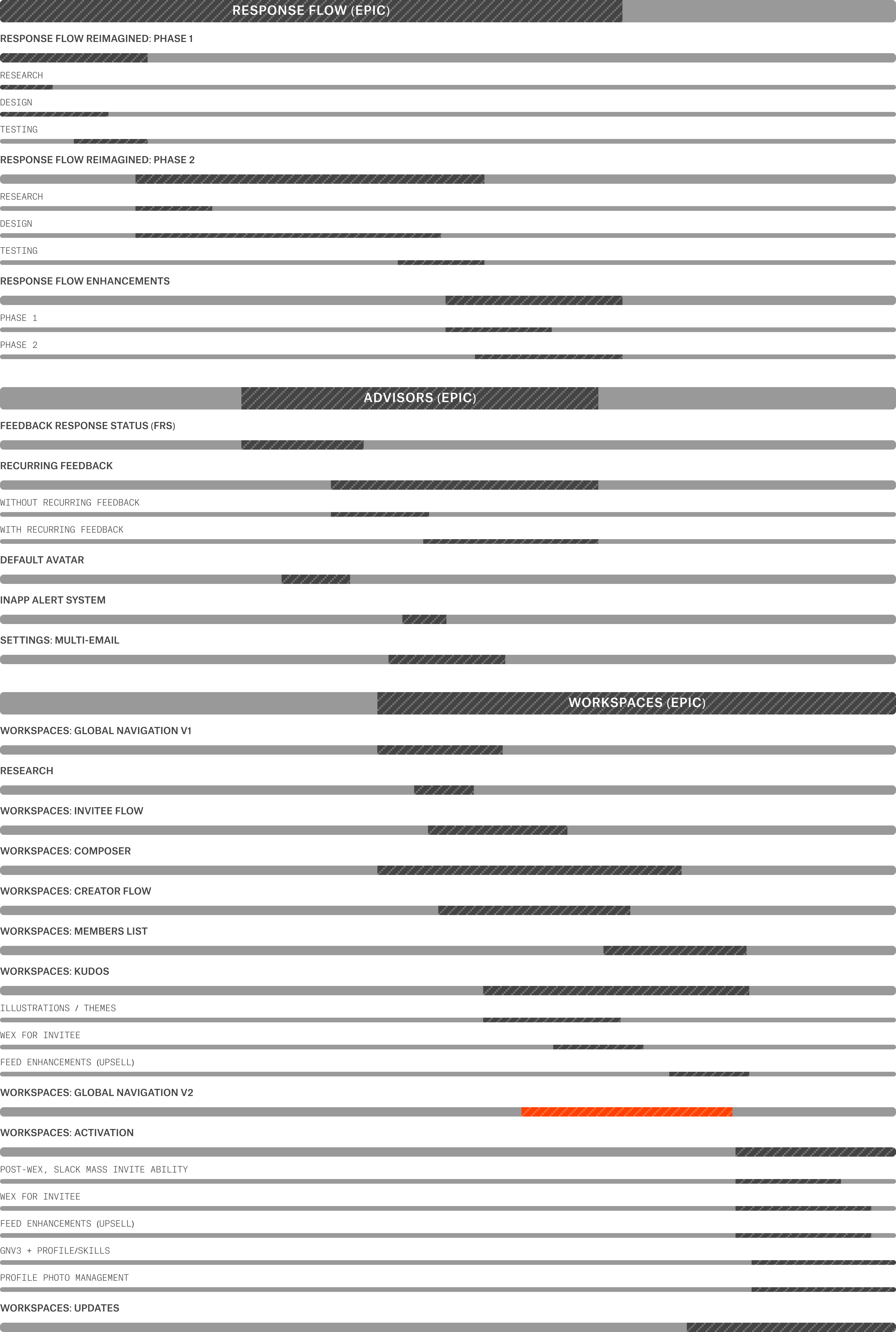
Below is a glimpse of the product-related projects I had on my plate that year and how the global navigation (in pink) fit in within the timeline.
So the issue had been on the radar for a while and I had done some work previously (GNv1) which was more of a "band-aid" – just in order to mv forward with other worksflows. Eventually it became a priority reinforced by recent feedback from ERG’s.
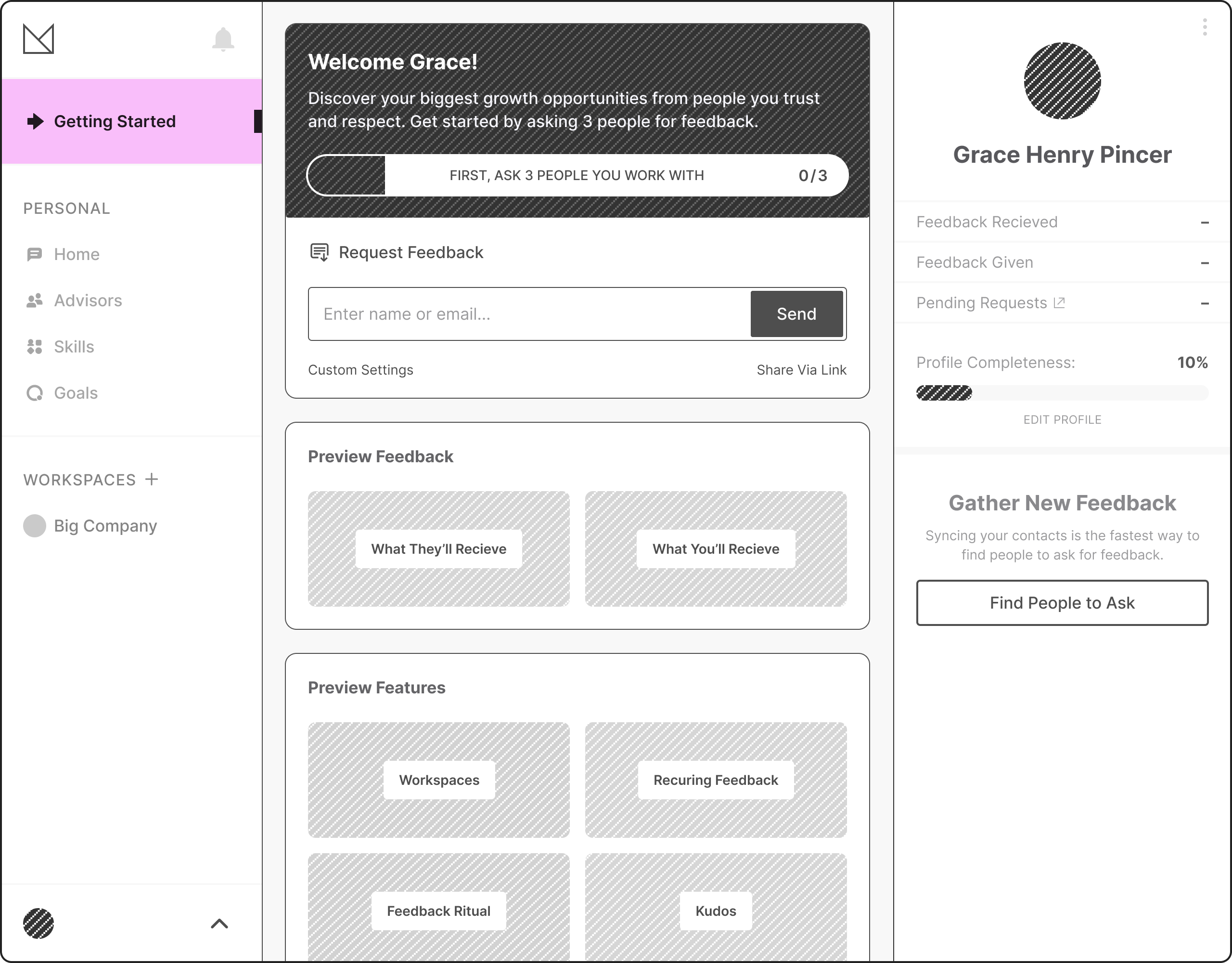
Previous Solution (MVP)
"Getting Started"
The idea here was to provide uses with:
- A light onboarding primer just to get going
- An overview/bridge between the two worlds (personal and workspaces)
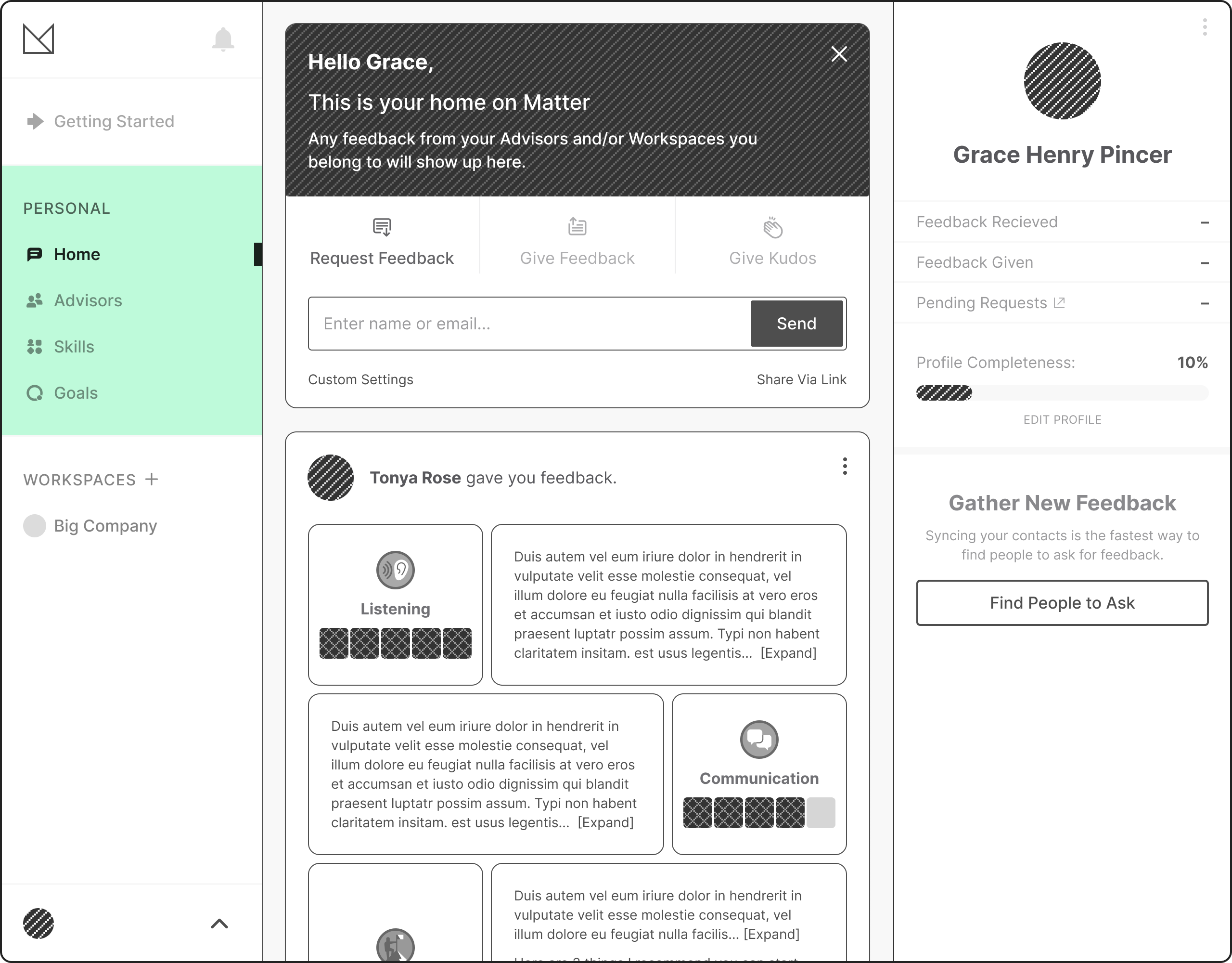
Personal
Meant to consolidate both personal feedback items as well as workspace feedback and mentions.
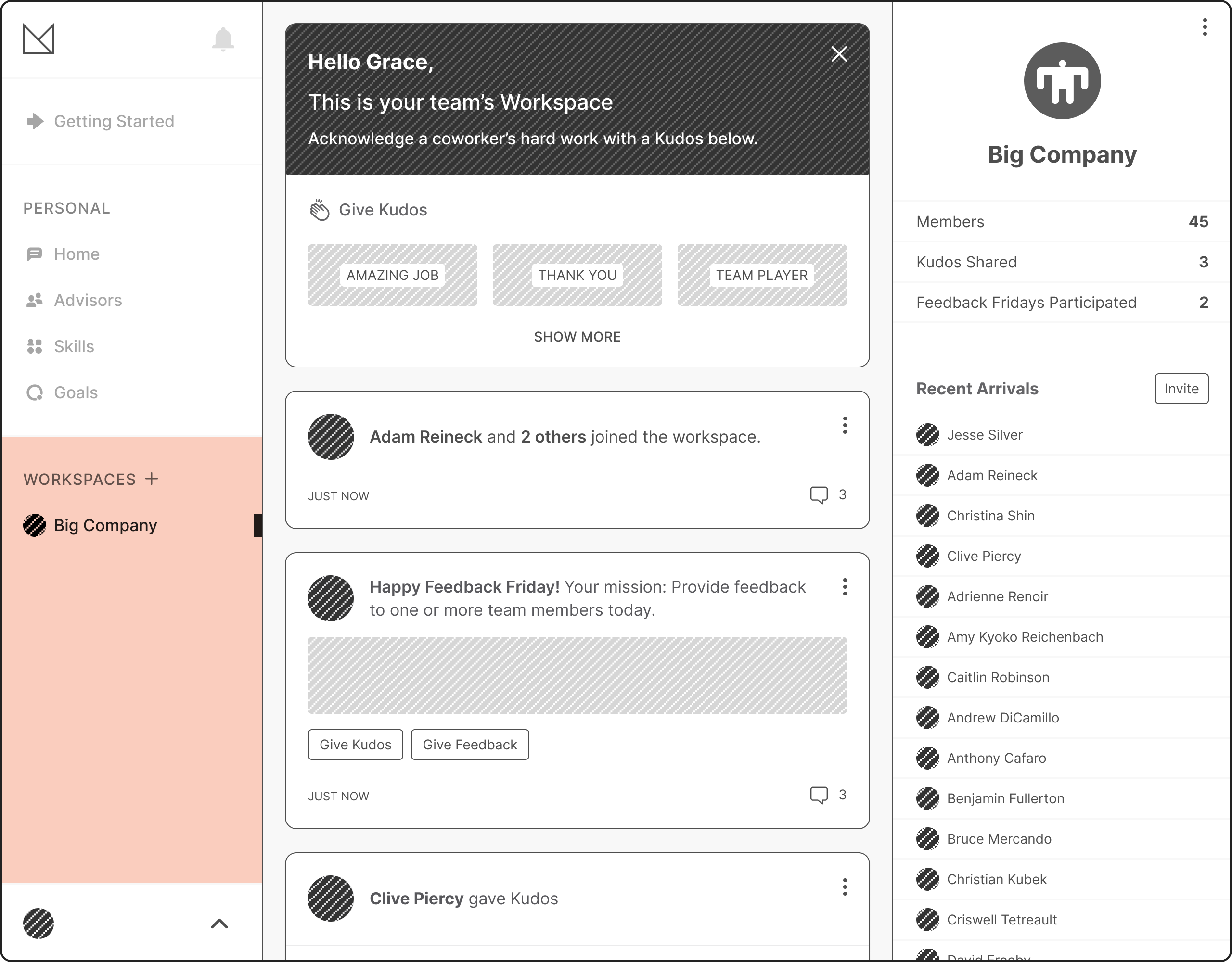
Workspace
All public workspace activity – promoting the single kudos because of the given confusion longform feedback (always private) can convey right above a public feed.
Sketches Round 1
For the initial round I leveraged the existing structure and made simple changes that I hoped would result in a quick fix from a technical perspective.
Notes:
- Adjusted Hierarchy
- Rearranged Listed Items
- Maintained Getting Started Page
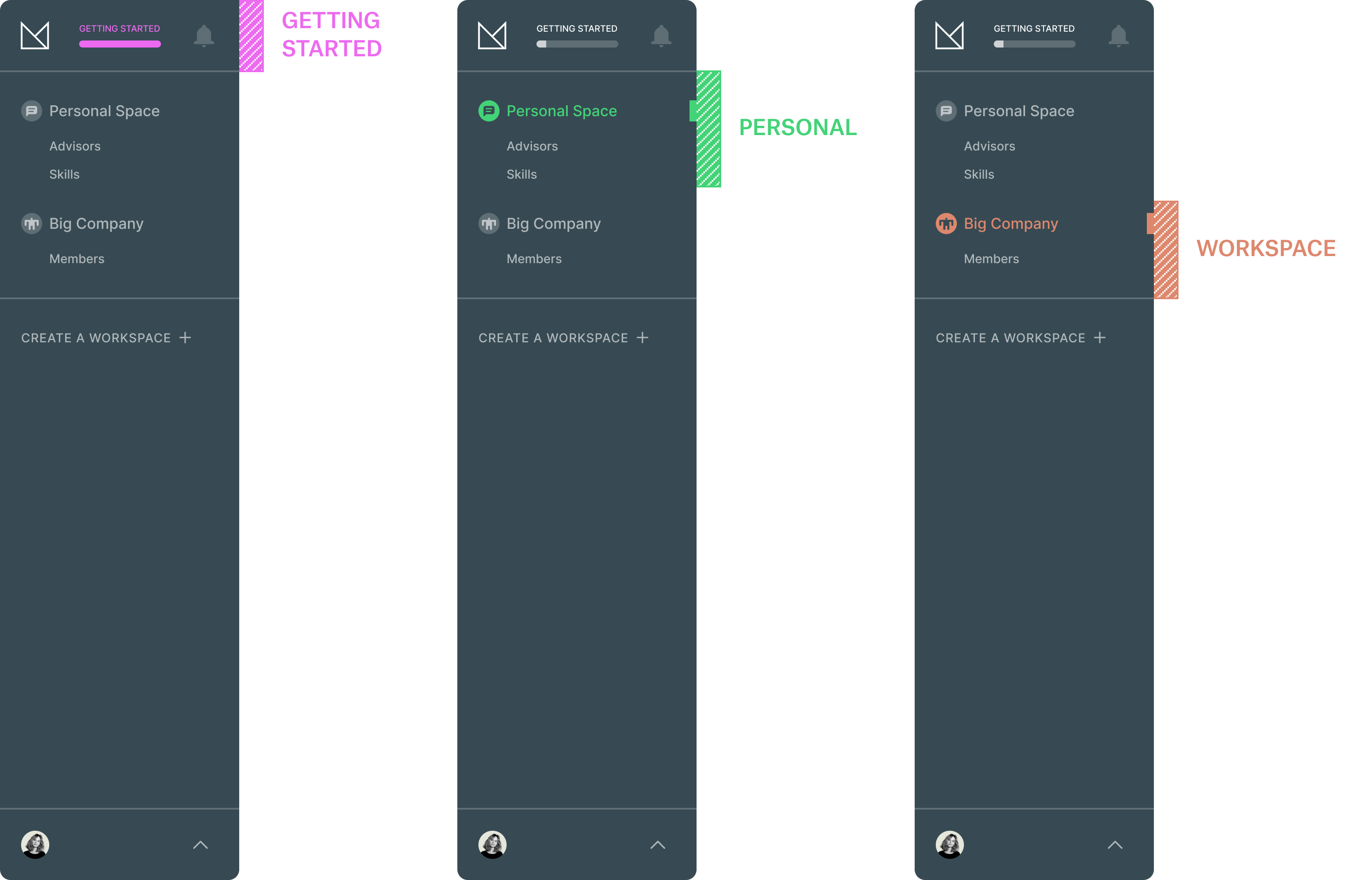
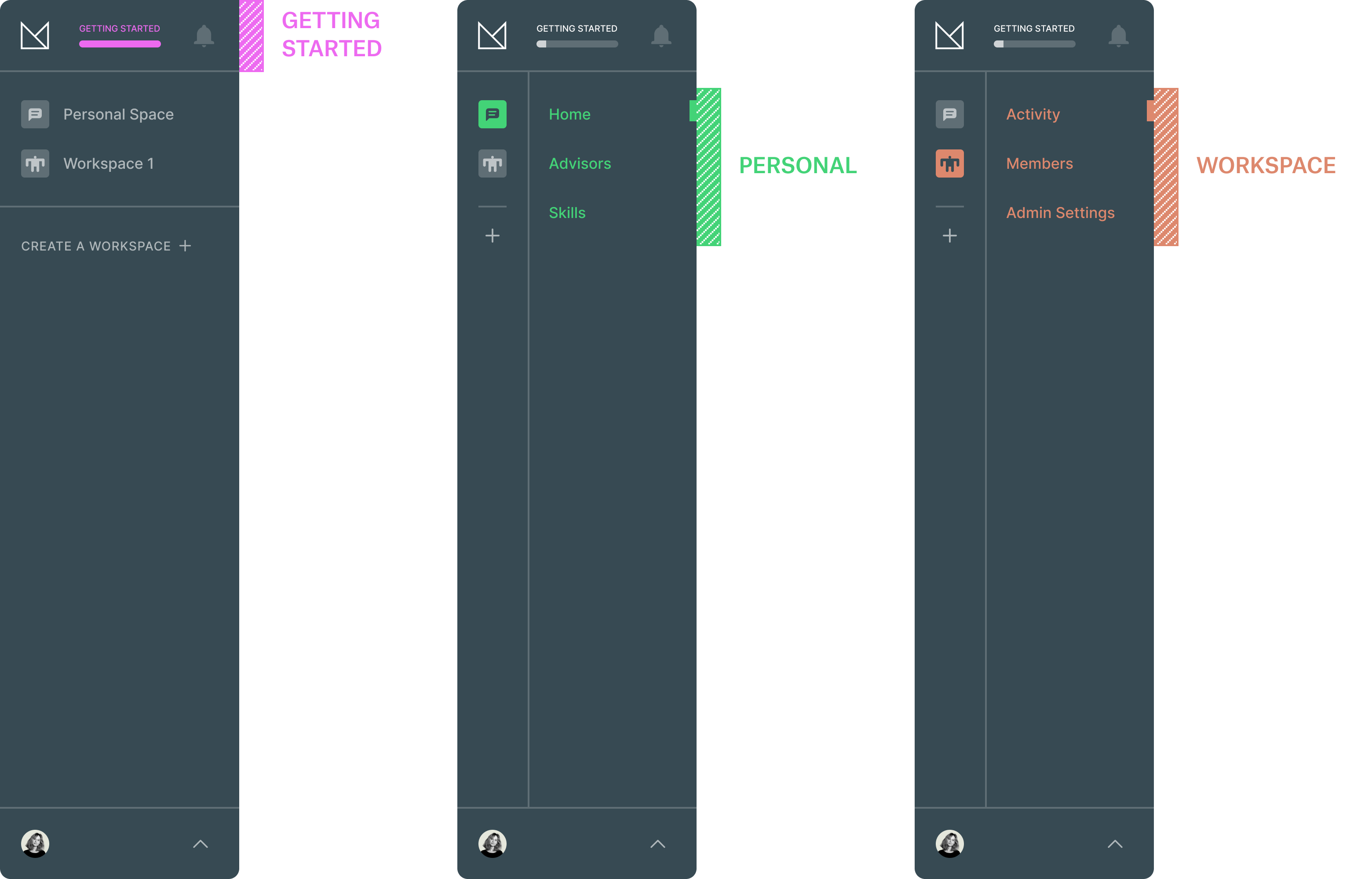
Sketch_01a
The main adjustment here is moving ‘Workspaces’ on the same level as ‘Personal’. I also slotted ‘Getting Started’ between the crown logo and the alerts icon – the whole progress bar is a CTA and would take the user there when active. One thing to note is that each title would be the primary location of that space – so “Personal Space” is equivalent to “Personal / Home”.
This option has issues when there's more than one workspace. The amount of real estate it takes up would become a real issue. Having skills under 'Personal' is also confusing since skills are a global feature which overlap into each individual workspace.
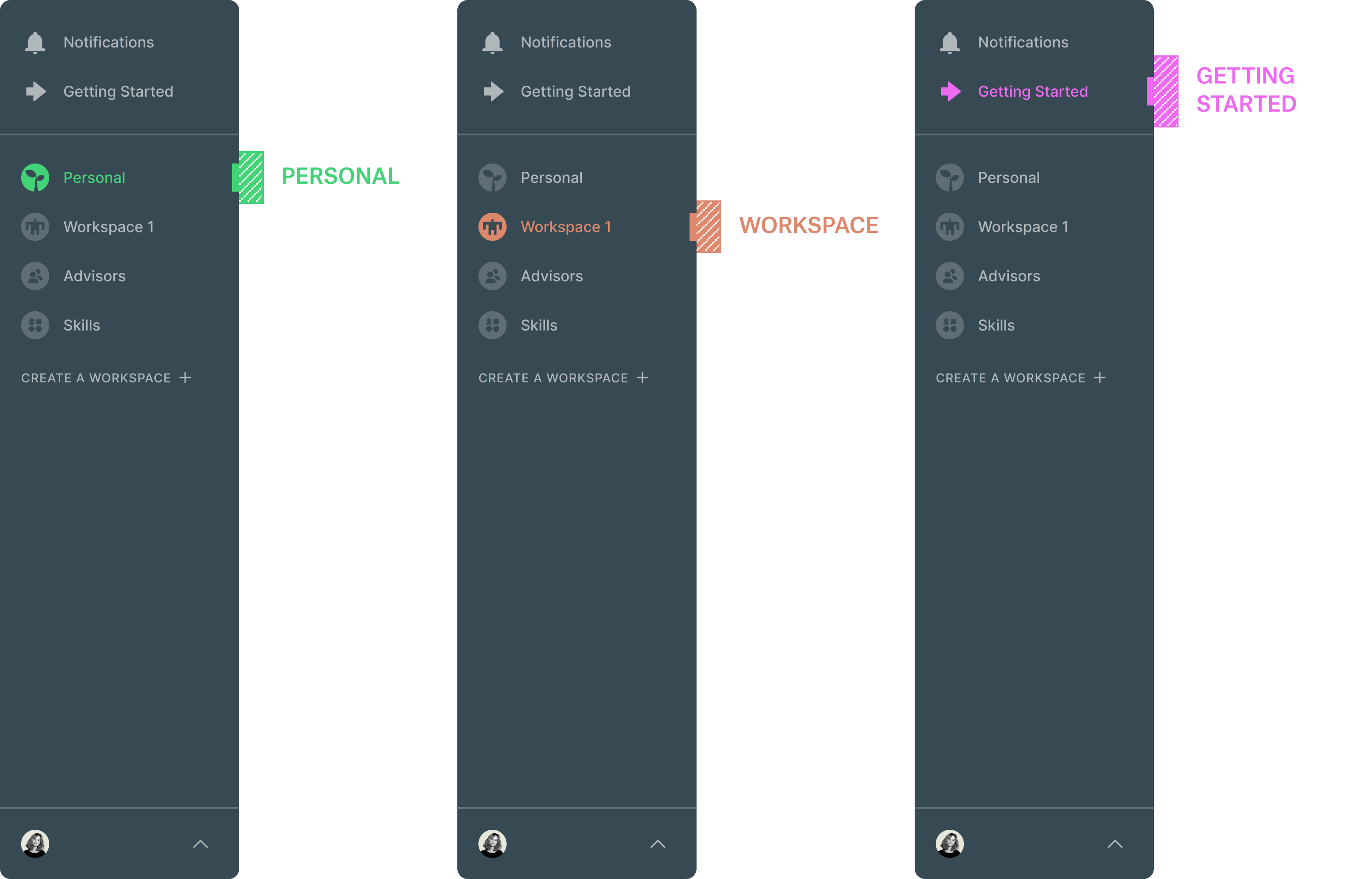
Sketch_01b
Getting Started was moved under notifications until it timed out dismissed by the user. Here is where things get a little tricky – ‘Personal’ and Workspaces are grouped together on the same level as ‘Advisors’ and ‘Skills’. This is something that you’ll see carried through to other options since Advisors and Skills overlap all types of spaces and it would make sense not to partition them.
So the Skills/Advisors you acquire through your time in each space will accumulate in those locations.
Sketch_01c
In this version, the placement of ‘Getting Started’ is the same as Sketch_01a. The relationship of the spaces is a little different here, the icons act as tabs, revealing a sub-menu when active. The initial state show the complete title of each space (Personal, Workspace 1, etc) but truncates if one of them is selected.
- Skills is only located under ‘Personal’ with the idea that skills acquired from associated workspaces would end up there.
- “Advisors” relates to Personal (as in personal advisors) and “Members” is the group name for users in a workspace.
- “Admin Settings” is introduced here since it’s separate than general settings and would need to be attached to each invidious workspace when there’s more than one.
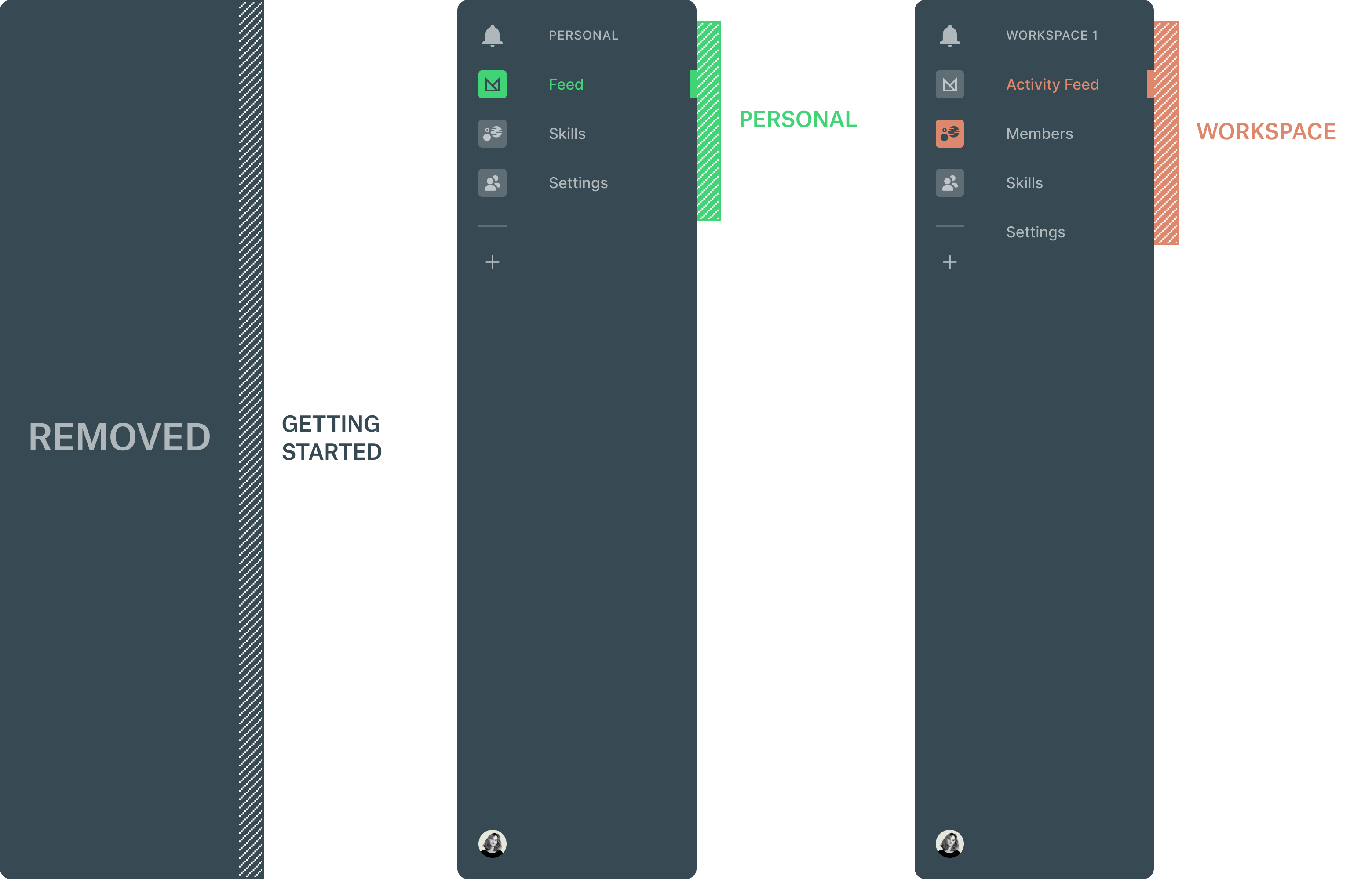
Sketches Round 2
Much lighter of a round in commprison. For these options, changes were made that push the architecture further:.
Notes:
- The two worlds (personal & workspace) are more siloed.
- Removing “Getting Started” altogether.
- Extracting the preview modules (onboarding actions) and adding them to the two spaces to reinforce each welcome experience.
Sketch_02a
- True separation between the two worlds with a Slack-ish tabbed UI
- Spaces are stacked as square icons to the left with Notifications in the top-left hand corner
- Toggling between spaces reveals an associated contextual navigation
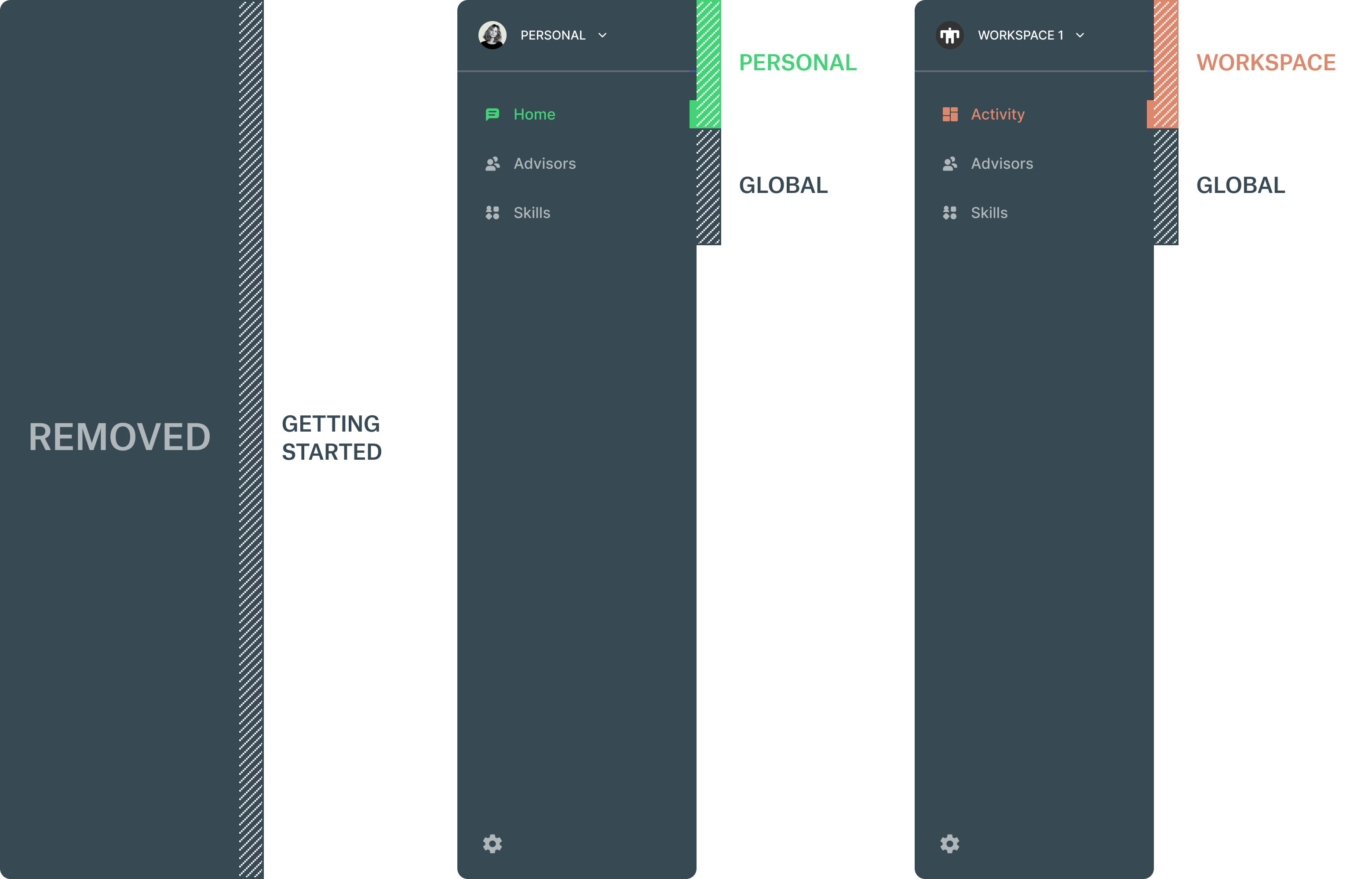
Sketch_02b / SELECTED
Of the two sketches this is the one I went with to do the deep-dive in round 3. Even though it’s siloed similar to Sketch_02a, the ui allows room to explore other avenues.
- Still siloed but maybe in a good way(?)
- Drop-down avatar menu on top allows the user to quickly toggle between spaces
- Toggling between spaces reveals an associated contextual navigation
Sketches Round 3
This was a deep-dive into the selected option (Sketch_03b) from the previous round. Decisions were made on which parts needed more prominence after discussions with the team which led to focusing on specific UI patterns:
Notes:
- Using a drop-down for toggling between spaces.
- Options for persistant elements that effect all spaces.
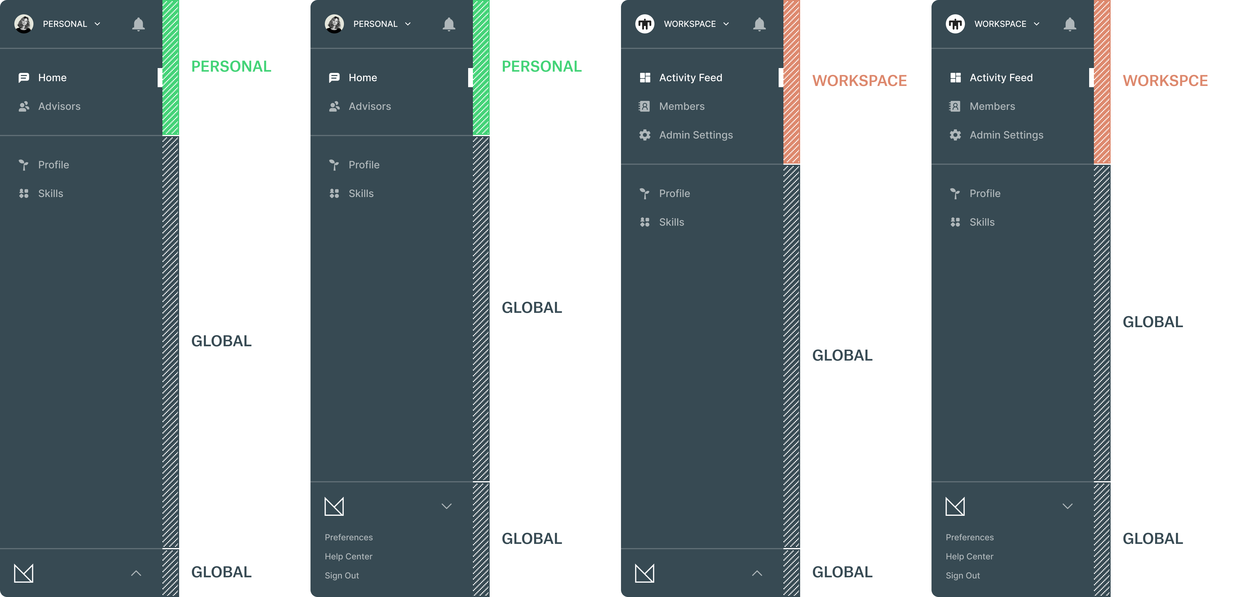
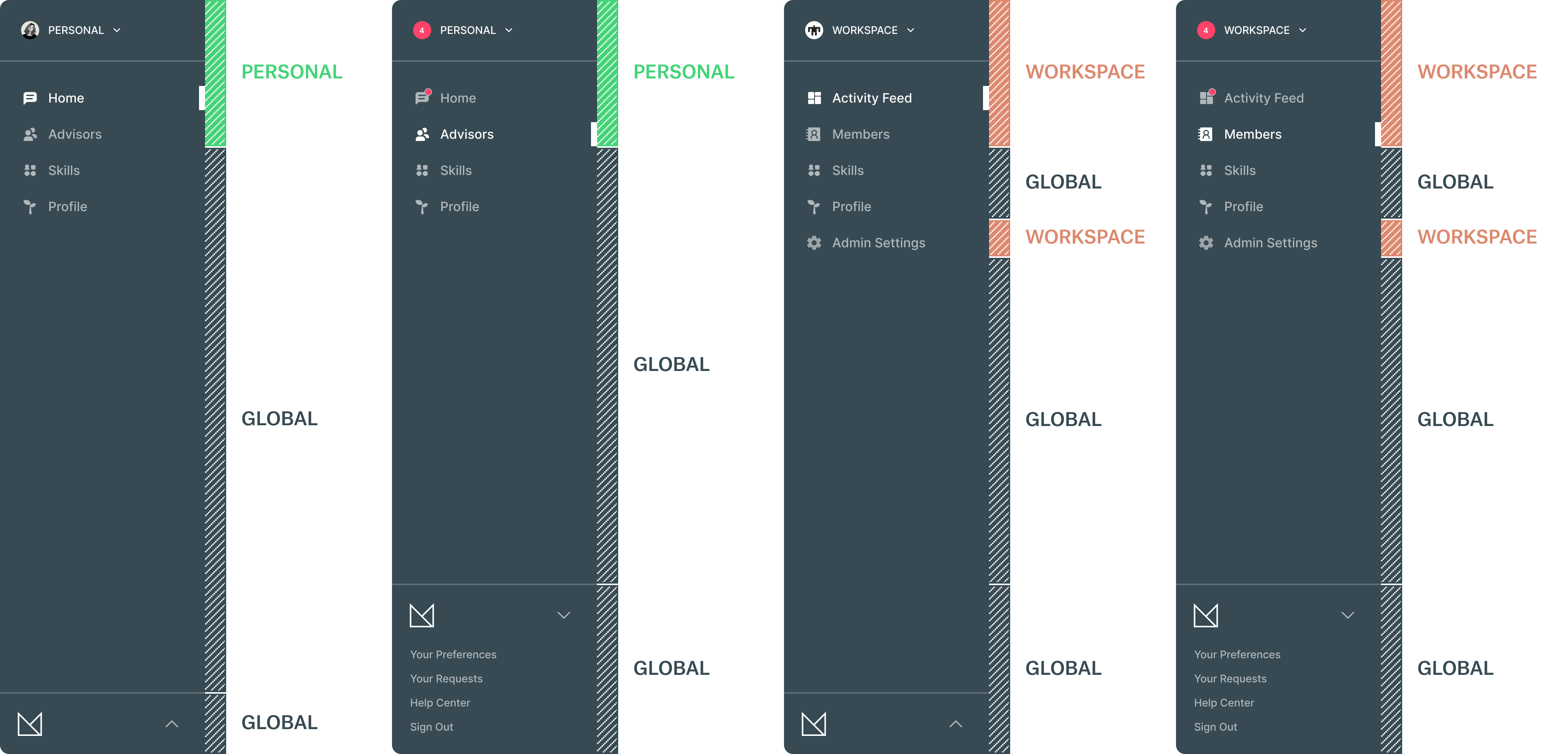
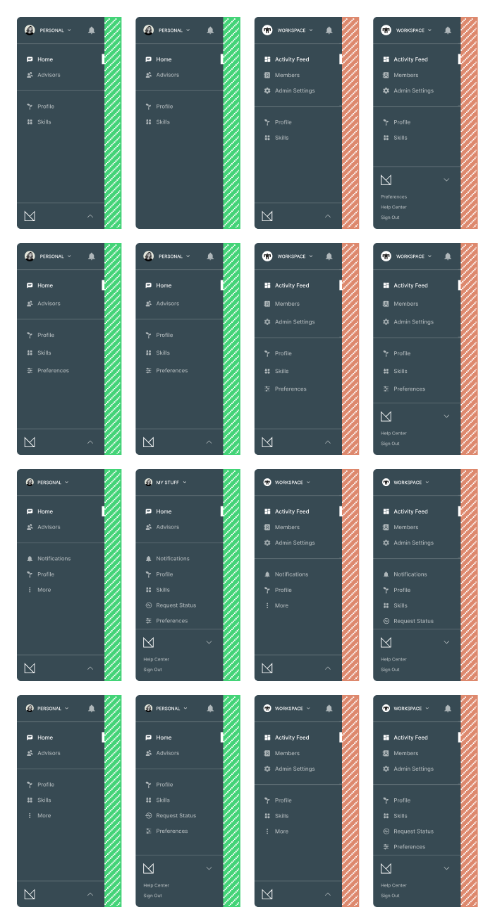
Sketch_03a
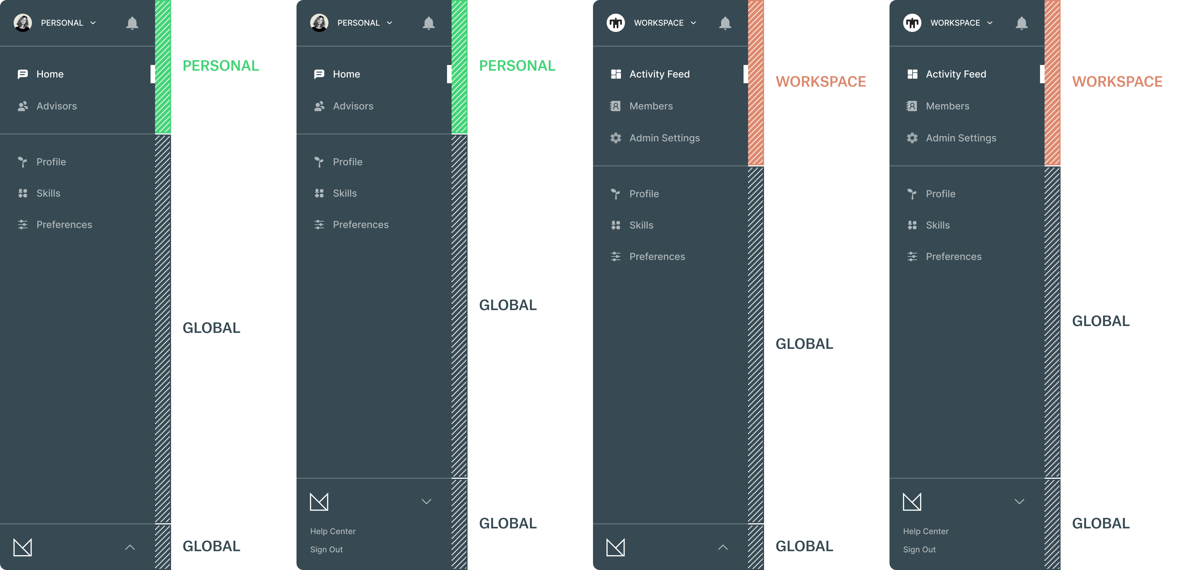
- Notifications located on top
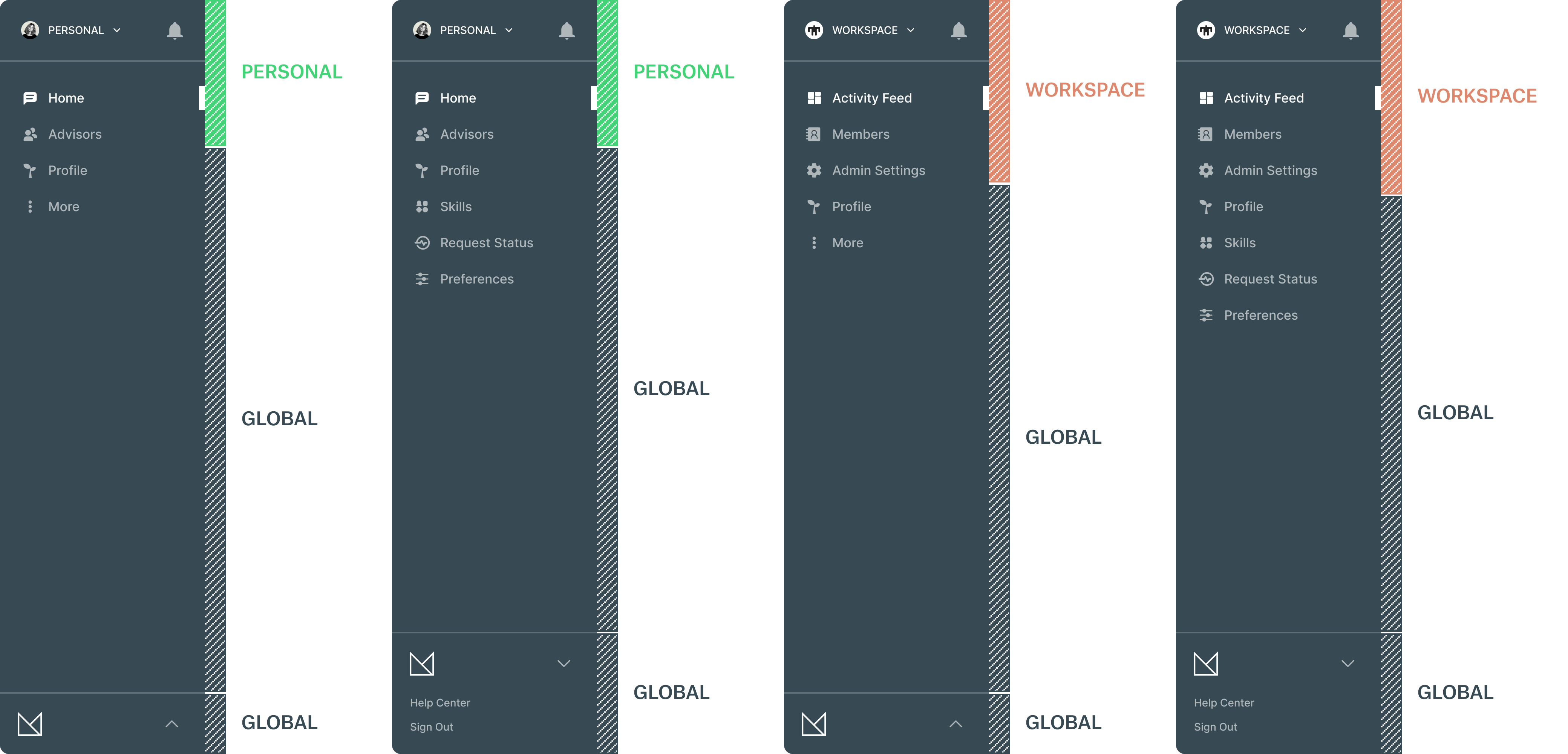
- Profile & Skills globally listed in the secondary group
- Admin Settings added to the Workspace primary list
- Preferences moved down to the bottom expandable tab
Sketch_03b
- Similar to Sketch_03a
- Notifications located on top
- Preferences listed in the secondary group instead of bundled in the bottom tab
- Increased spacing slightly to air it out
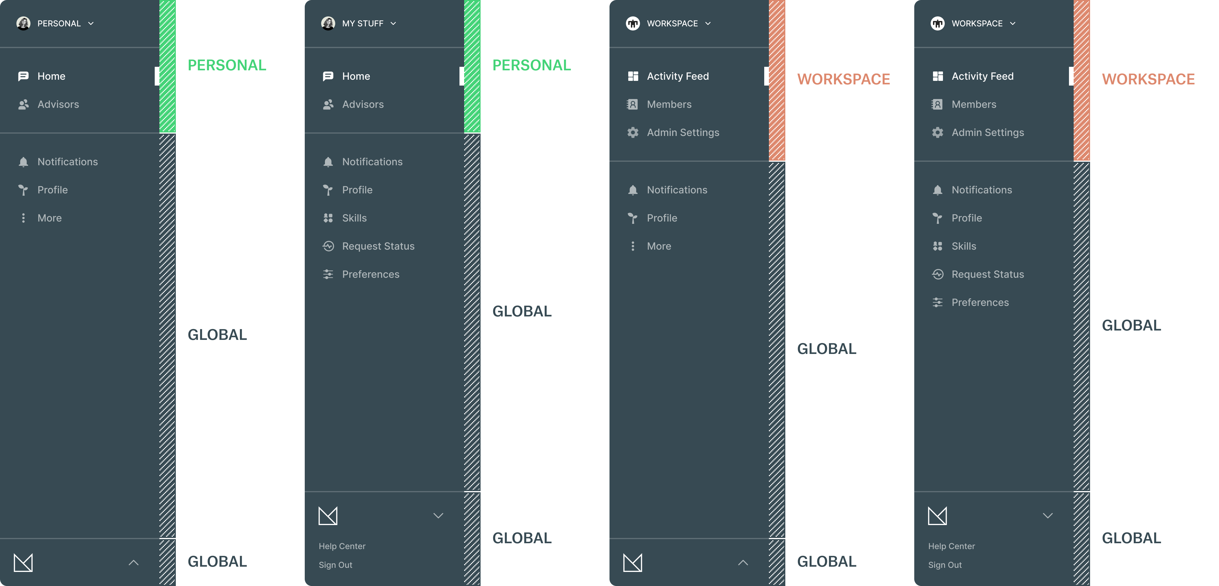
Sketch_03c / SELECTED
- Notifications removed from top in favor of listing them in the secondary group
- Profile promoted over Skills in the secondary group
- Request Status introduced here as it was being built as an extracted feature from the Notifications section
- The “More” kebab CTA expands to reveal Skills, Request Status and Preferences
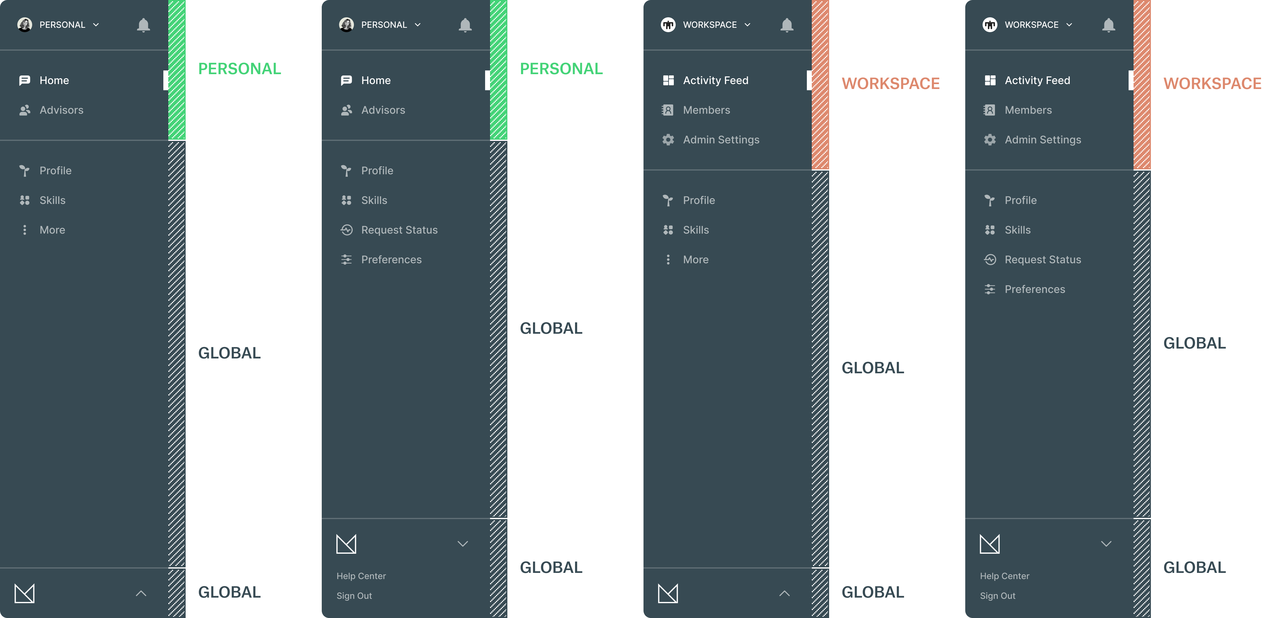
Sketch_03d / SELECTED
- Similar to Sketch_03c
- Notifications on top instead of listed in the secondary group
- Profile promoted over Skills in the secondary group
- Request Status as it’s own location within the secondary group
- The “More” kebab CTA expands to reveal Request Status and Preferences
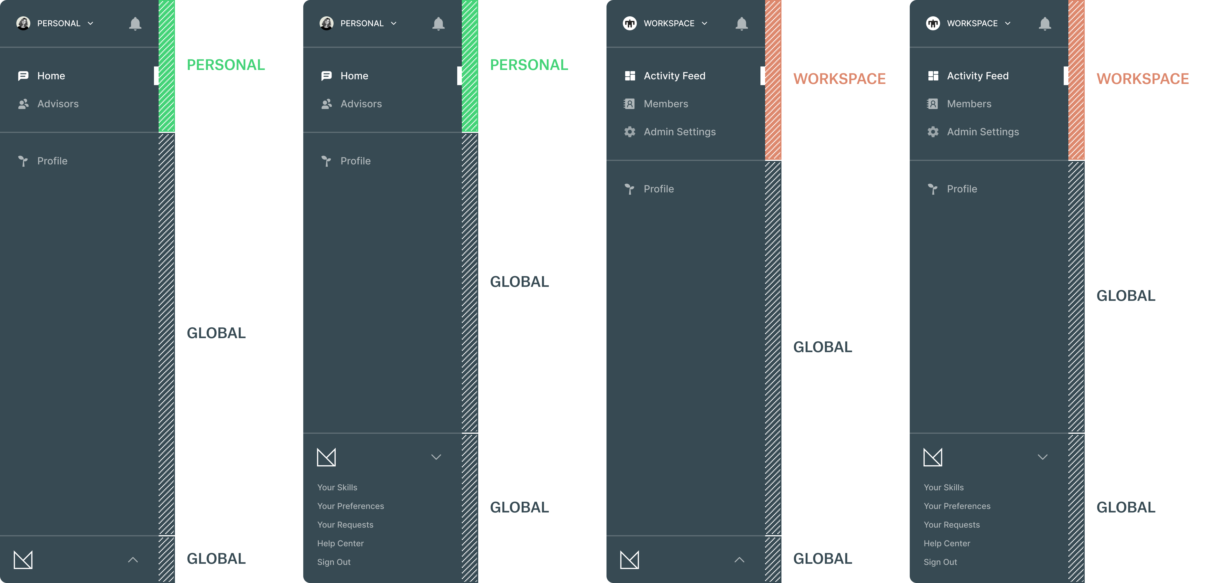
Sketch_03e
- Notifications on top instead of listed in the secondary group
- Profile the only location within the secondary group
- Skills, Preferences and Requests moved to the expandable bottom tab
Sketch_03f
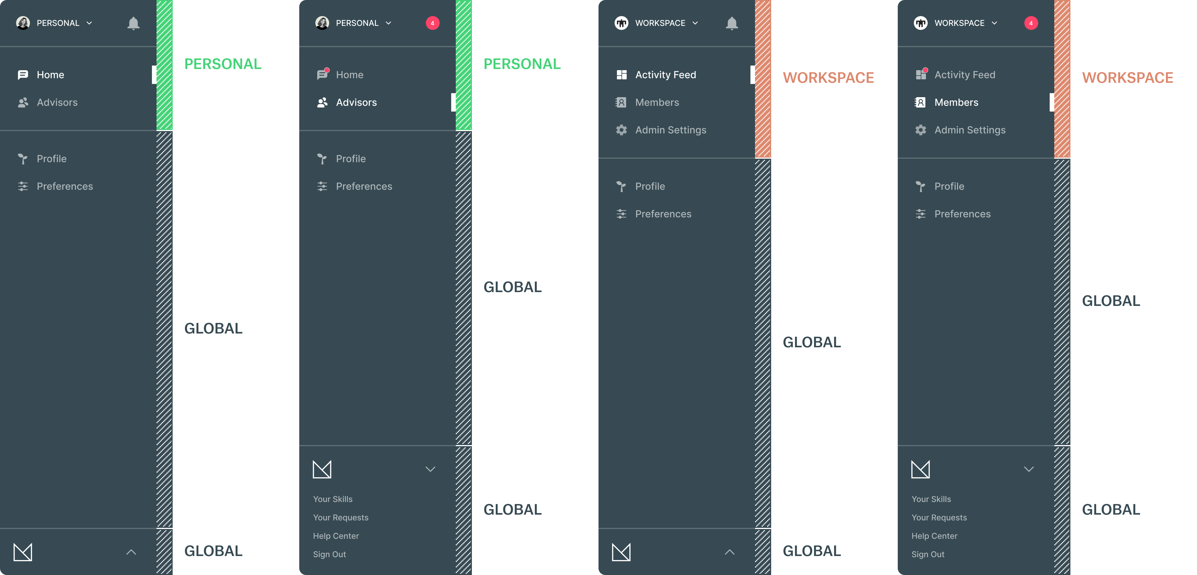
- Notifications on top coupled with a notification badge indicator in the primary group
- Profile and Preferences listed globally in the secondary group
- Skills and Requests moved to the expandable bottom tab
Sketch_03g
- Avatar swaps out for notifications when available
- Notification badge indicator in the primary group
- Profile land Skills isted globally in the secondary group
- Preferences and Requests moved to the expandable bottom tab
- Removal of divider line for global locations
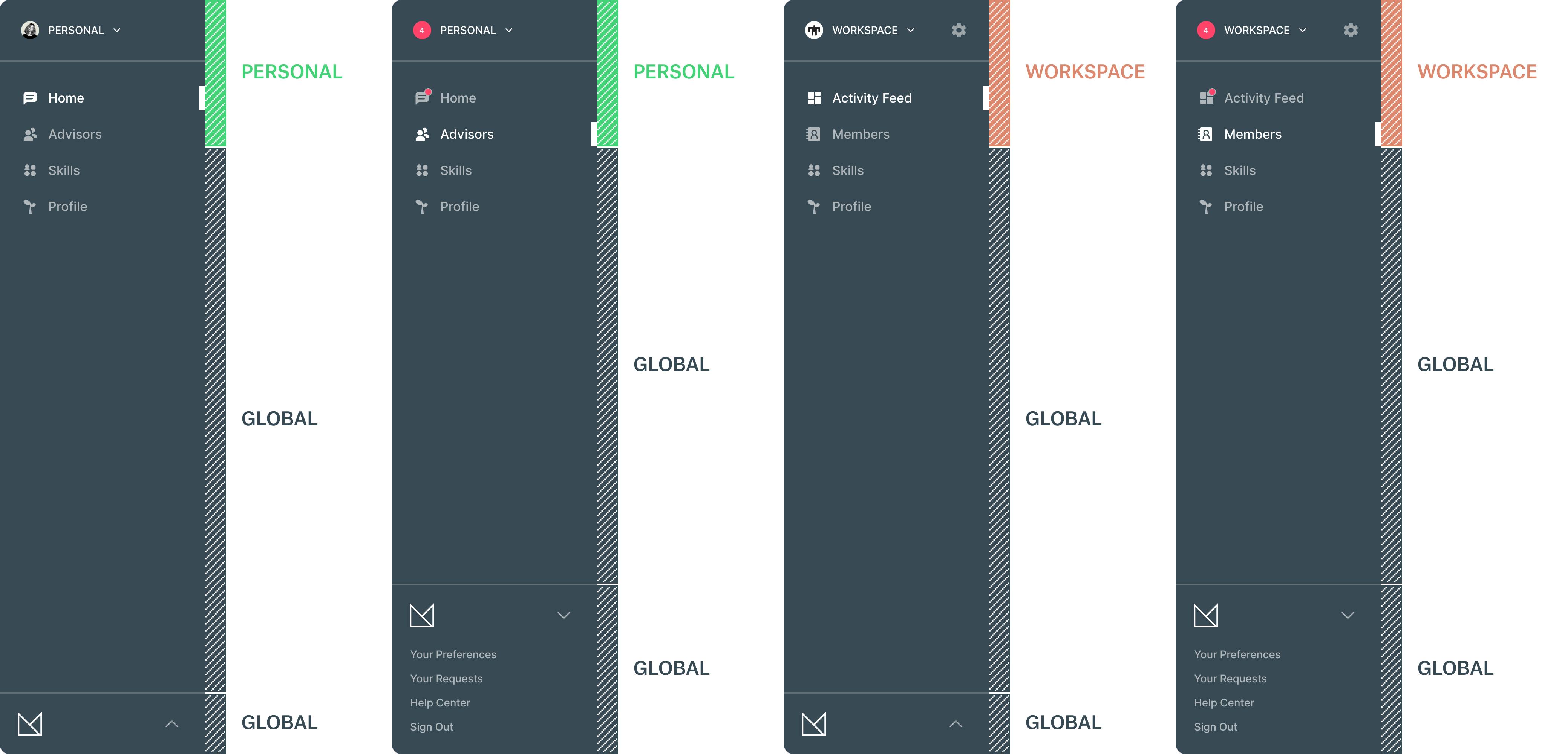
Sketch_03h
- Similar to Sketch_03g
- Avatar swaps out for notifications when available
- Notification badge indicator in the primary group
- Admin Settings represented by the gear on top
- Skills and Profile listed globally in the secondary group
- Preferences and Requests moved to bottom expandable tab
- Removal of divider line for global locations
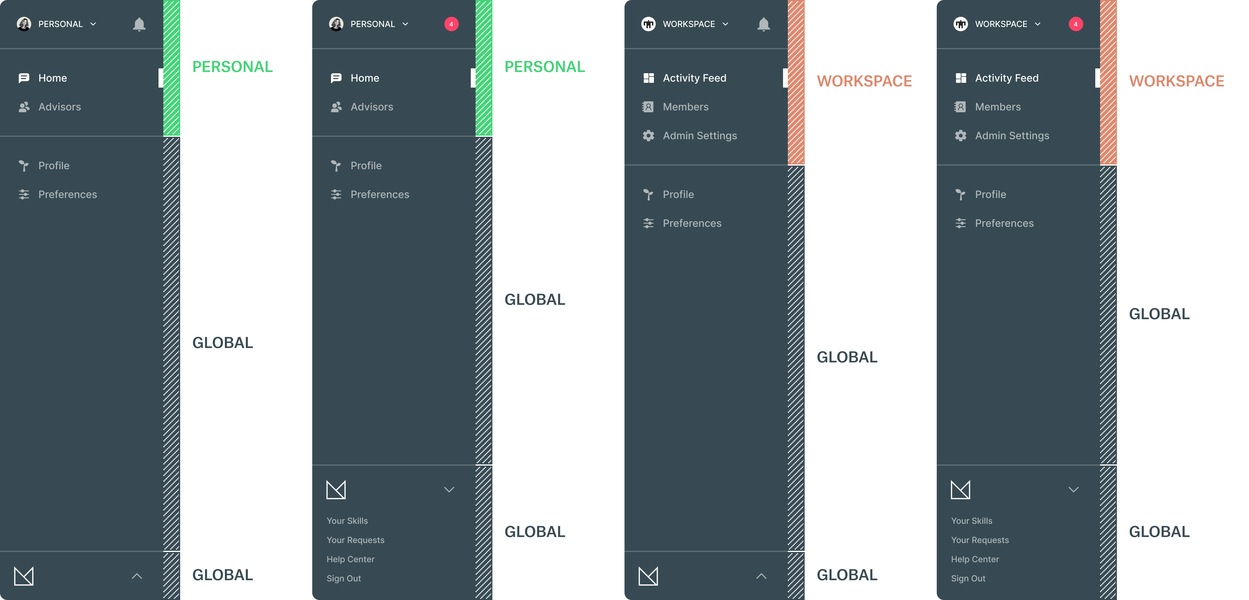
Sketch_03i
- Admin Settings listed in the primary group
- Notifications located on top
- Profile and Preferences listed in the secondary group
- Skills and Requests moved to bottom expandable tab
- Divider line for added back for global locations
Sketch_03j
- Notifications located on top
- Admin Settings and Profile listed in the primary group
- Removal of divider line for global locations
- The “More” kebab CTA expands to reveal Skills, Request Status and Preferences
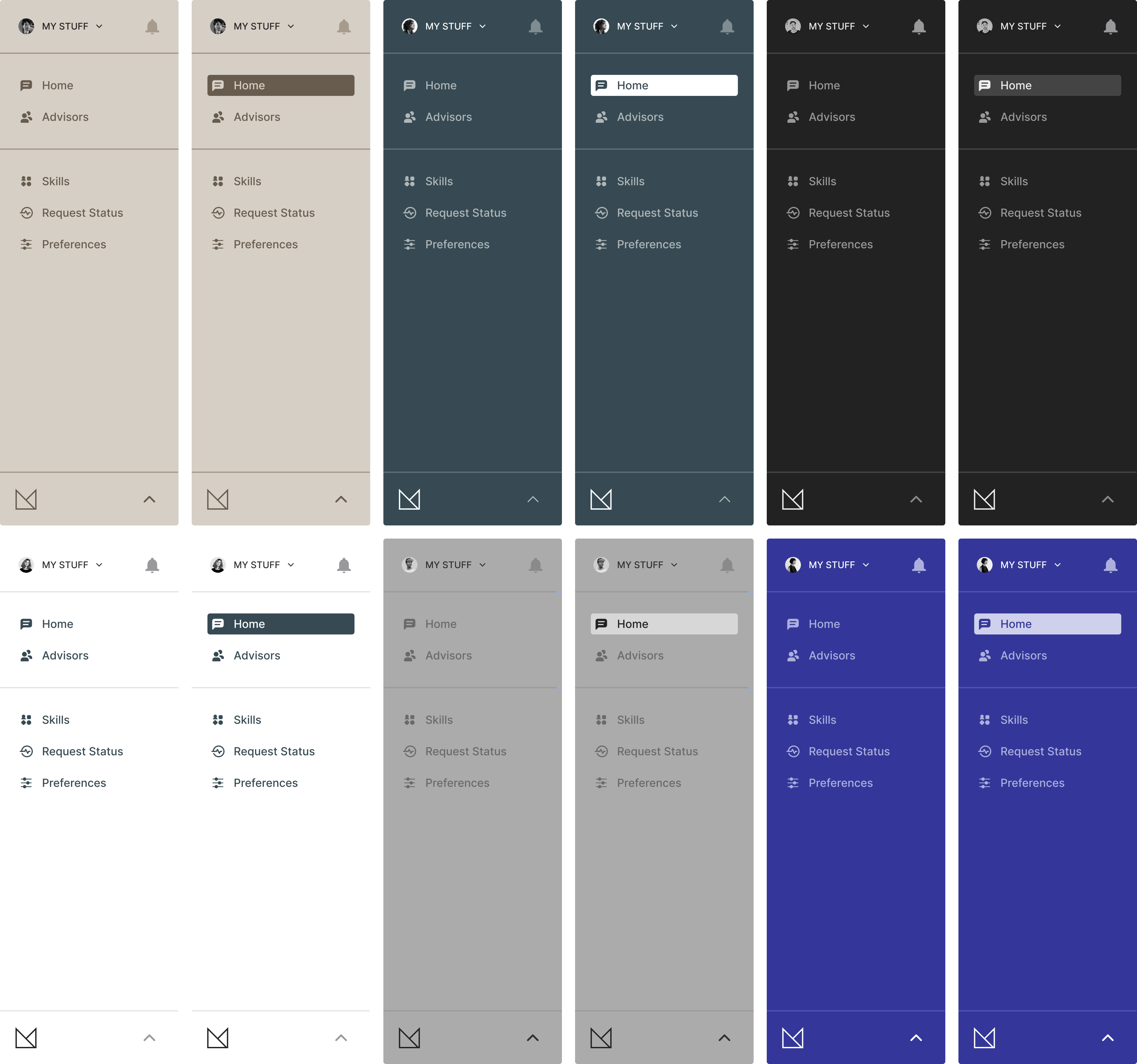
Color Studies
User Interface / Experience
This was a deep-dive into the selected option (Sketch_03b) from the previous round. Decisions were made on which parts needed more prominence after discussions with the team which led to focusing on specific UI patterns:
- Using a drop-down for toggling between spaces.
- Options for persistant elements that effect all spaces.
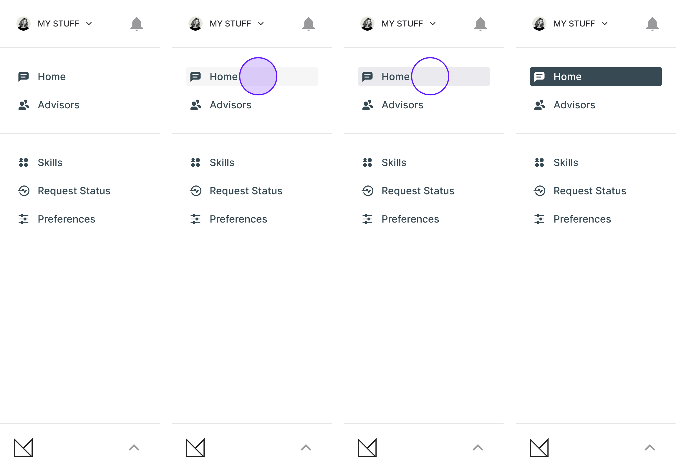
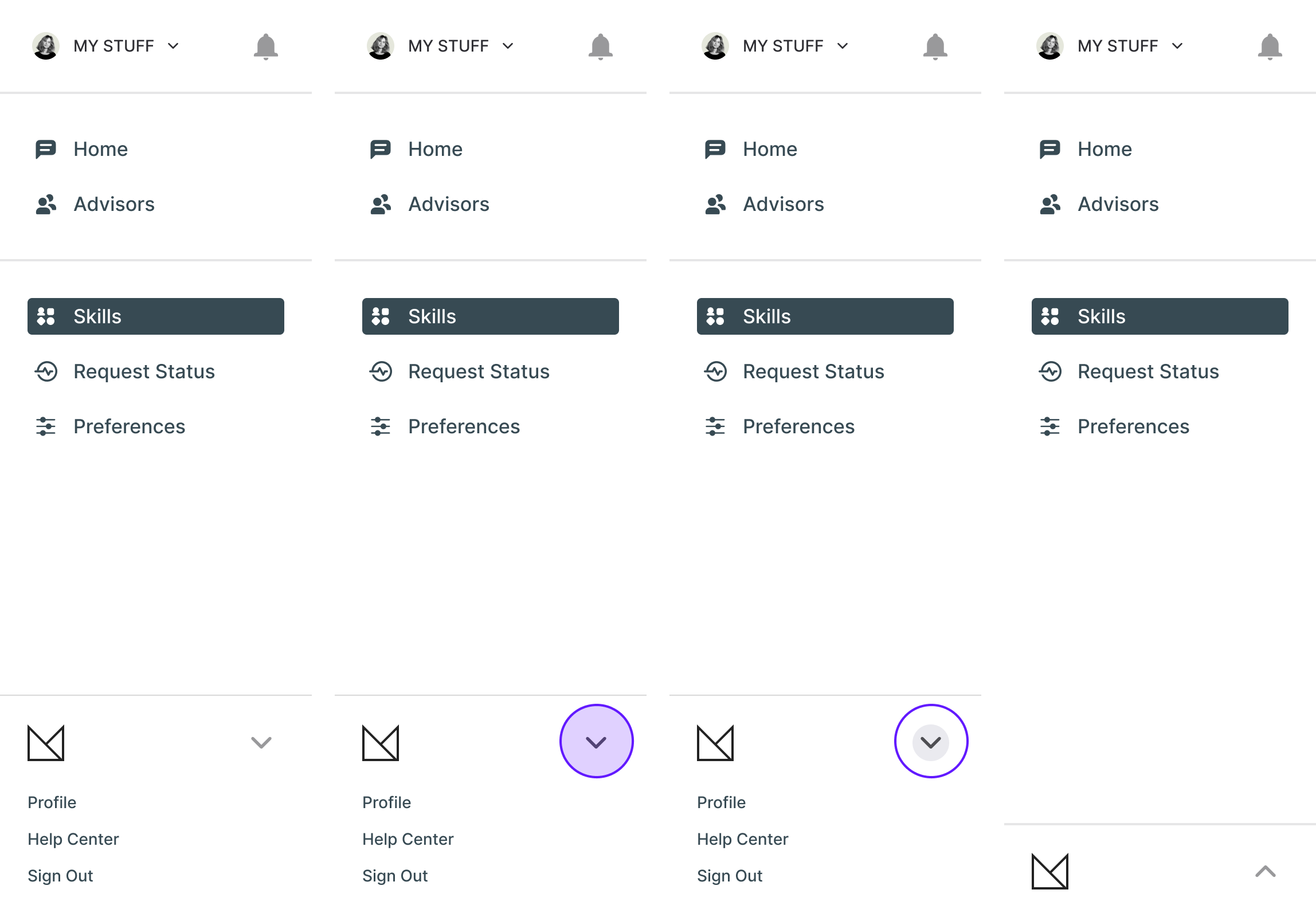
Primary/Secondary States
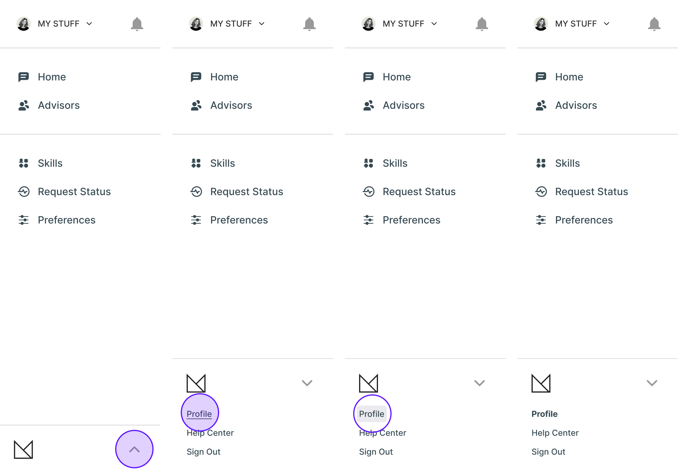
Overflow Tab Open/Active
Overflow Tab Close/Passive
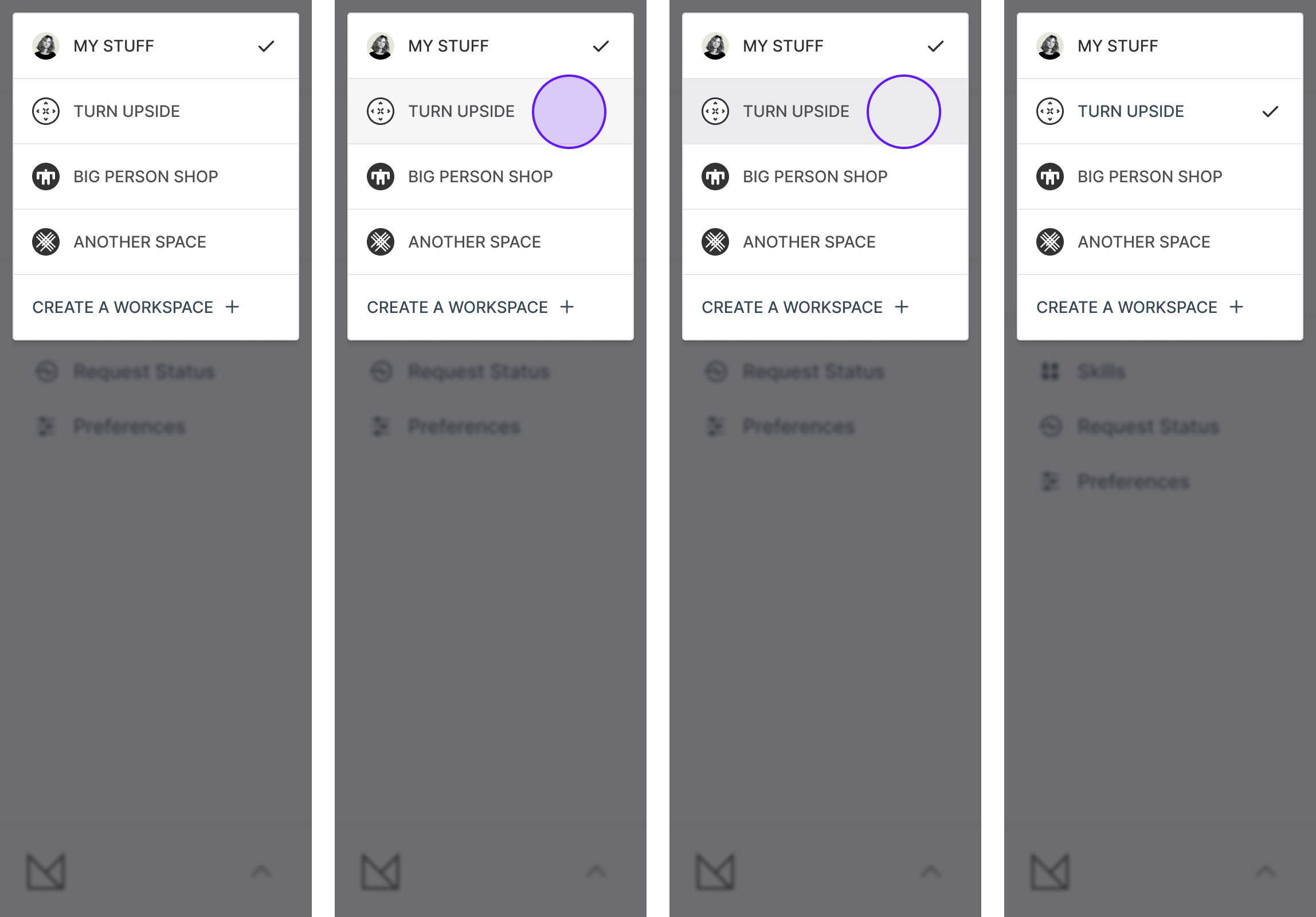
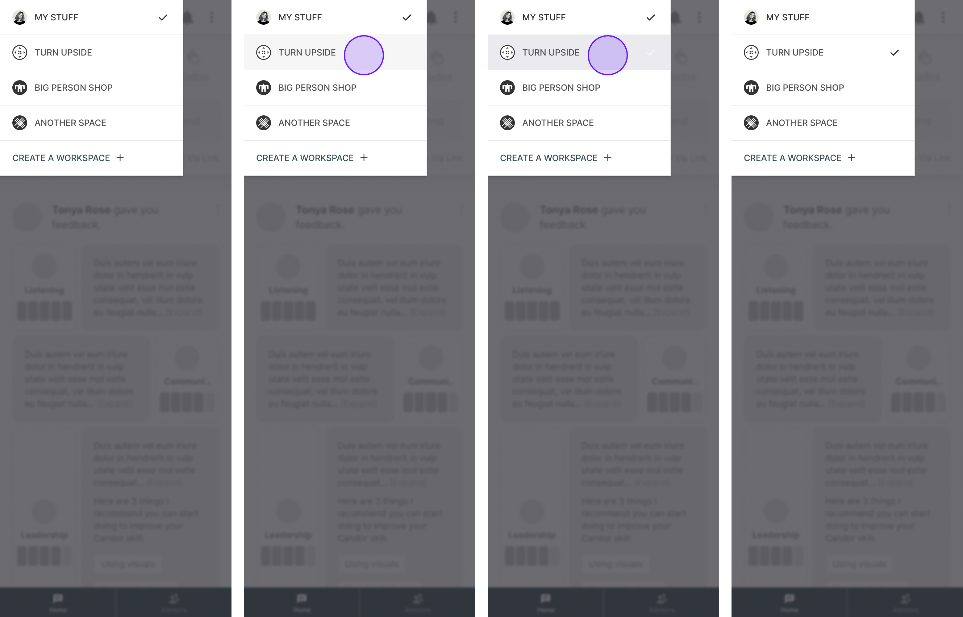
Space Toggle/Selection
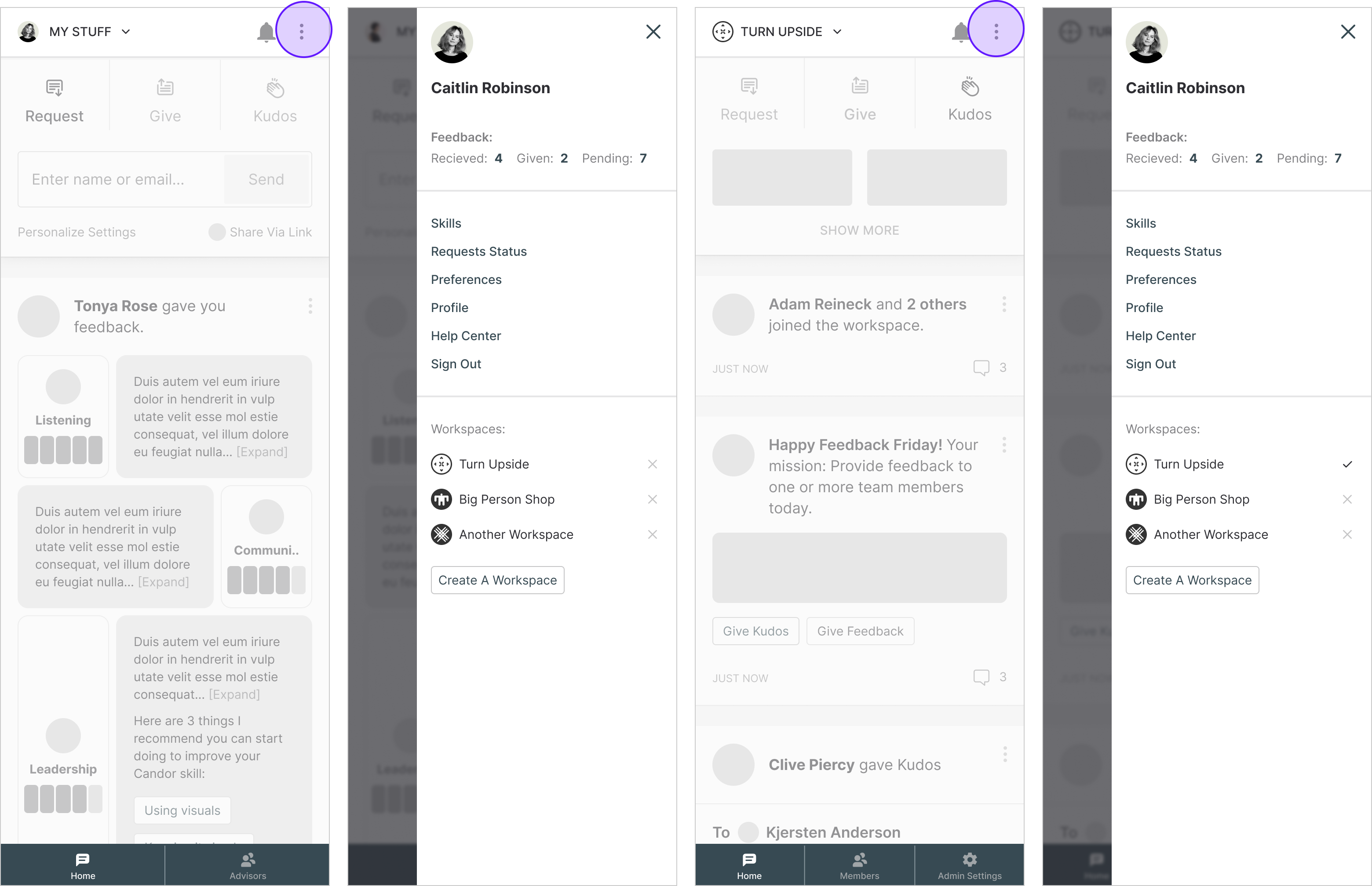
Mobile Navigation Drawer
Mobile Space Toggle/Selection
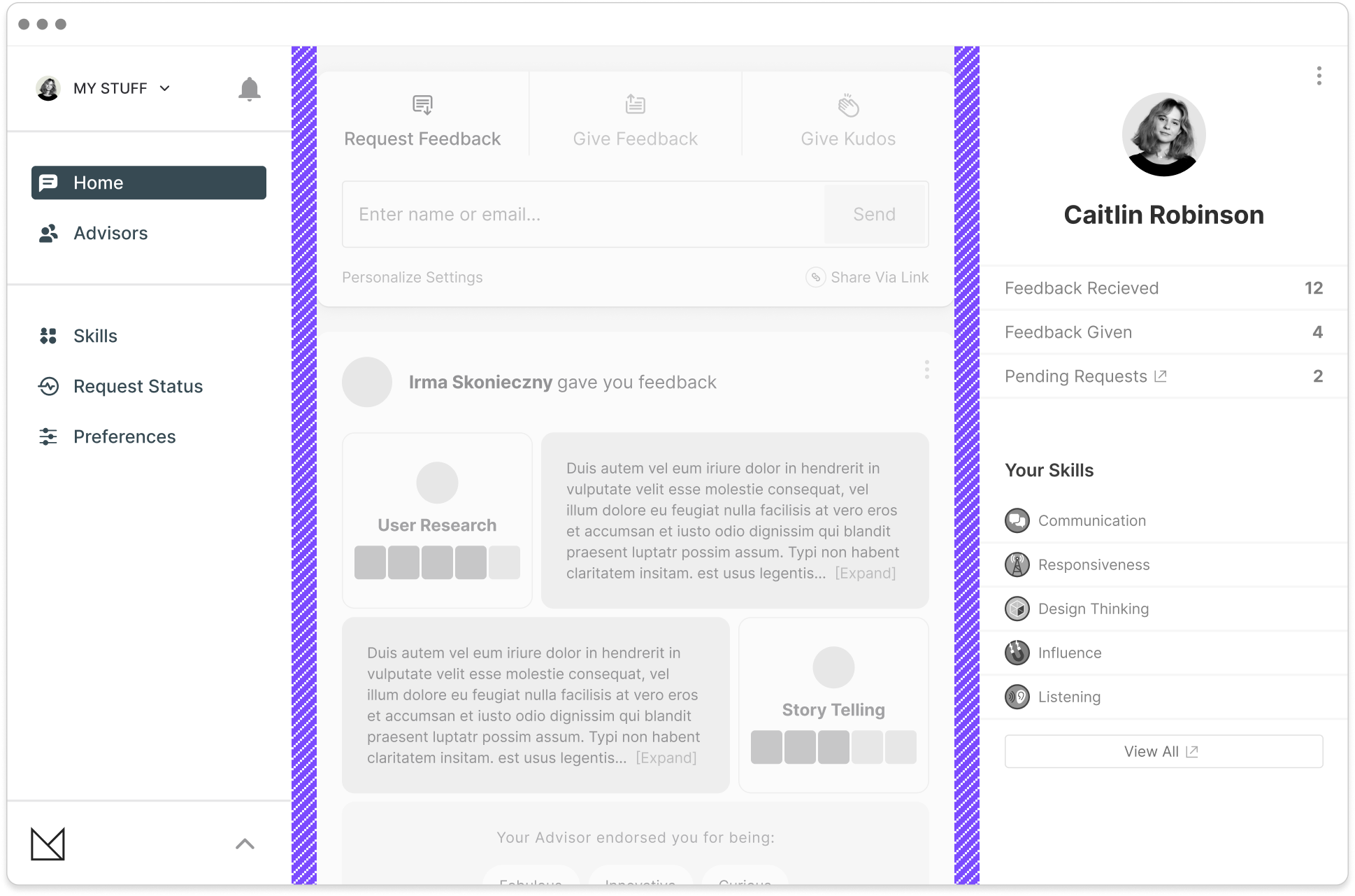
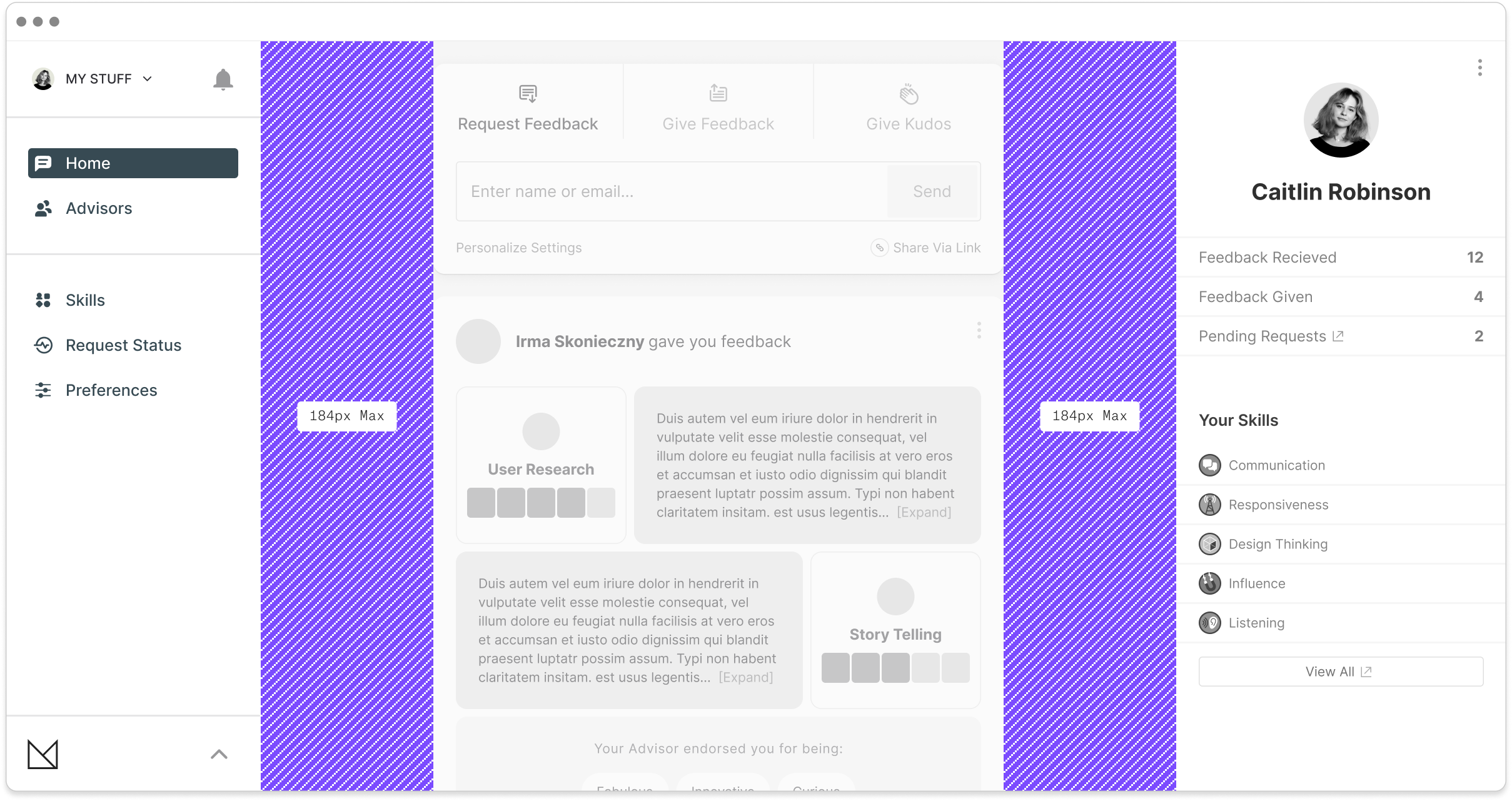
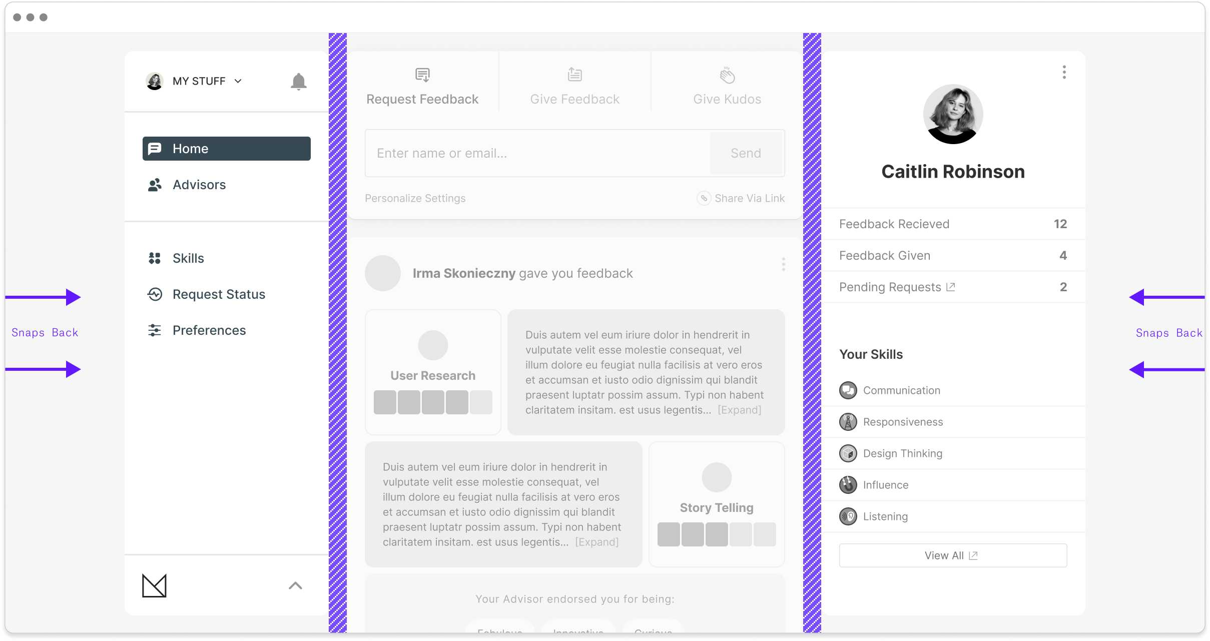
Browser Max-width Snap-back
Locations
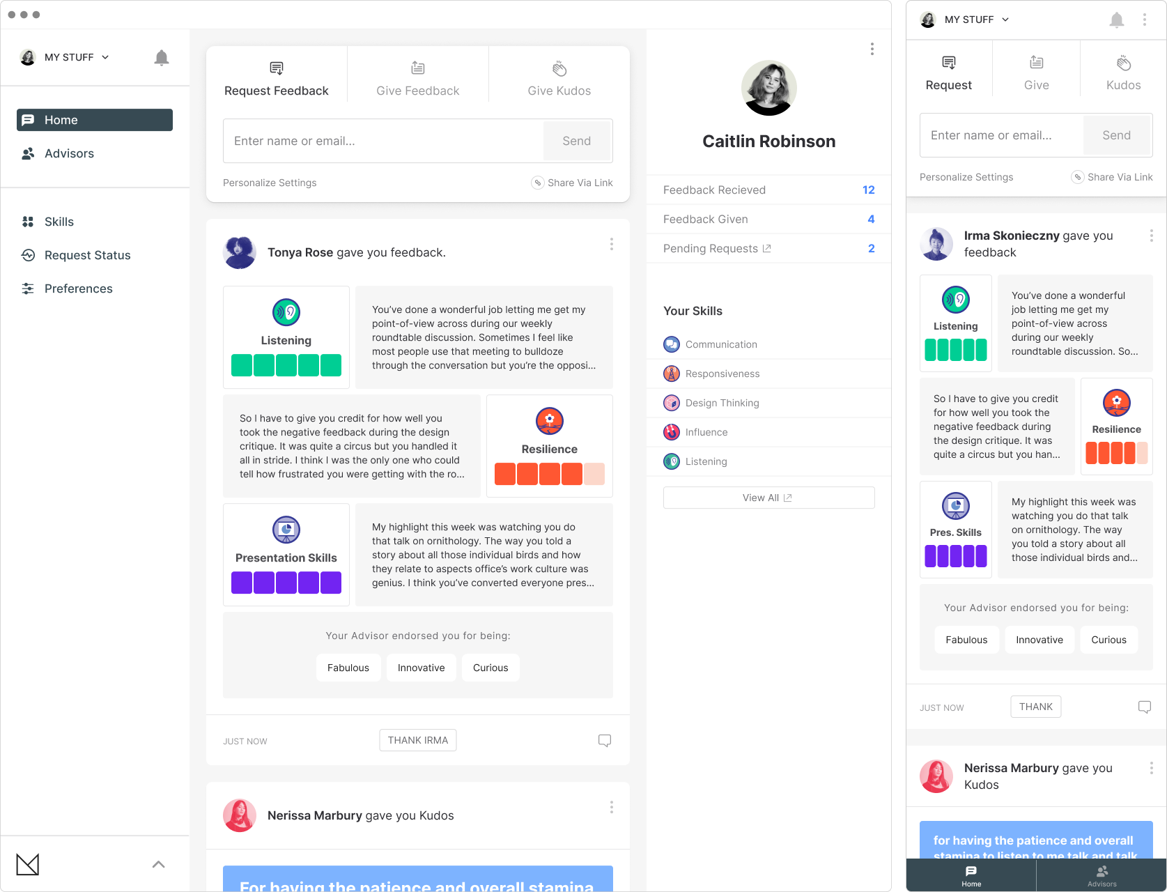
Personal / Home
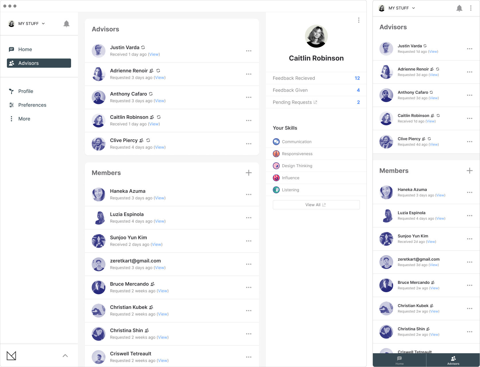
Personal / Advisors
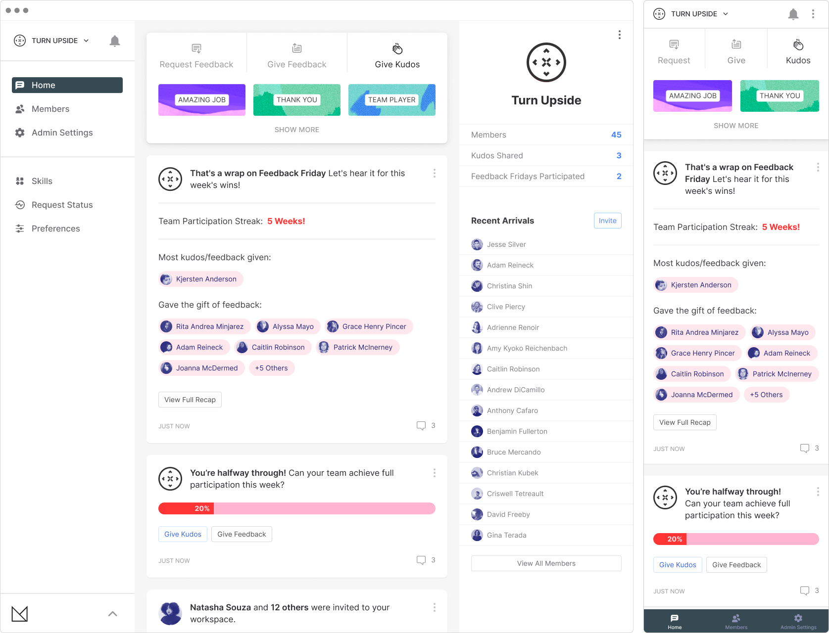
Workspace / Home
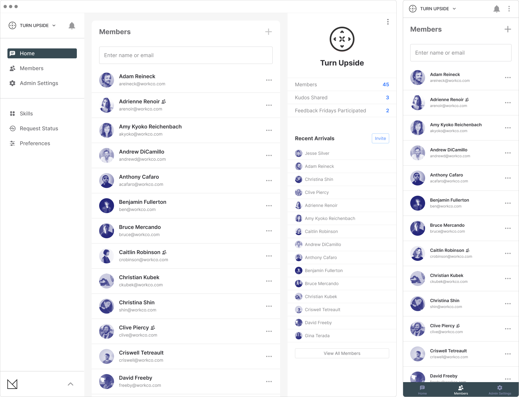
Workspace / Members
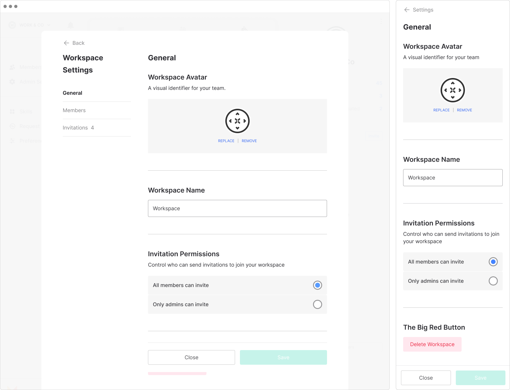
Workspace / Admin Settings


