IDEO / Ditto
The work that was done prior to this consolidation was establishing the brand essence and designing the brand identity & experience.
IDEO is a global design consulting firm headquartered in Palo Alto, California. They are strongly associated with the design thinking approach to designing products, services, environments, brands, and digital experiences. GS Group is one of the largest South Korean corporations with severeal subsidiaries and affiliates. GS Home Shopping (now GS Shop) was their popular homeshopping entity. They split from LG Group a few years prior to this project and hired IDEO as design consultants to revamp GSHS.
- Logotype
- Signature
- Symbol
- Clear Space
- Usage
- Misuse
- Color: Primary Pallete
- Color: Secondary Pallete
- Color: Logo Combinations
- Color: Logo Backgrounds
- Color: Proportion of Use
- Typography: English
- Typography: Korean
- Typography: Web English
- Typography: Web Korean
- Photography: In Context
- Photography: Storytelling
- Photography: People
- Illustration: Examples
- Illustration: Theme
- Iconography
- Pattern
- Motif: Ditto Angle
- Tone of Voice
- Tone of Voice: Beliefs
- TV / Screen UI
- TV / Experts & Participation
- TV / Channel ID
- Print / Magalette / Cover
- Print / Magalette / Sub-Theme Spread
- Print / Magalette / Behind the Scenes
- Print / Delivery / Thank You
- Print / Delivery / Vendor Card
- Print / Invitation Card
- Print / Notebooks
- Outdoor / Delivery Van
- Outdoor / Billboard / Landscape
- Outdoor / Billboard / Portrait
- Outdoor / Banner
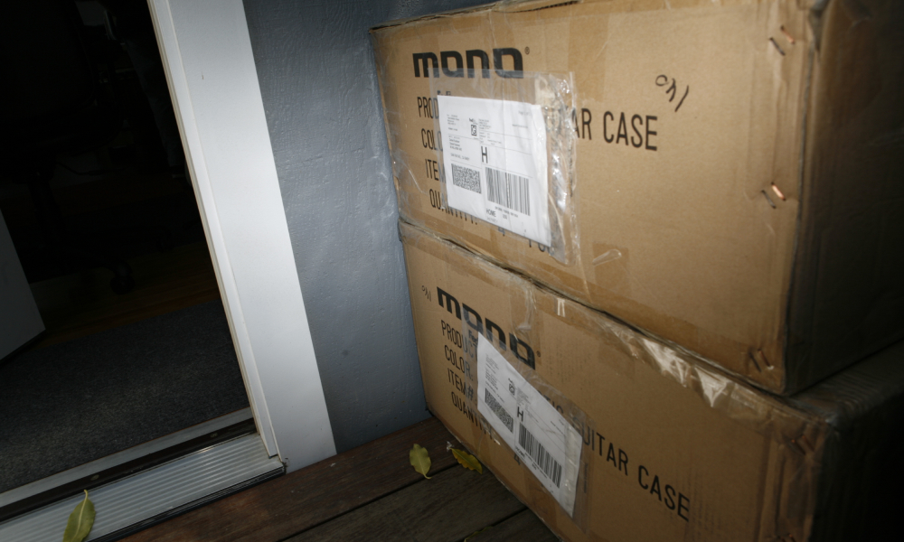
- Packaging / Delivery / Box
- Packaging / Shopping Bag
- Corporate / Business Cards
- Corporate / Binder Cover
- Corporate / ID Card
- Corporate / Uniform
- Web / Sub-Theme Page
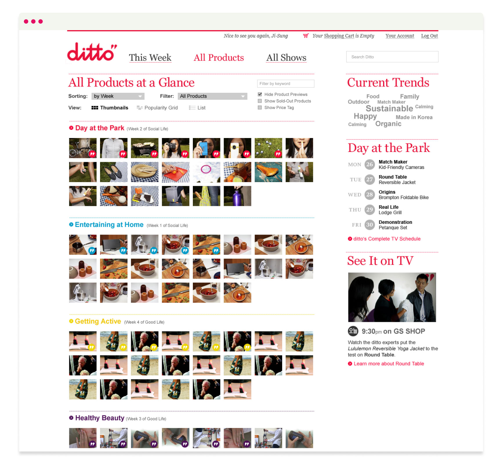
- Web / All–Product Page
- Web / Product Page
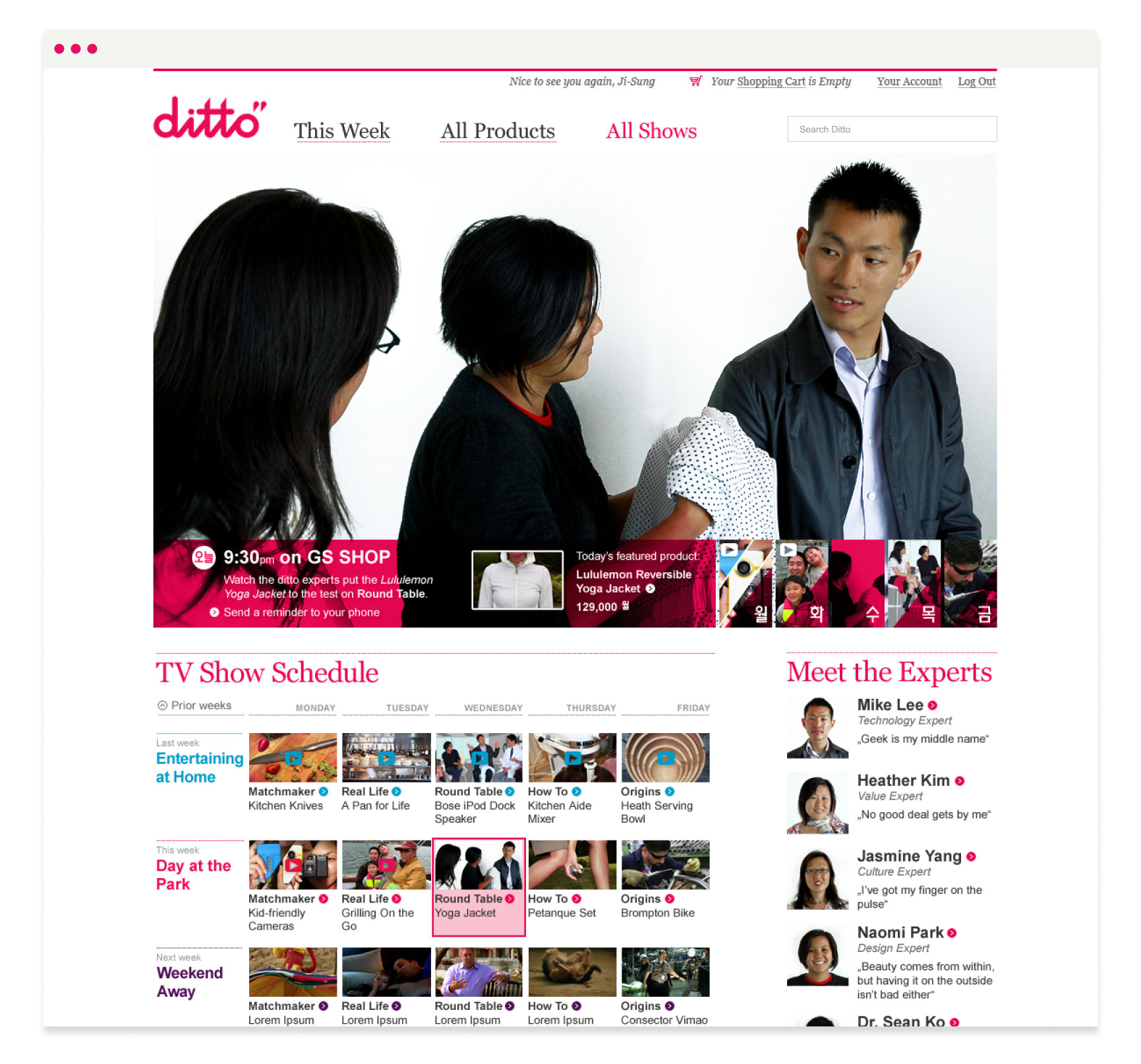
- Web / Show Overview Page
ditto is a new kind of shopping experience designed around our customers. An extension of the experience, the ditto brand has also been designed with our customer in mind.
ditto was selected as our name for many reasons: it’s rhythmic sound, positive meaning and ability to affirm our belief in the products and experience we offer.
The impact of our brand identity depends on all of us using these elements consistently in the way we talk and interact with our customers across platforms and media. We hope you’ll take the time to get to know this exciting new experiment from GS SHOP. Enjoy.


GS SHOP and ditto are built around the same idea: The Real Deal. The brands share the same core values, but express these values differently.
The following pages are all about that expression.
We invite our customers into the purchasing experience.
We help customers find products that fit their lives.
We share real stories about our products and the people behind them.
We offer products that are worthy of our customers’ attention.
We engage with customers as people who we’re always happy to see.
The ditto mark is the ditto stamp of approval.
The tops of the letter ‘t’ in ditto have been cut off to form a ditto mark. The ditto mark represents The Real Deal. It is a recognizable graphic element that indicates a product or vendor has ditto’s endorsement. Specifically, the ditto mark indicates that a product or vendor aligns with one or more of ditto’s beliefs.

The brand elements are the building blocks of ditto’s identity. They are what make ditto recognizable everywhere people come in contact with it.
The brand elements include the logo, mark, graphic element, color, typography, photography, illustration, pattern and tone of voice. Each of these elements is outlined in detail on the following pages, and can be seen in application in the final section.

The cursive logotype is a refined version of handwriting. It’s real and personal, enthusiastic and individual. It has been designed to be legible in all sizes and mediums, if used correctly. The logo will become a visual signifier of the ditto brand in all related materials.
The placement of the ditto mark should always remain consistent. The bottom edge of the ditto mark should align with the center of the cross on the letter ‘t’. The left edge of the ditto mark should align with the inside right edge of the “o” in ditto.

When the ditto logo is used with the tagline, the period on the tagline should align with the center of the ‘o’ in ditto.
The dot above the ‘i’ in ‘life’ and the full period at the end of the tagline have been redrawn to be perfect circles. They reflect the perfect circles in the ditto cursive logotype.

The ditto mark was formed by cutting off the tops of the letter ‘t’ in ditto. They are judiciously used as the brand’s stamp of approval. We intend this stamp of approval to evolve into the symbol of a ditto movement as the ditto beliefs gain recognition.
General Rules: The two shapes that make up the ditto mark should never be separated or used individually. One color should always be used across both shapes. The amount of space between the ditto marks should remain consistent.
The primary mark is reserved for signaling the ditto ‘stamp of approval’ and at key moments such as the signature line in communication to customers. The ditto marks can be reproduced with a texture to add a tactile quanlity to the stamp of approval.
However, do not try to fake a texture. This would not only look bad, but it would reflect badly on the ditto brand. Get a stamp made either in rubber or wood and have it professionally printed and scanned so you can reproduce them at large scale without pixelating.

A clear area around the ditto logo will ensure it has maximum visibility and impact in every communication. The clear space is based on the width and height of the perfect circle ‘o’ when extending from all four sides of the logo.

General Rules: The cursive ditto is always accompanied by the ditto mark.
Product and ditto: The ditto mark can be used without the logo to indicate a product is approved by ditto. In this case, the mark sits squarely on the product image.
Writing ditto: When the ditto name appears in body copy, it should always be written in all lowercase letters. In body copy, the ditto name is not followed by the ‘“’ditto mark.


Do not change the relationship between the logotype and the ditto mark

Do not stretch the logo

Do not condense the logo

Do not create the logo or typeset the logo in any typeface

Do not move the ditto mark

Do not use the logotype without the ditto marks

Do not outline the logo

Do not use the logo in any color not specified in this document

Do not increase or decrease the size of the tagline.

Do not change the typeface of the tagline.

Do not use different colors for the tagline and ditto mark.
The ditto color palette is derived from the personality of the brand and the feeling we want it to convey to consumers. As a whole, the ditto palette feels warm and approachable. The palette is an unexpected combination of colors, which is in line with the witty and curious character of the brand.
When the logo is used in color, the primary color combination is Plum Purple with a Candy Red ditto mark. This color combination was chosen because of its appeal to ditto’s target market, representation of the ditto brand and ability to work well across platforms.

Pantone 2627C
#42145F
C 84
M 100
Y 7
K 33
R 66
G 20
B 95

Pantone 206C
#CB0044
C 0
M 100
Y 48
K 0
R 203
G 0
B 68

Pantone 203C
#E7AEC6
C 0
M 36
Y 2
K 0
R 231
G 174
B 198

Pantone 3135C
#0094B3
C 100
M 1
Y 20
K 3
R 0
G 148
B 179

Pantone 606C
#D4BA00
C 0
M 6
Y 100
K 14
R 212
G 186
B 0
The secondary color palette includes three colors for special use. The cool gray provides a utility color for body copy that’s softer than the traditional black. It is a neutral color that will let other colors stand out.
Fluorescent Pink and Gold are spot colors for use in print only. They are used to provide a special touch for important communications only.

Pantone Gray 8C
#8B8D8E
C 23
M 17
Y 13
K 41
R 139
G 141
B 142

Pantone 806 C
#F39AC0
C 0
M 50
Y 1
K 0
R 243
G 154
B 192

Pantone 871C
#A39161
C 36
M 37
Y 70
K 6
R 163
G 145
B 97


Plum Purple is the predominant color for the ditto brand. When consumers think of ditto, Plum Purple is the color that will come to mind.
Purples was chosen for its association with creativity and sharing. The other four colors provide bright memorable contrast to the Plum Purple backdrop.
40%
15%
15%
15%
15%
To keep things simple, we have selected 3 weights from the Swift family - Swift Light, Regular and Bold.
We chose Swift, with its strong, grounded serifs and substantial feel, as a contrast and complement to the rounded and personal ditto cursive. Swift is somewhat unexpected in the Korean visual landscape and therefore also subtly signals something new.

Yoon is the Korean typeface, and should only be used for Korean characters. Western characters and numbers should always be typeset in Swift.
The Korean typeface, like the English typeface, is limited to 3 weights - Ultra Light, Medium and Bold. Yoon’s symmetric geometry mirrors the perfect circle “o” in ditto.

Arial is a clean, simple websafe typeface that should be used when body copy includes Western characters and numbers on the web. Georgia is a clean, simple websafe typeface that should be used for all Western character head- ings, titles, and other large text on the web.

Malgun Gothic is also a clean, simple websafe typeface and should be used for all Korean characters on the web.

In-context photography feels natural and lived-in as opposed to styled and untouchable. Images should feel like they were snapped with a hand-held camera, capturing moments in a candid, contextual manner.
The images should feel real as opposed to staged. Images should convey a moment in time that alludes to a larger story.






Storytelling is a big part of the ditto brand, and photography is a great medium to use.
This page demonstrates how contextual photography can work together in a layout to build a complete picture—in this case a peek into the life of MONO founder and design director, Daniel Kushner in his studio in San Rafael, California.





ditto uses candid in-context portrait photography. People are never posed, and image subjects do not look or seem too perfect. We should get the sense that the images are about real people.
In the spirit of The Real Deal, people’s expressions should be open, approachable and genuine. Avoid exaggerated expressions. Images should be as real a representation of the subject as possible.






The ditto illustration style rotates based on the month’s theme. Each theme should have its own illustration style that surfaces twice a year. Illustration is the primary indication to consumers that it’s time for a new theme.
Each theme’s illustration style will be created by a different illustrator, artist or designer. Celebrating local artists is consistent with ditto’s beliefs and provides a hook for customers. The selected artist should use the ditto brand and the month’s theme and sub- themes as their inspiration.
In general, illustrations should feel organic, hand-crafted, whimsical or intuitive. This relates them to the real, enthusiastic and personal quality of the ditto logo.


Below is an example of illustrated type and graphics for a theme. The selected artist should create display text for the theme, sub- themes and any other significant copy. They should also create a bank of graphics related to the month’s theme.
Each letter and graphic should feel handcrafted and unique, adding to the personal feel of the brand.


The ditto iconography works as an information system to introduce an idea or cue an action. The icon should represent its corresponding idea or action clearly.
Icons should always be used in a circle. The elements within the circle should also be rounded so as to connect to the shapes and strokes of the ditto logotype.

Curser

Play

User Question

Repeat

Search

Guest Expert

Music

Host or Guest Host

Movies

Favorites

Web Submission

Bookmark
The ditto mark can be combined to create a supporting graphic element. The pattern should be used sparingly, so as not to dilute the impact of the mark.
For instance, it can be used as the lining of a shopping bag or the wrapping paper inside a box.


The ditto angle is taken from the lower right side of the ditto mark. It is the edge that was cut between the letter ‘t’ in ditto and the ditto mark.
The angle is a dynamic graphic element that is recognizable across the ditto brand. It can be used to contain an image, break up a layout or orient type.
General Rules: The ditto angle should always be 51.5 degrees. Nothing should cross the ditto angle. It should always be a clean, uninterrupted line.

The tagline sums up the custom- er benefit of shopping with ditto. ditto takes a unique approach to helping customers find what fits their life:
Experience-based sourcing (by theme and sub-theme). Stringent product requirements based on a set of values. Multiple, expert perspectives on products.
With all of this information, customers are set up to make purchasing decisions based on function, values and a desired experience.

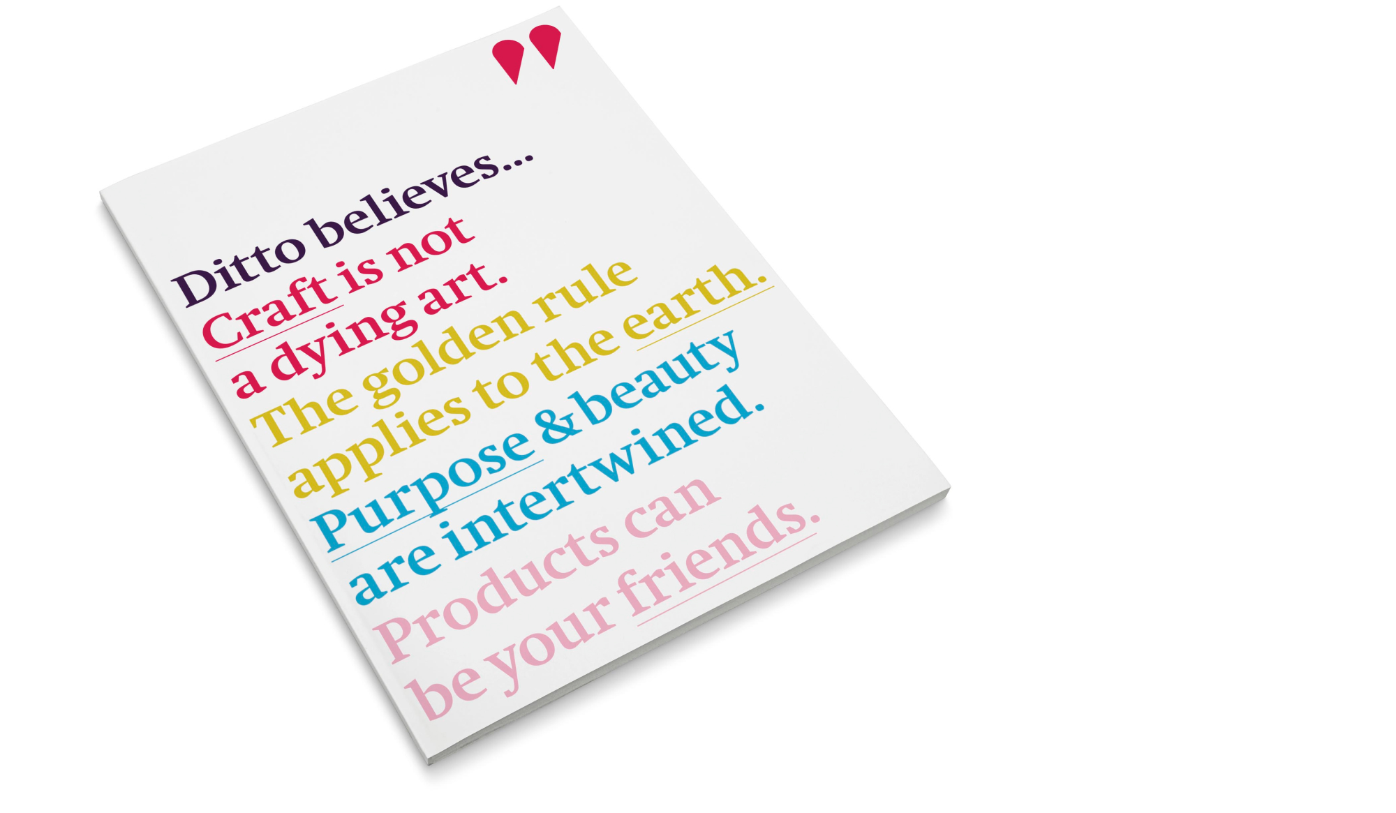
The ditto beliefs are our beliefs as a brand. They make our sourcing process transparent to customers, and allow our customers and vendors to share our enthusiasm for these ideals. This encourages loyalty by creating something meaningful in which our custom- ers and vendors can participate.
It’s important the beliefs are localized in an appropriate way. The beliefs should not over-promise; they should be an honest representation of where we stand as a brand.
The beliefs should live on the ditto website and can also be used in advertising. Examples follow in the application section.
By bringing all of these elements together in a consistent way, we can create a strong, recognizable brand identity for ditto.
This section includes the brand elements in a variety of applications — TV, online, print, outdoor, packaging and corporate. The examples featured on the following pages should inspire how the brand comes to life; the artwork is not print ready.

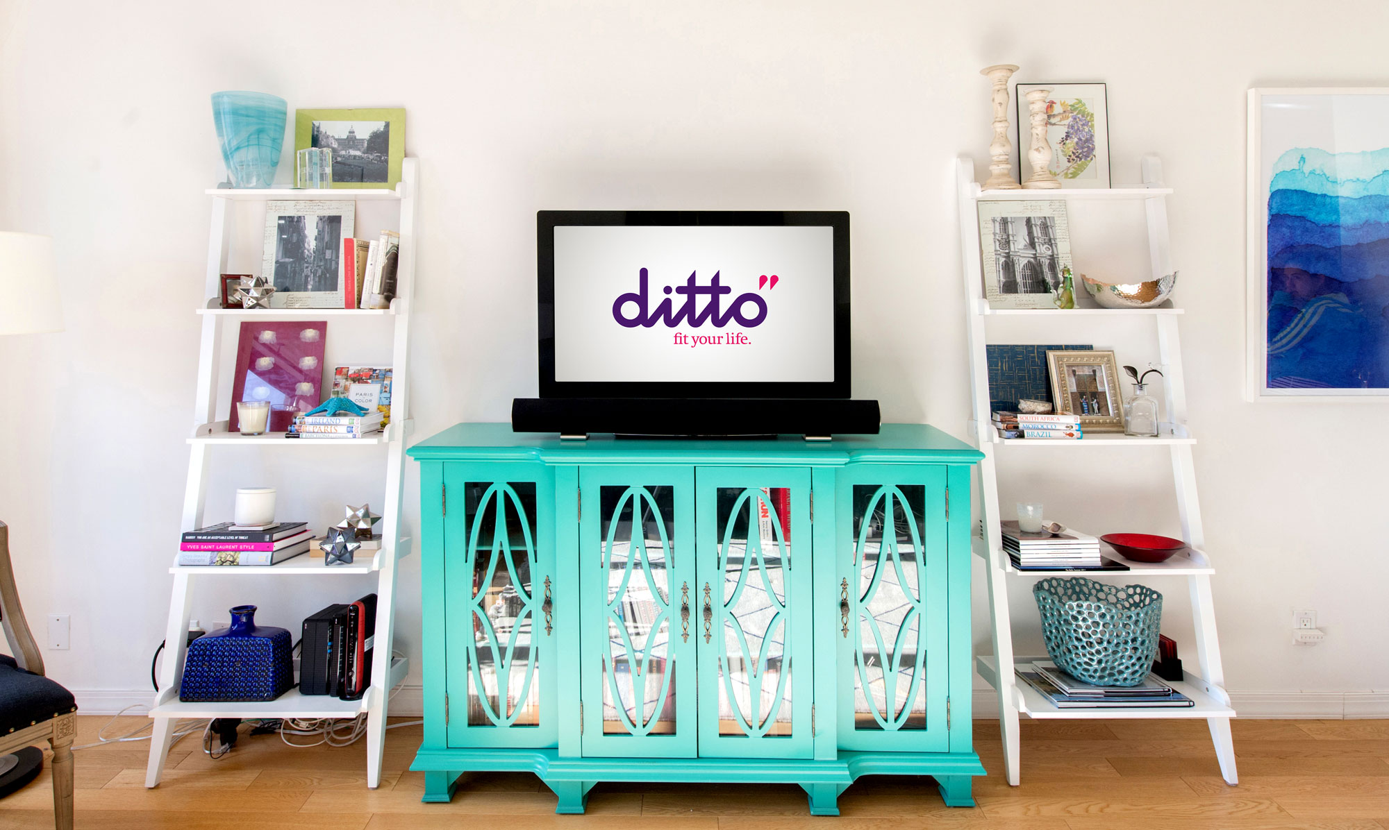
Information is contained in semi-transparent boxes on the lower third of the screen. These boxes feature the ditto angle and are dynamic, sliding in and out of the frame as needed.
The ditto mark sits as a watermark in the top left corner of the screen. All elements on the screen should be kept to a minimum so as not to disrupt the focus on the real story. Product information animatics flow from the right side of the screen as seen below.

The semi-transparent box on the lower left side of the screen is reserved for expert and guest names as well as calls to participate, as seen below.

The station break animation brings the ditto logotype to life as it is drawn out on the screen. As the tops of the letter ‘t’ are cut off, the ditto mark emerges dynamically.
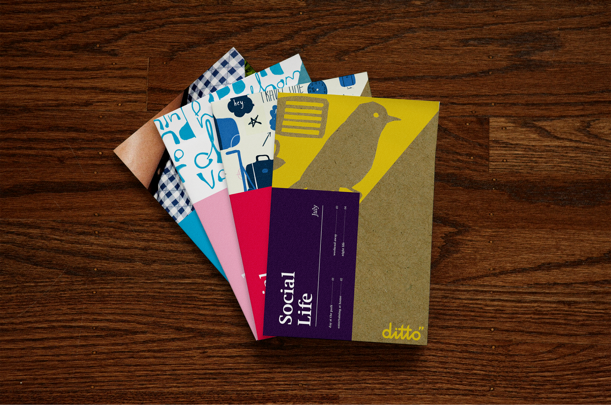
The cover of each monthly magalette boldly features the illustrations commissioned for that month’s theme. The cover has a detachable second layer that introduces the month’s sub-themes.
On the inside of the small cover is a monthly calendar with events and a ditto TV schedule. The unique look and feel of each magalette makes it collectible.
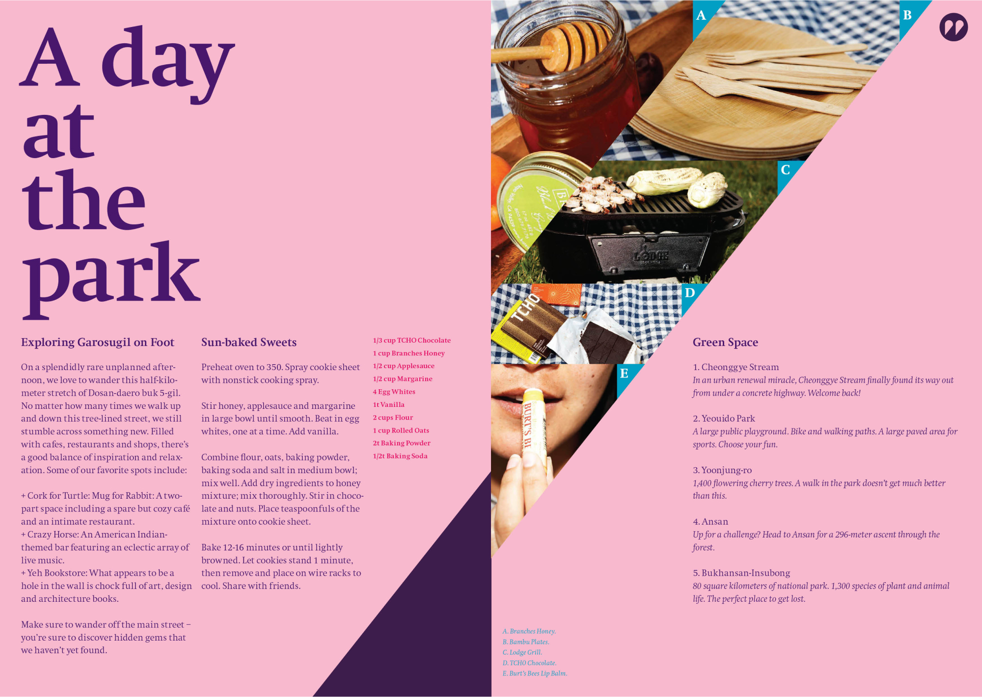
Inside the magalette, each sub-theme has its own spread. Sub-theme spreads should include a small selection of featured and supporting products as seen below.
Magalette content should be inspirational and experiential. It should put the selected products to use, whether in a recipe (see honey below) or on an urban hike (see sunscreen below).
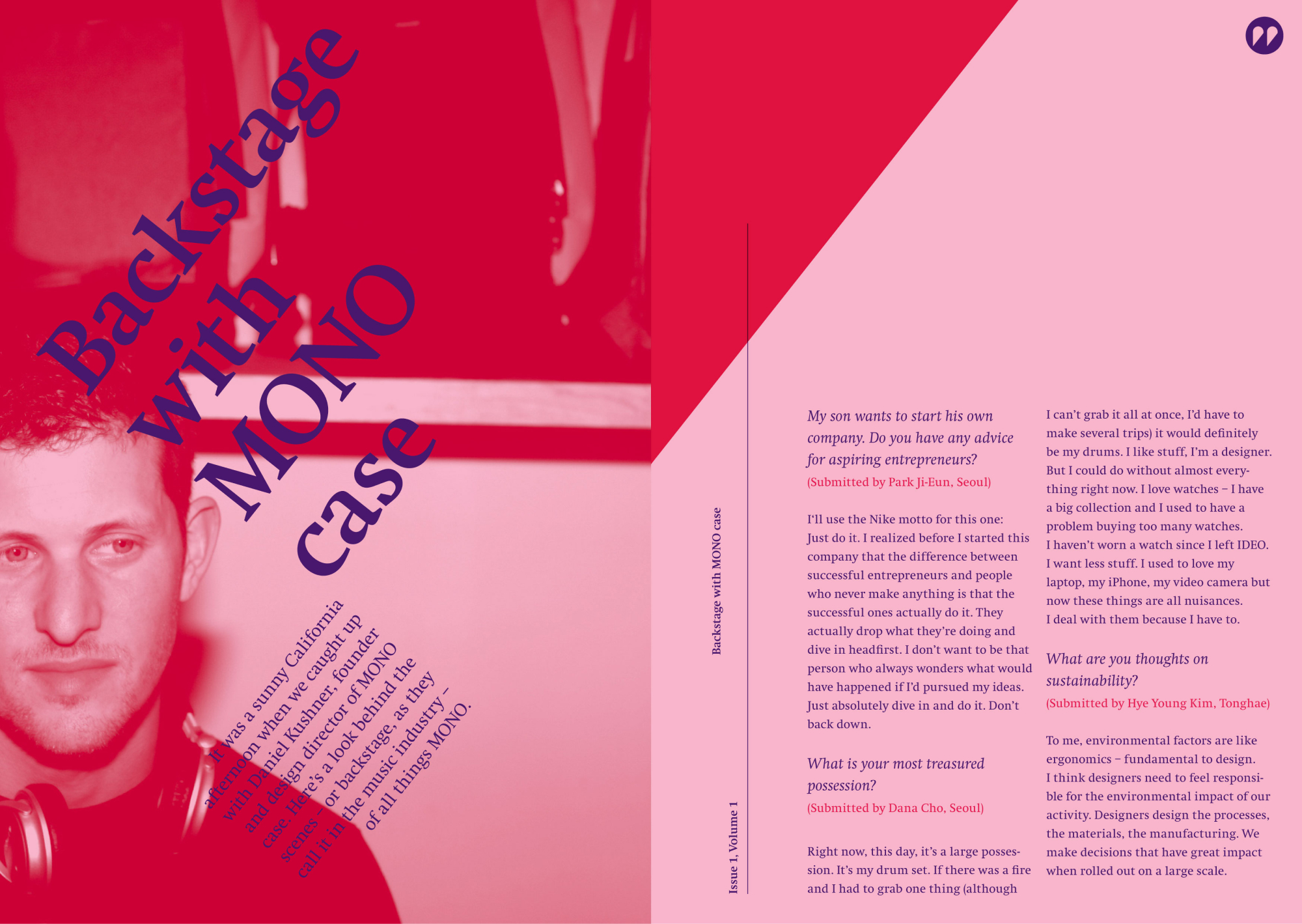
Behind the scenes stories dive into the real stories of real people. They are written in the ditto tone and feature ditto photography of the subjects. Each magalette should end with a behind the scenes story. Before ditto interviews the featured designers, a call for questions should be put on the website.
Customers can submit questions (as seen below) that will be asked in the interview. The top 5 questions are featured in the magalette while the rest of the story lives online.
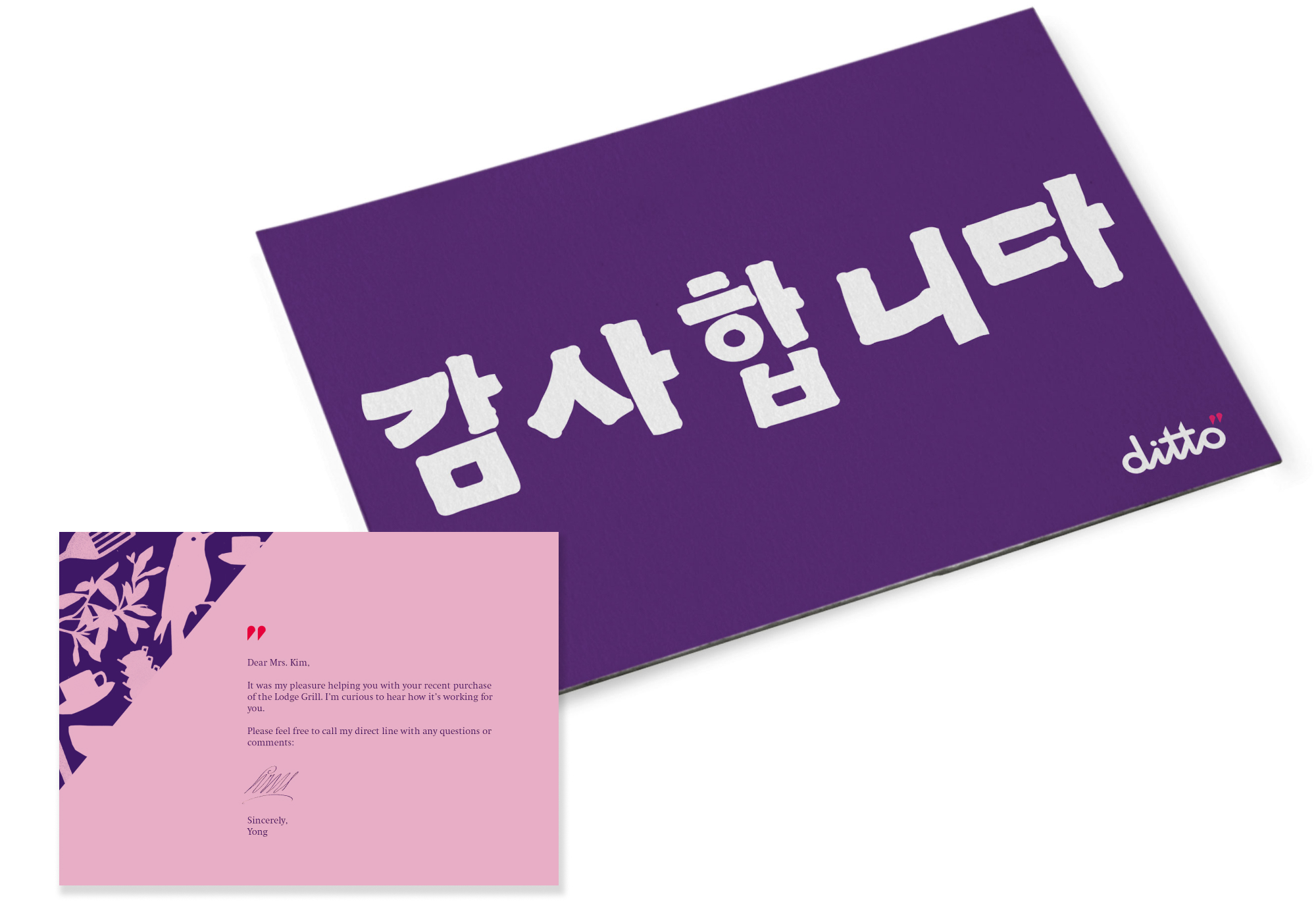
The Thank You card incorporates the ditto angle and primary ditto graphic elements to mark an important moment in the relationship between ditto and the customer. The card incorporates the illustrations of each theme, and so stays fresh every month.
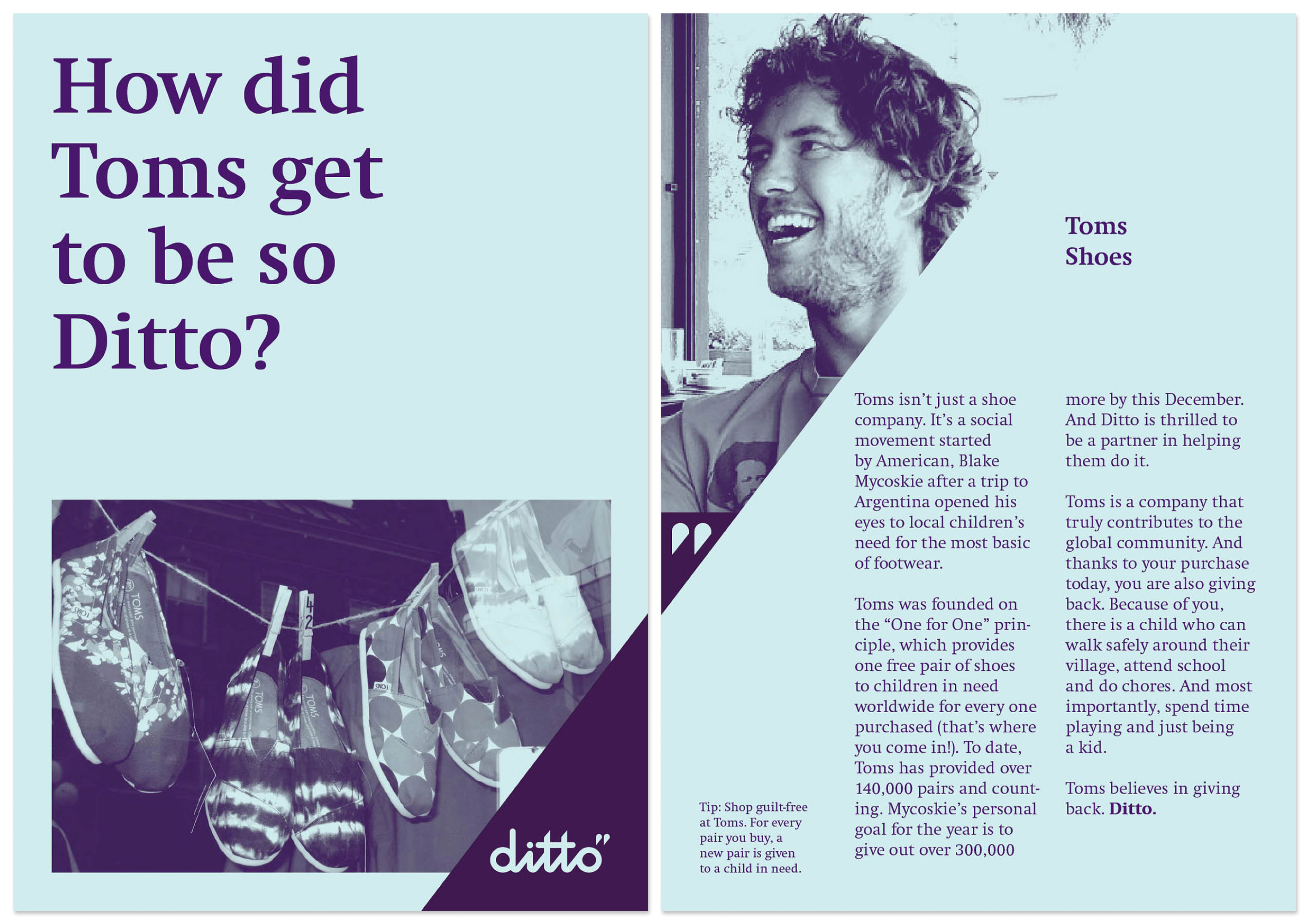
The vendor card features the vendor’s story and explicitly connects it to ditto beliefs. The simple mono-tone photography is within ditto’s photographic style.
One color printing is affordable and creates a distinctive look.
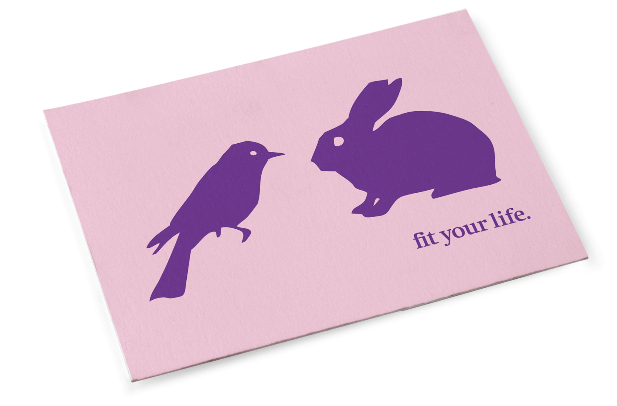
The invitation incorporates the illustrations of the relevant theme. The bold front side of the invitation features the ditto tagline. A playful twist on the ditto mark creates a heart, inviting the customer in.
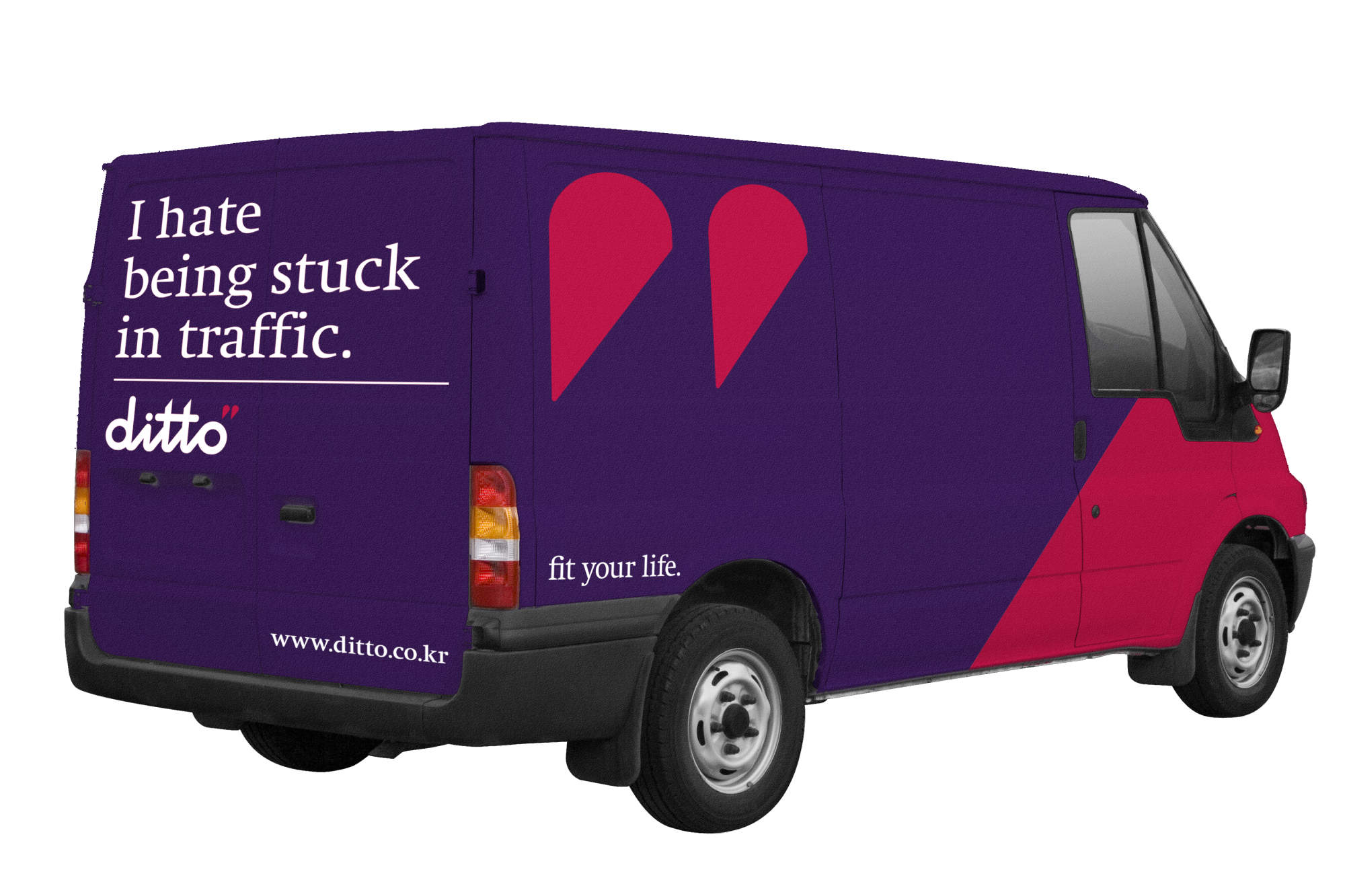
The delivery van is an opportunity to get the ditto brand out on the streets and communicate with consumers. The truck facilitates an emotional connection with the public through the playful, honest and witty language on its back door.
The van features the ditto colors, logo, tagline, angle & personality.
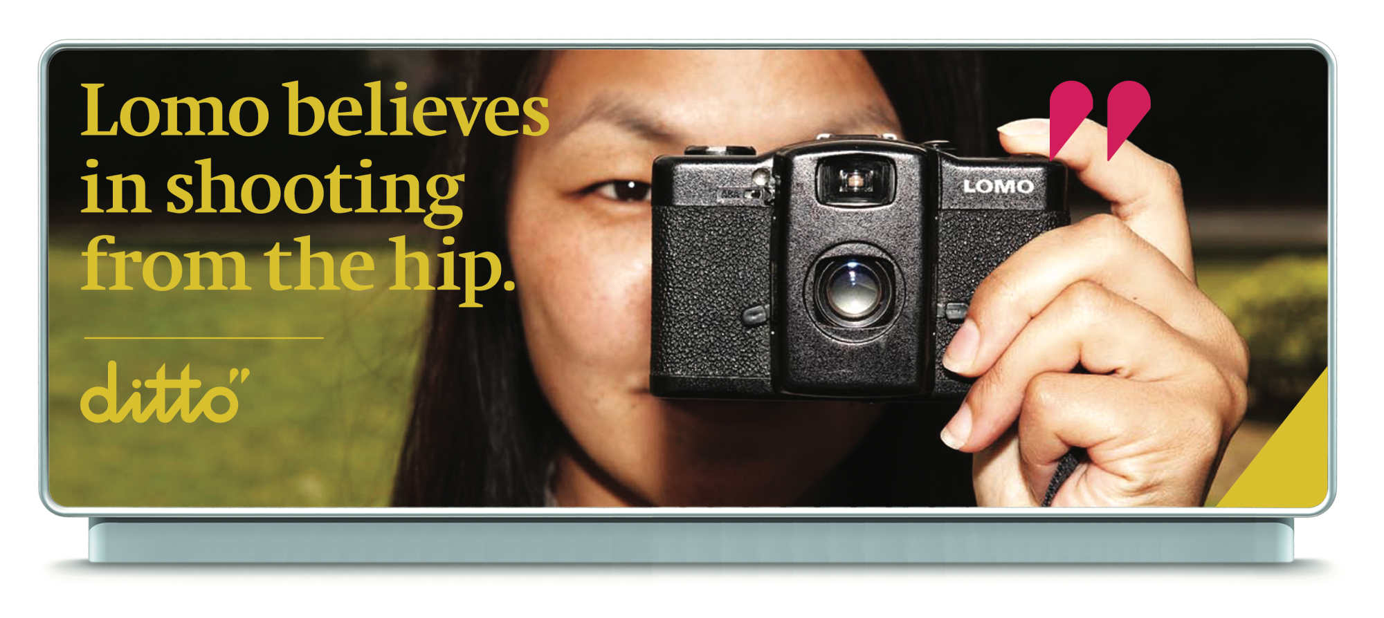
The billboard uses ditto beliefs and the ditto mark to vouch for the featured product. It provides the start of a background story on the vendor and communicates the mutually beneficial alignment between the vendor and ditto.
The ditto mark highlights the featured product. The ditto angle is featured in the same color as the logo and copy, providing a clean look and feel to the billboard.
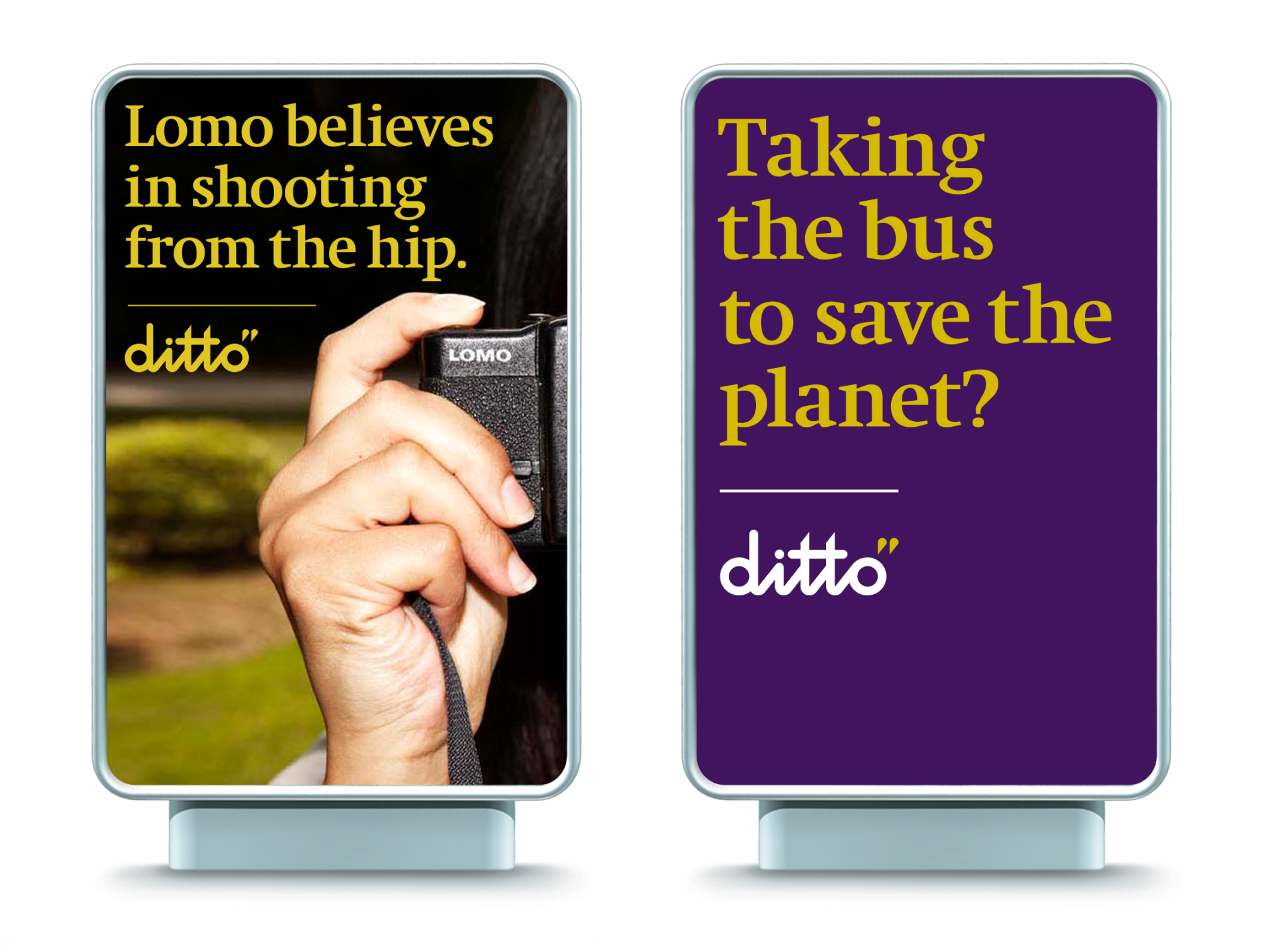
The billboard builds an emotional connection with consumers. It uses one of the ditto beliefs to relate to consumers as ditto relates to vendors in other advertisements.
In the ad below, the consumer has chosen the bus over driving, which aligns with the “golden rule” belief.
ditto banners create a clean, recognizable backdrop. Option 1 uses the angle and logo to frame the banner, and can be used when ditto isn’t emphasizing the stamp of approval.
Option 2 uses the ditto mark as a stamp of approval and should be used accordingly.


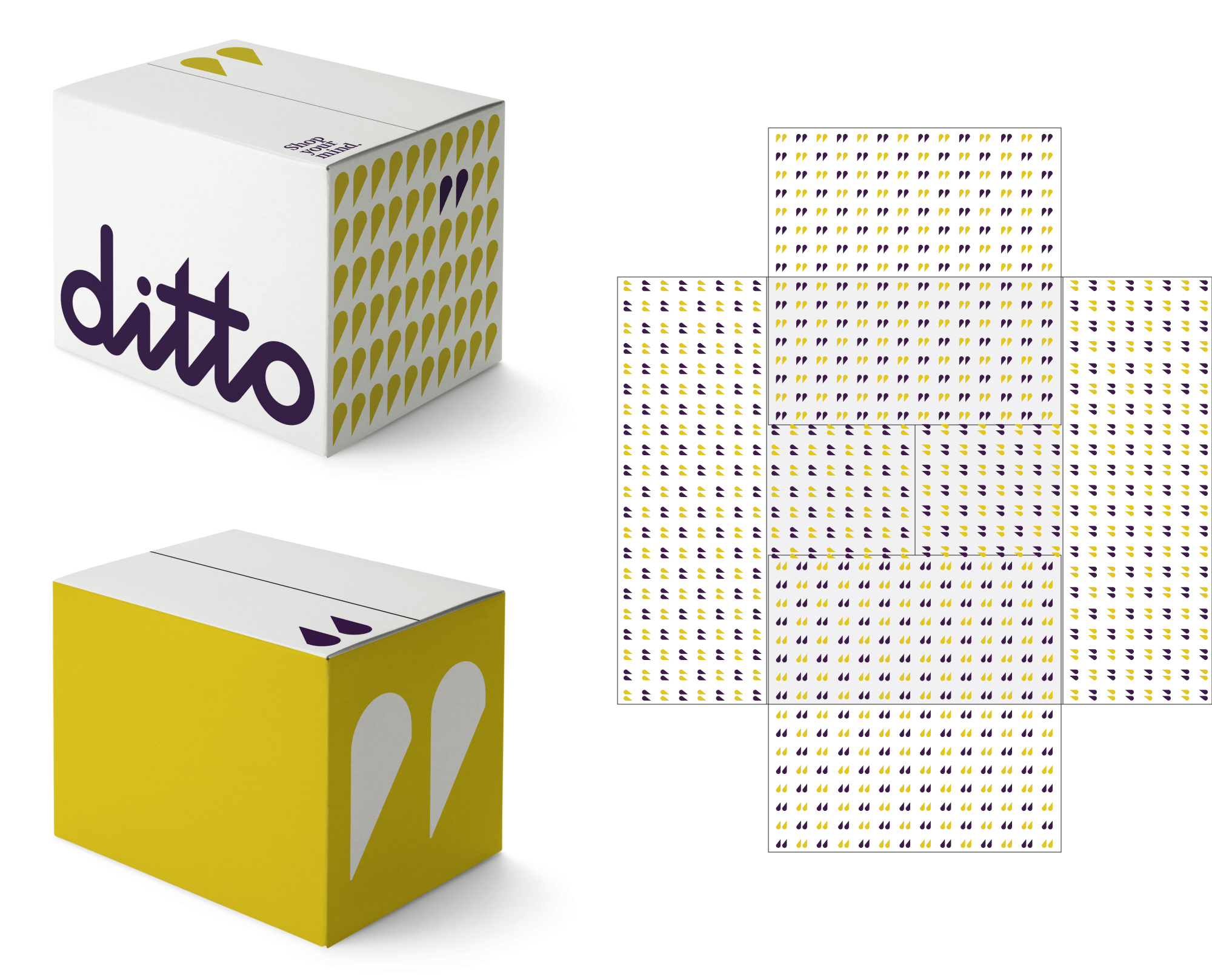
The ditto box features the primary graphic elements and strong use of color. The ditto mark is used on the outside of the box as a stamp of approval on the product inside.
All surfaces are designed, providing a vibrant and distinctive package. The inside of the box uses the ditto pattern. When 3 boxes are placed next to each other, they spell out the ditto logo.
The shopping bag focuses on the primary brand elements – the logo, mark and tagline. The ditto mark is used on one side of the bag as a stamp of approval on the product inside. Heavy, recycled card stock reflect ditto beliefs on craft and the golden rule.

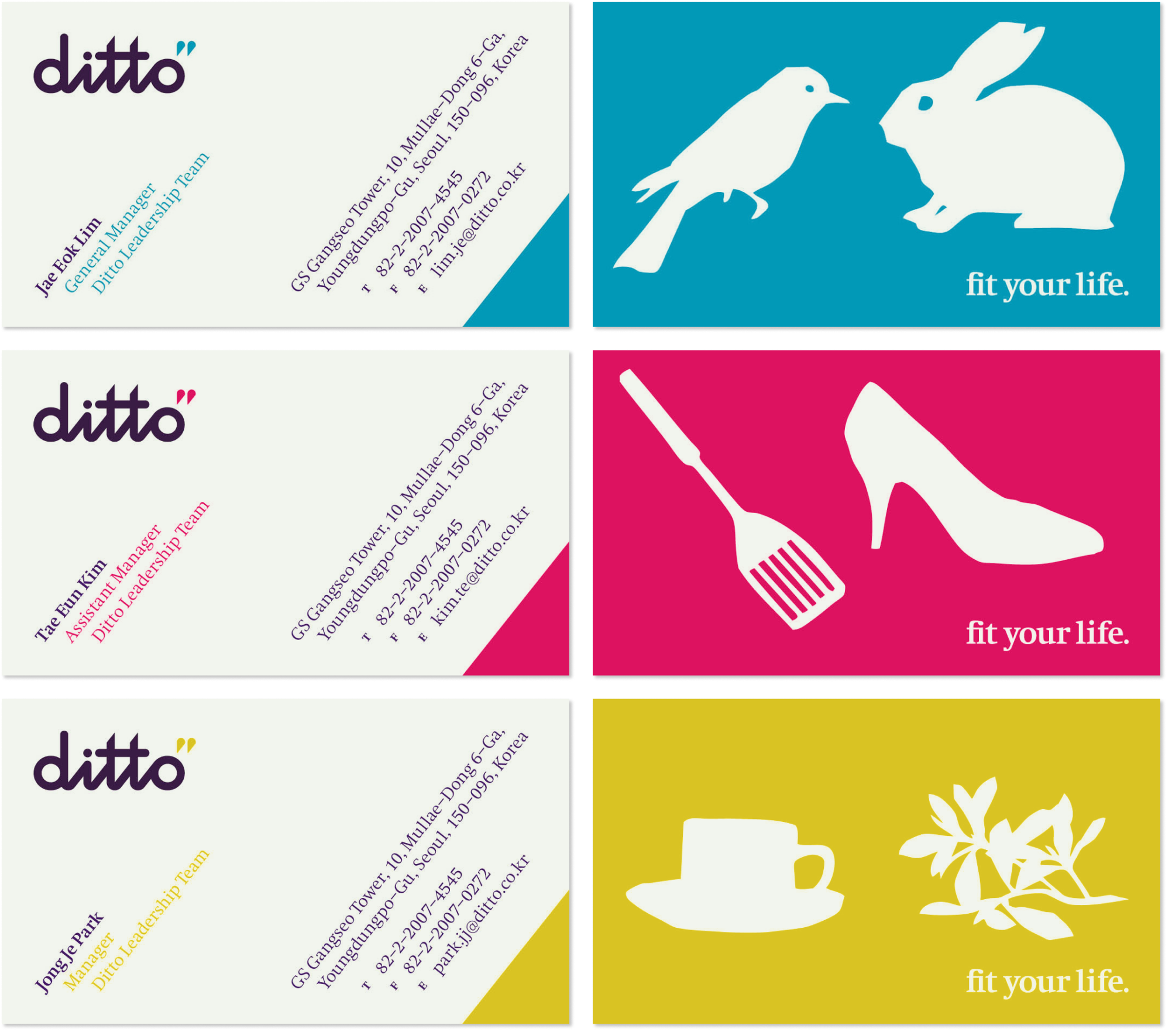
Because personality matters at ditto, the illustrations and colors are customized on individual business cards. ditto business cards use one side for employee title and contact information as well as the ditto logo.
On the other side each employee selects illustration elements from the ever-growing sub-theme illustration library. Both illustrations should be selected from the same artist. The ditto angle, logo, tagline and typeface unify the cards.
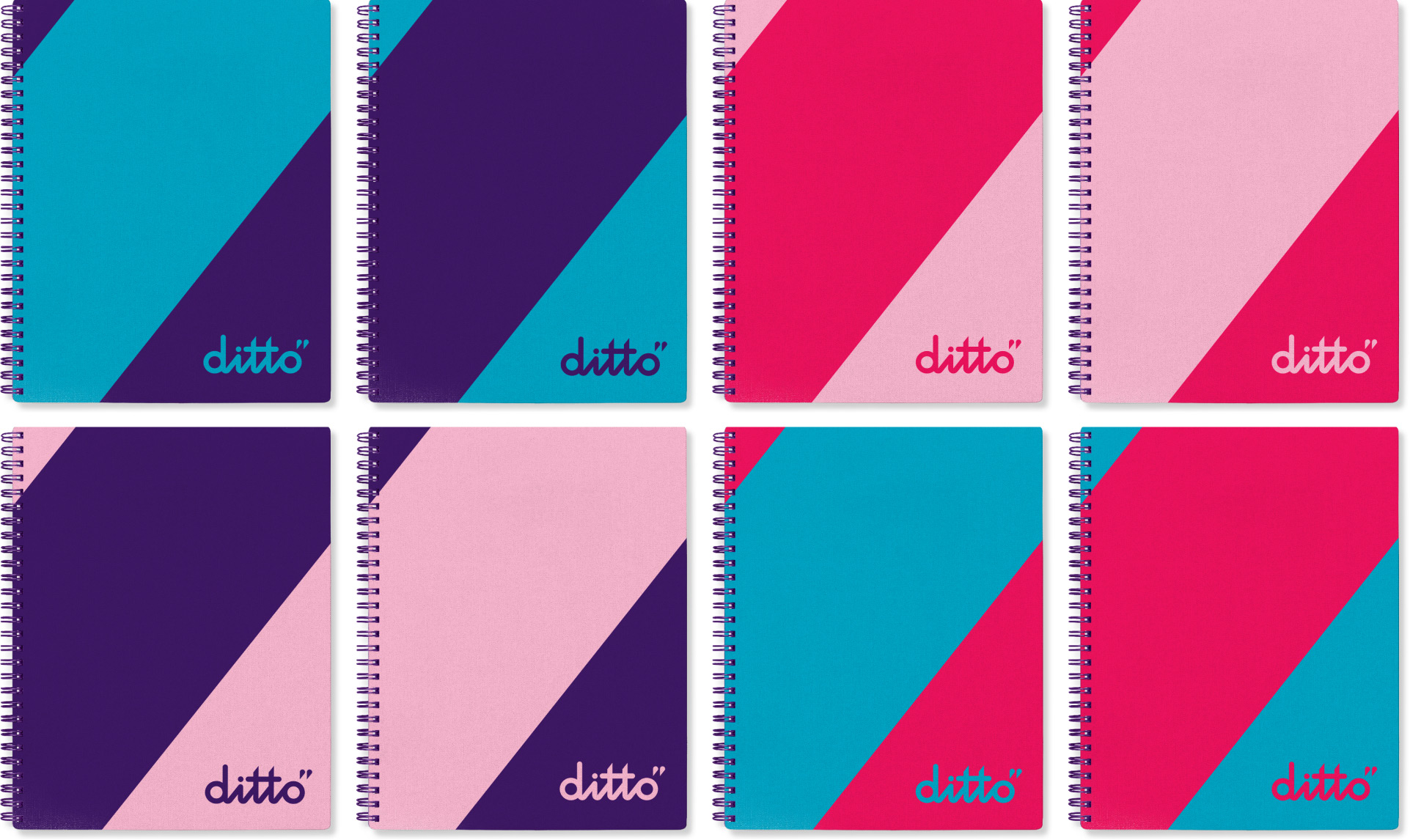
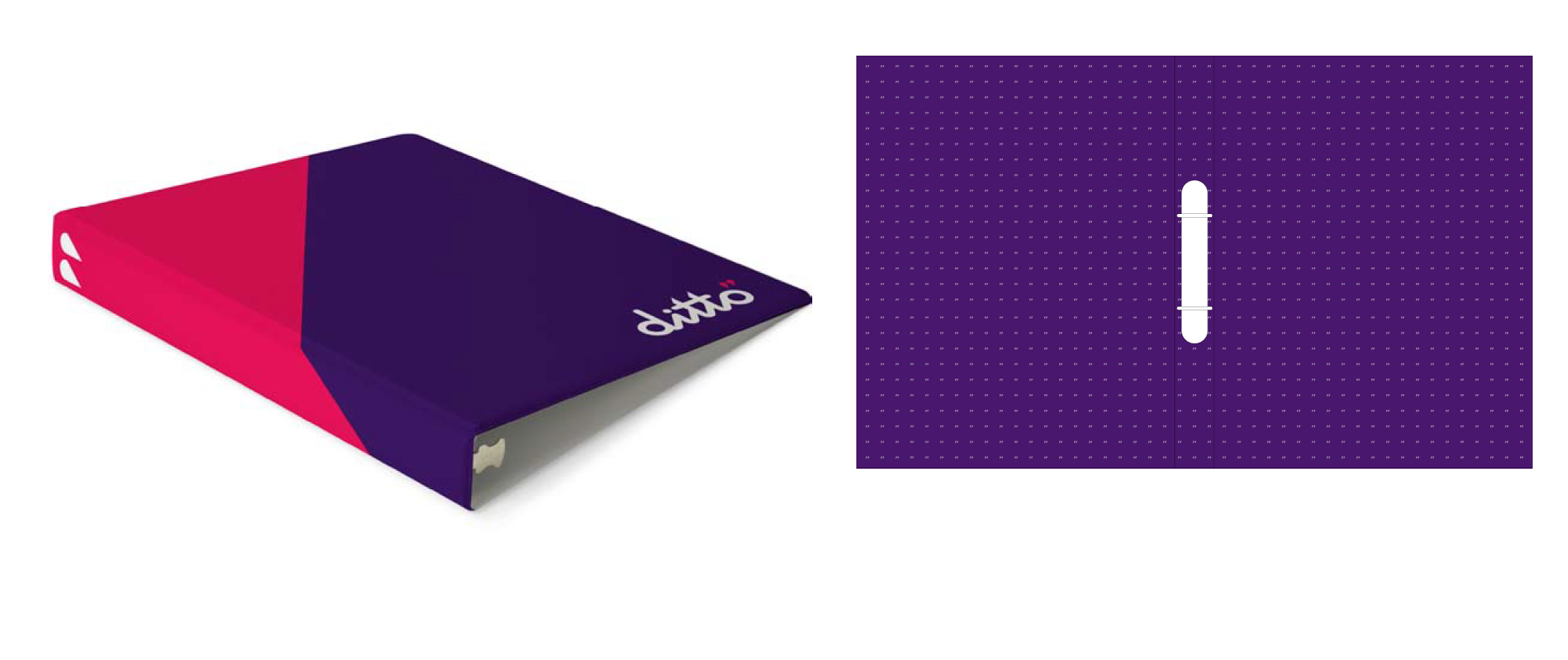
The ditto binder introduces the primary ditto brand elements and colors all over the office. The pattern is used as a supporting texture inside both covers.
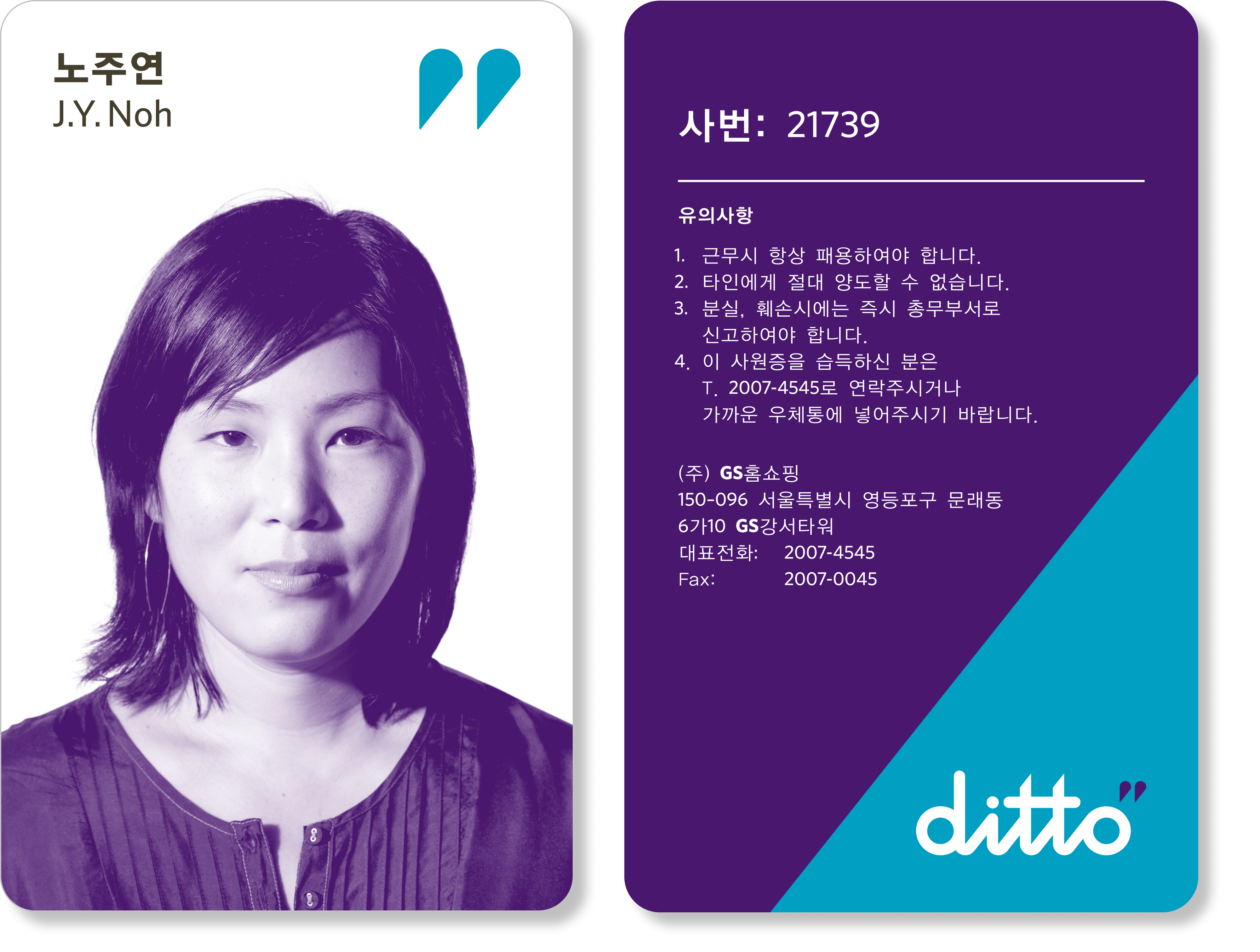
The ditto ID card introduces the primary ditto brand elements to employees.
The ditto uniform is relaxed, casual and comfortable – for real people. The ditto mark on the upper left reflects the employees commitment to ditto and stamps ditto’s ‘seal of approval’ on the people who will make it real.

The current ditto sub-theme page serves as the home/start page of the ditto website. It is designed to provide a clean, focused view of a specific experience and the curated product selection associated with this sub-theme.
One color is used throughout the navigation, while other ditto colors provide links to other sub-themes. The ditto mark serves as a navigation tool to featured products, guiding customers to find out more about them and stamping them with the ditto ‘stamp of approval.’
Weekly refreshing of this page presents new stories to customers, while more frequent updates of the expert blog and other modules insure a continuously dynamic experience. The illustrations associated with the monthly theme anchor the sub-theme within the larger experience.
Note: For complete guidelines on web features, please see the ditto Website guideline document.
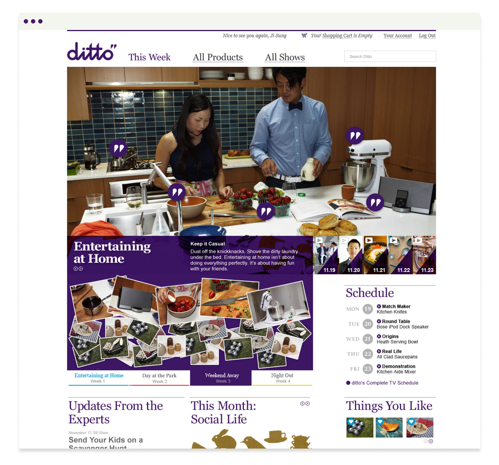
The photographic style is maintained in the images of products and people on the site. Products are shown in context. A clean grid provides a simple, at-a-glance view of the months’ products. The ditto mark highlights the featured products. Color consistency per sub-theme is maintained in titles and the ditto mark.
Note: For complete guidelines on web features, please see the ditto Website guideline document.
Note: For complete guidelines on web features, please see the ditto Website guideline document.
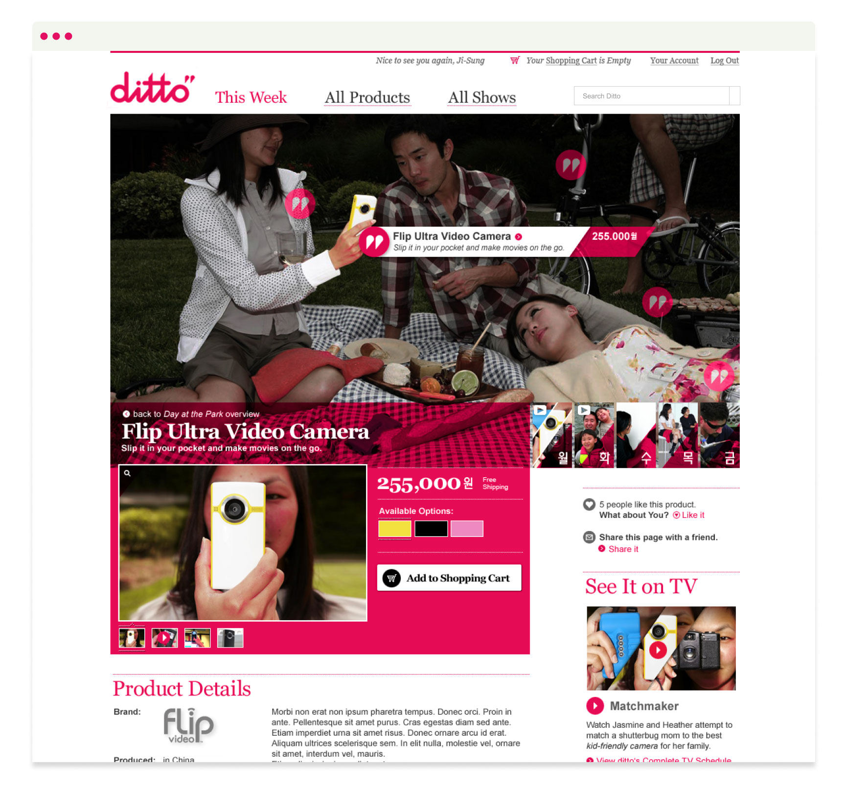
Note: For complete guidelines on web features, please see the ditto Website guideline document.
