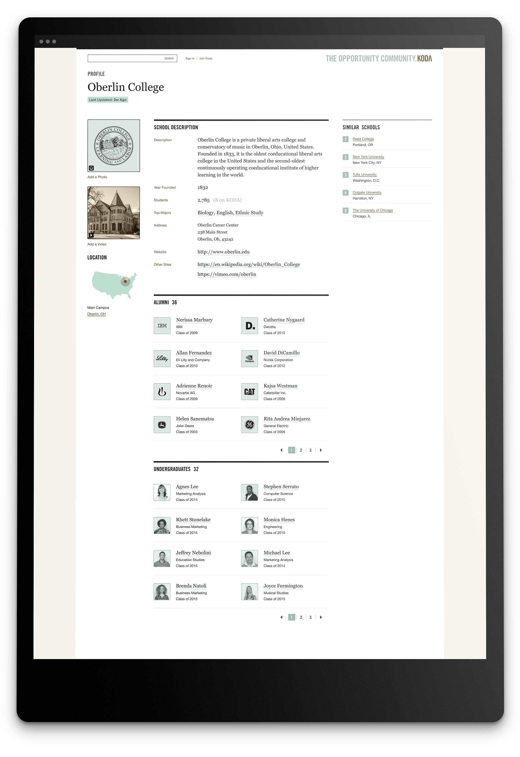
IDEO / Koda
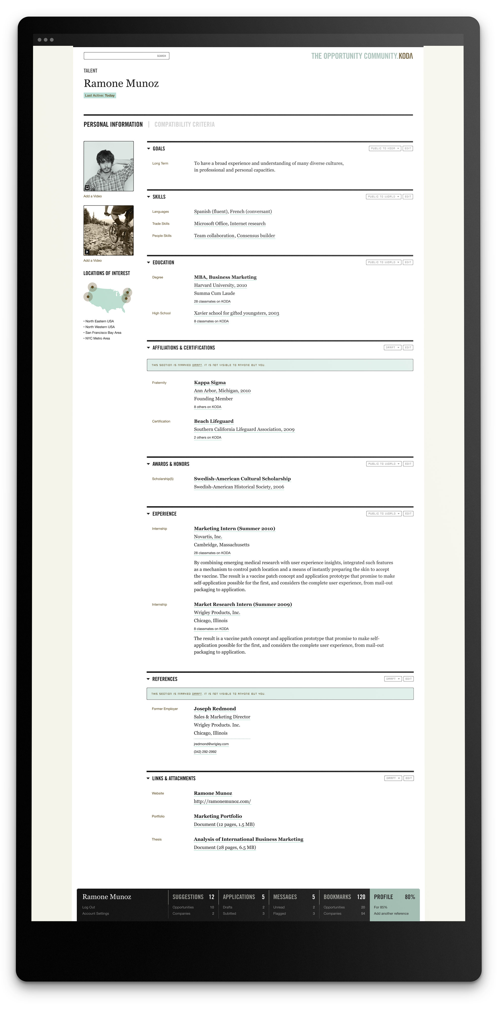
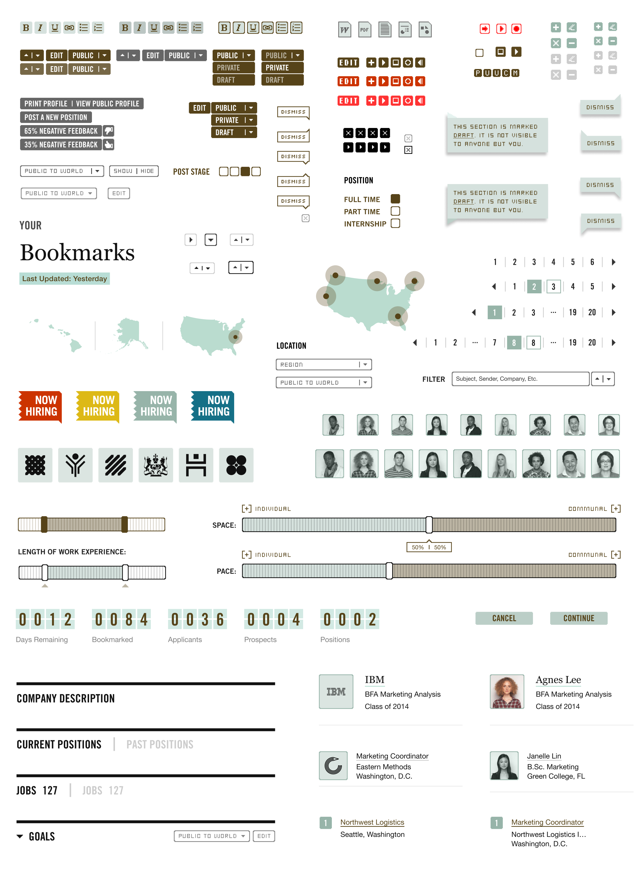
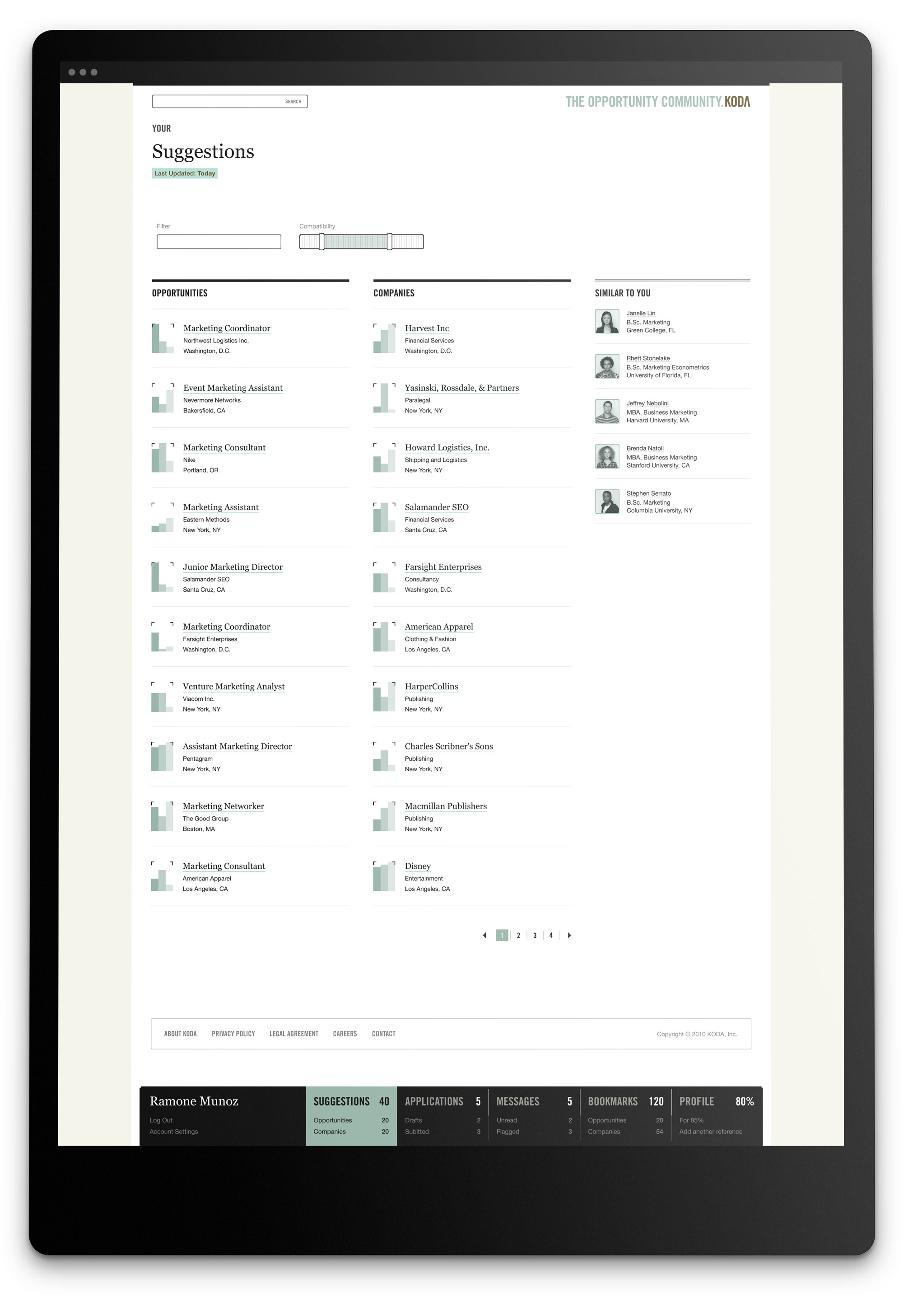
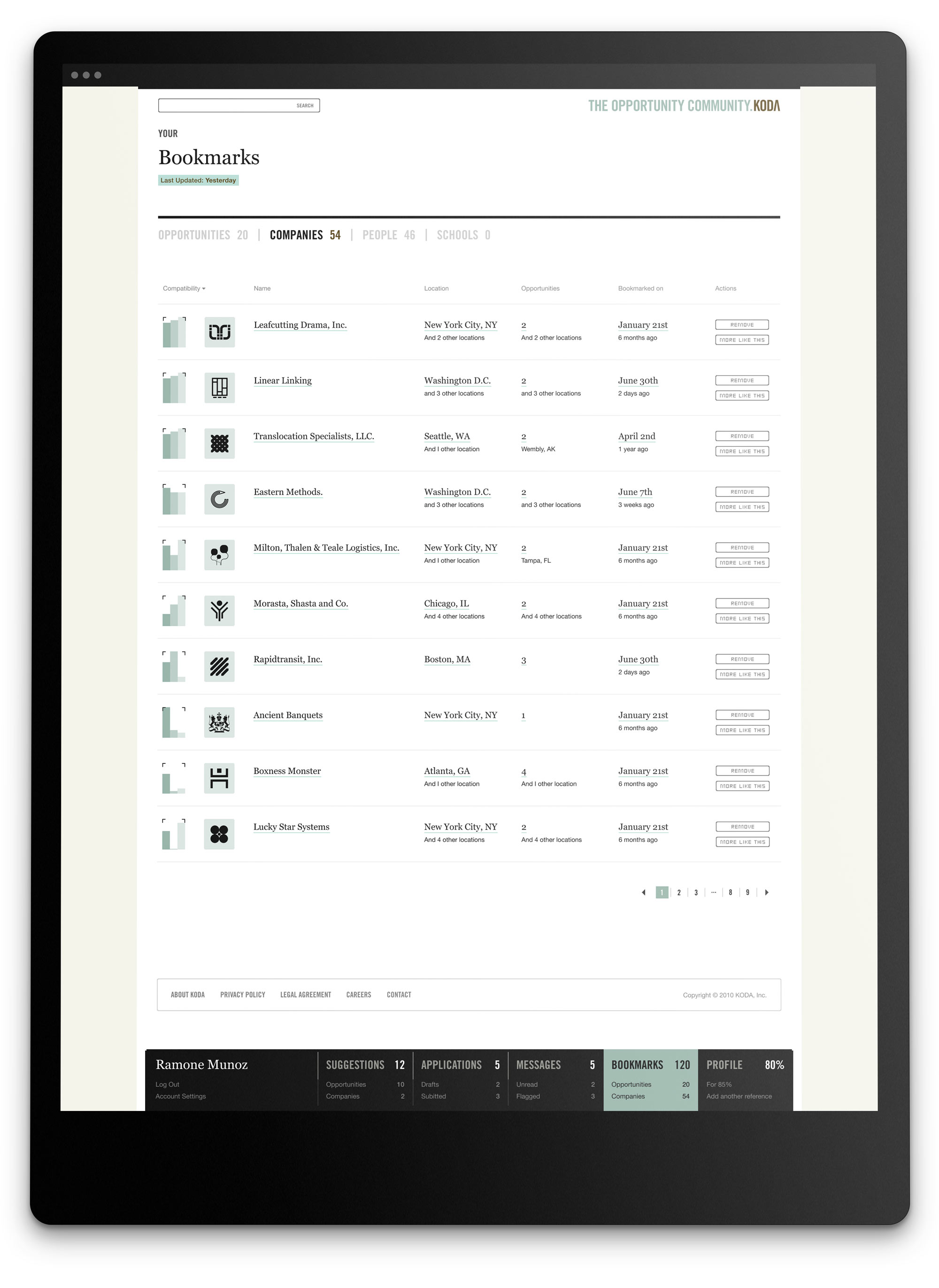
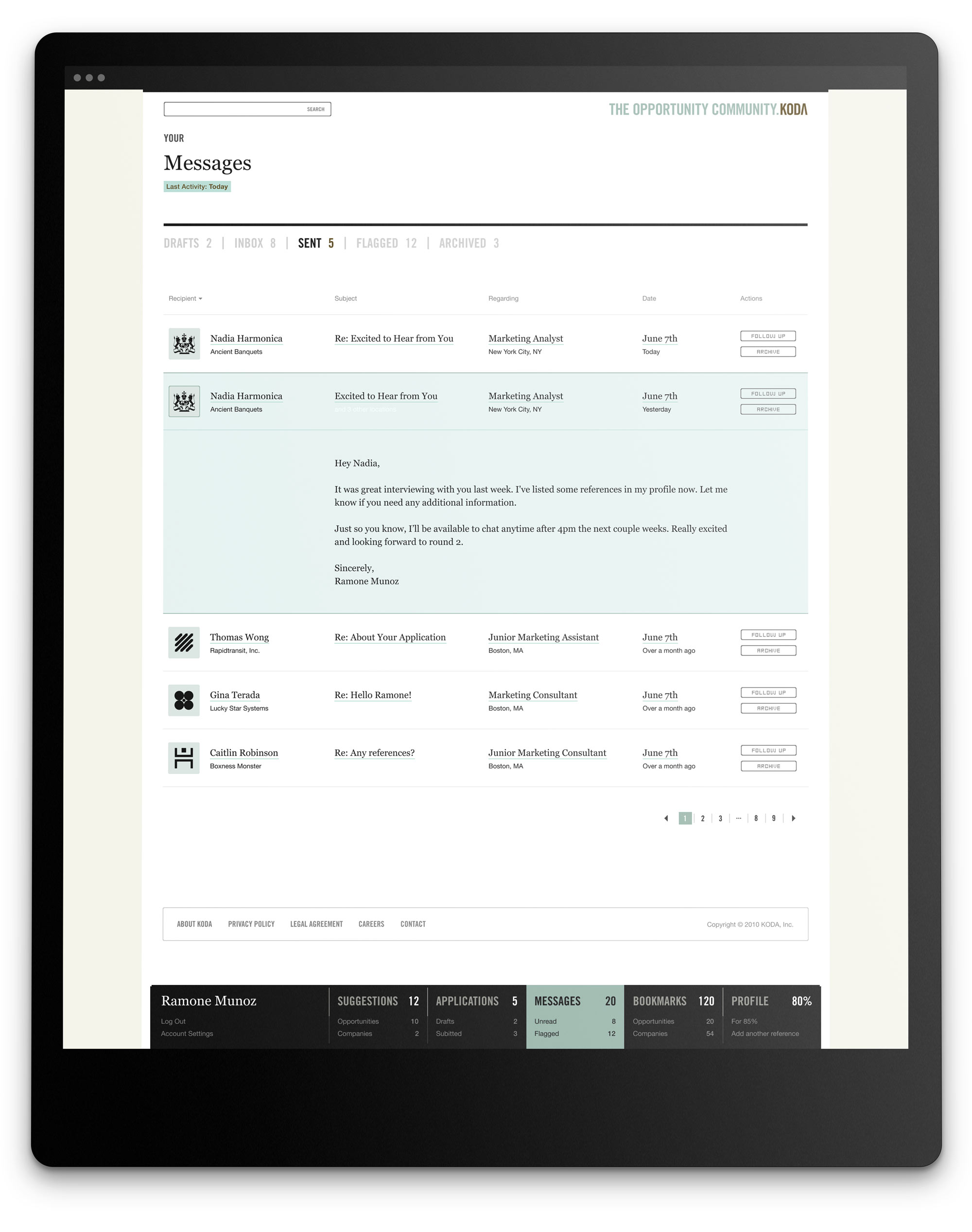
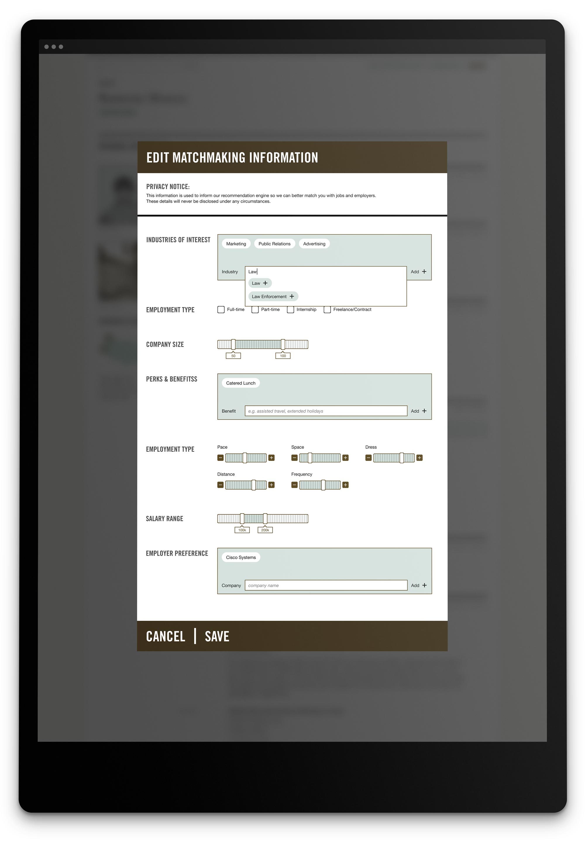
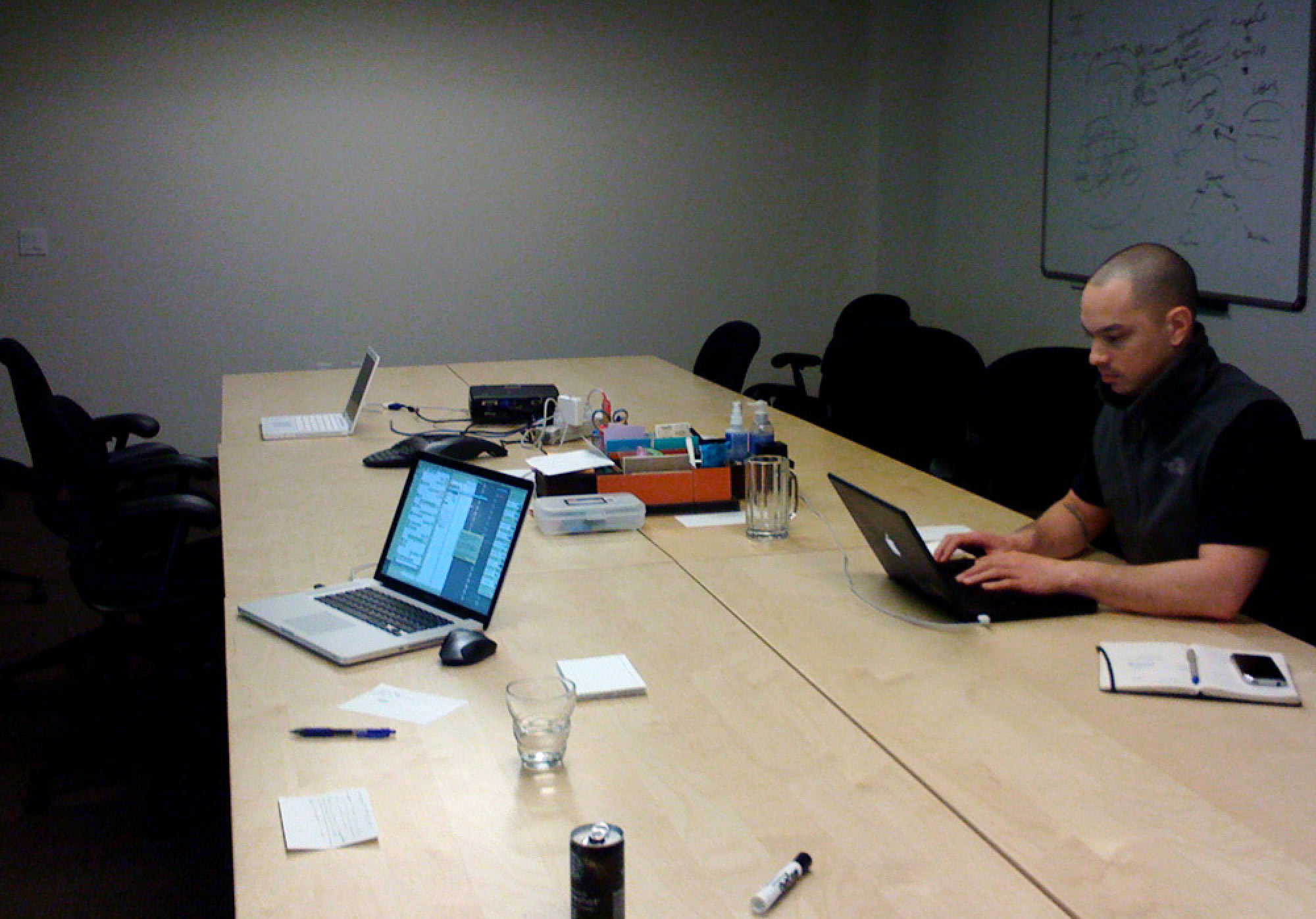
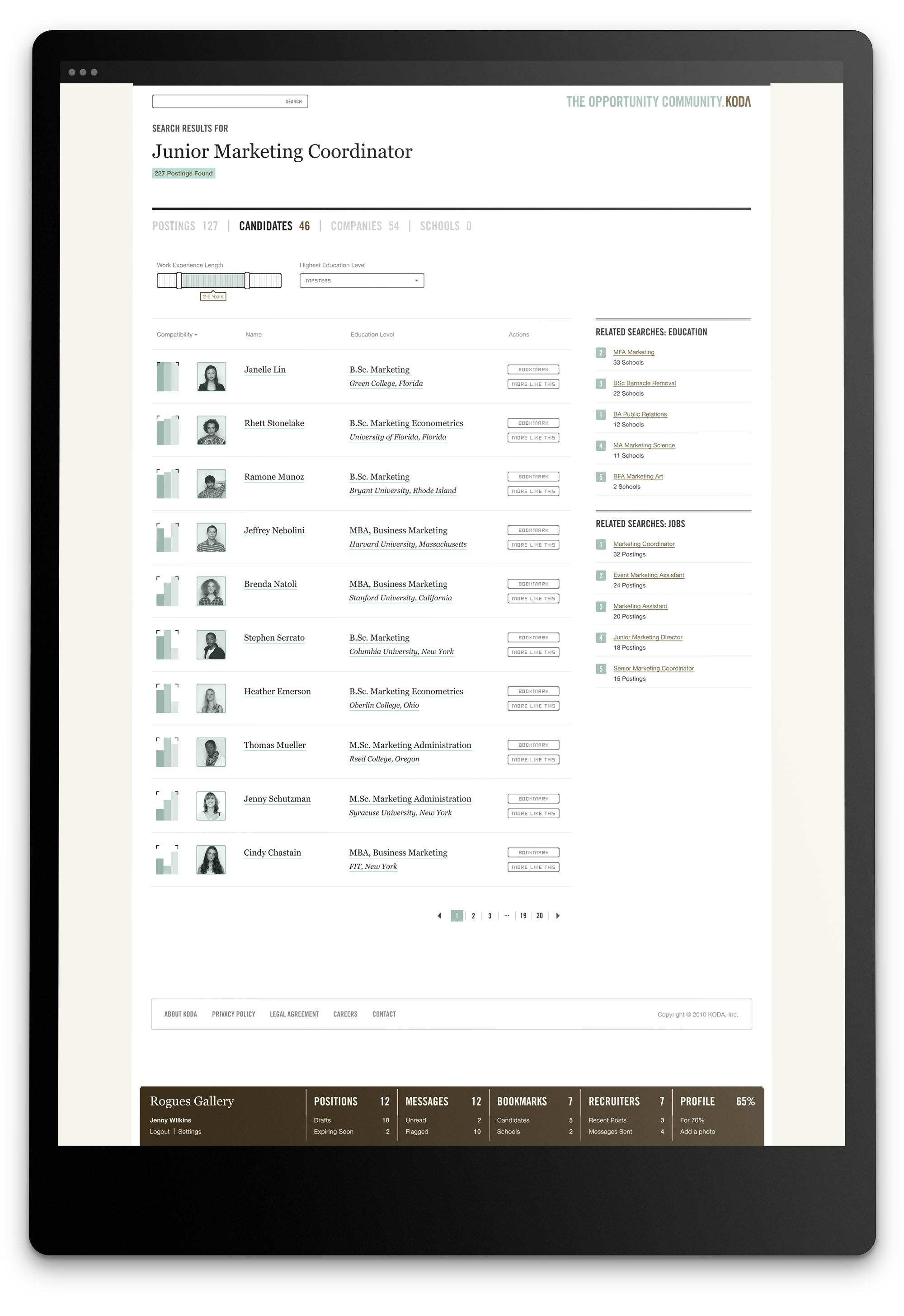
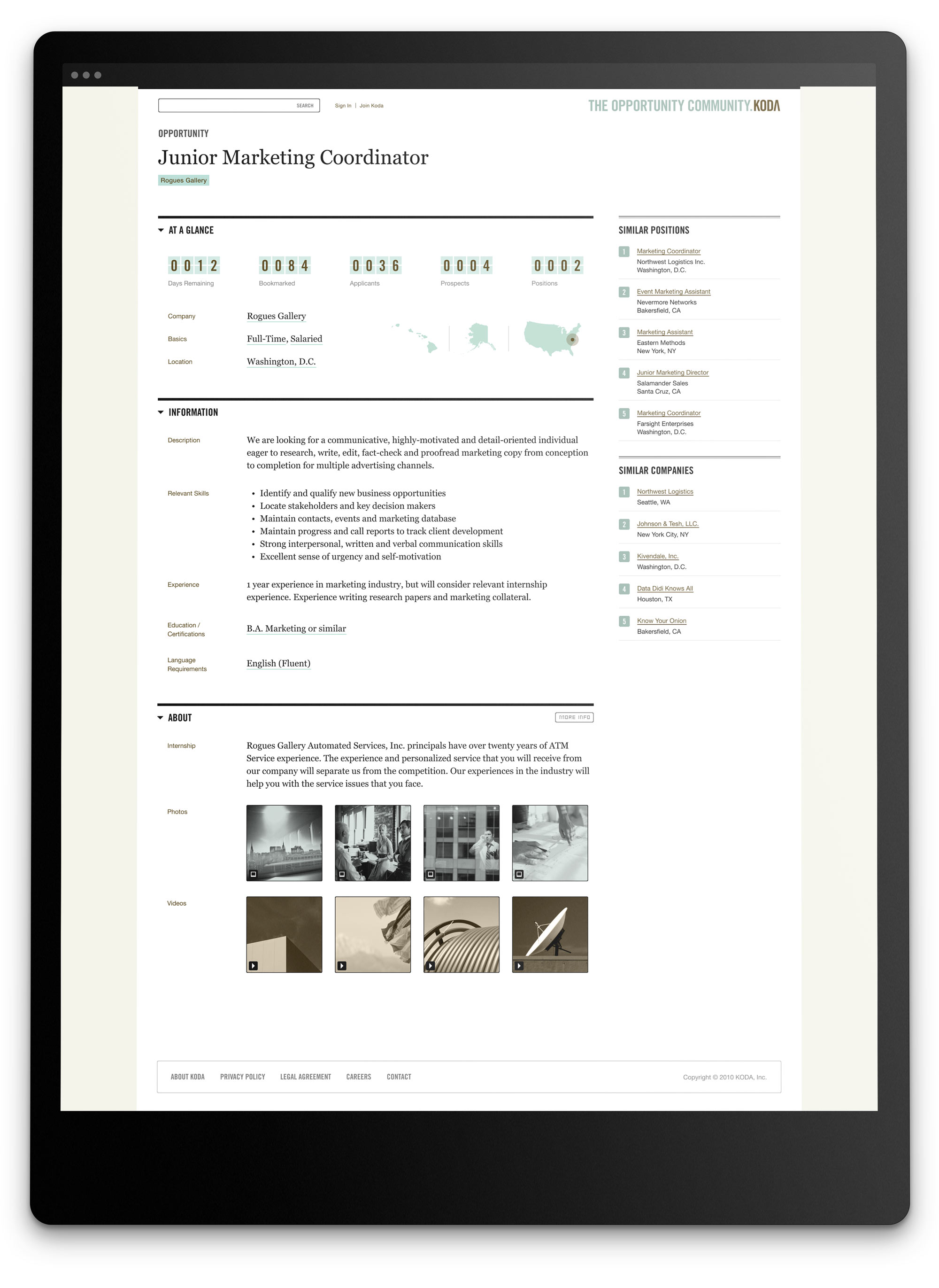
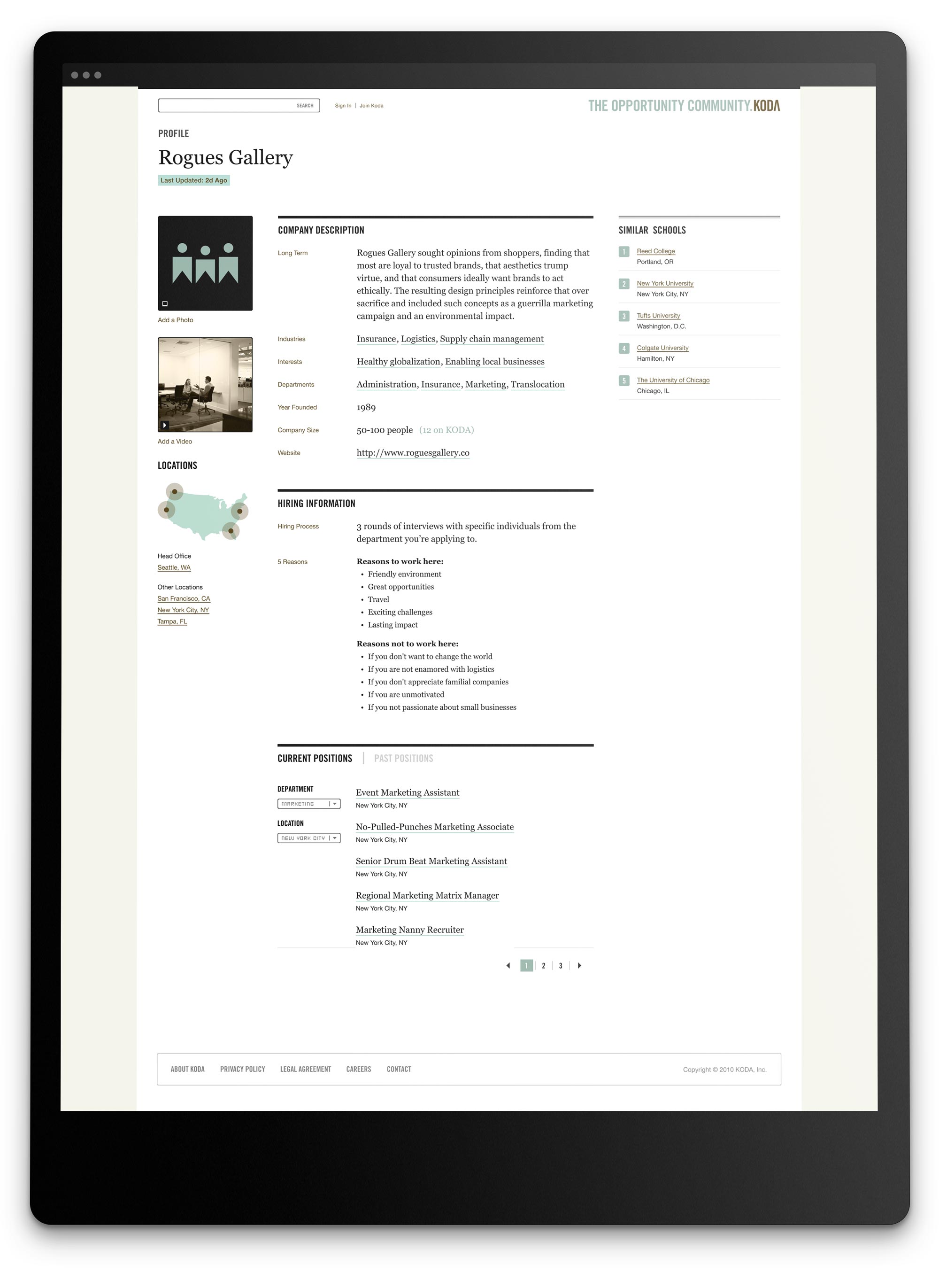
The design was influenced by the pixel-aesthetic sites (K10K, etc.) during the early 00’s.
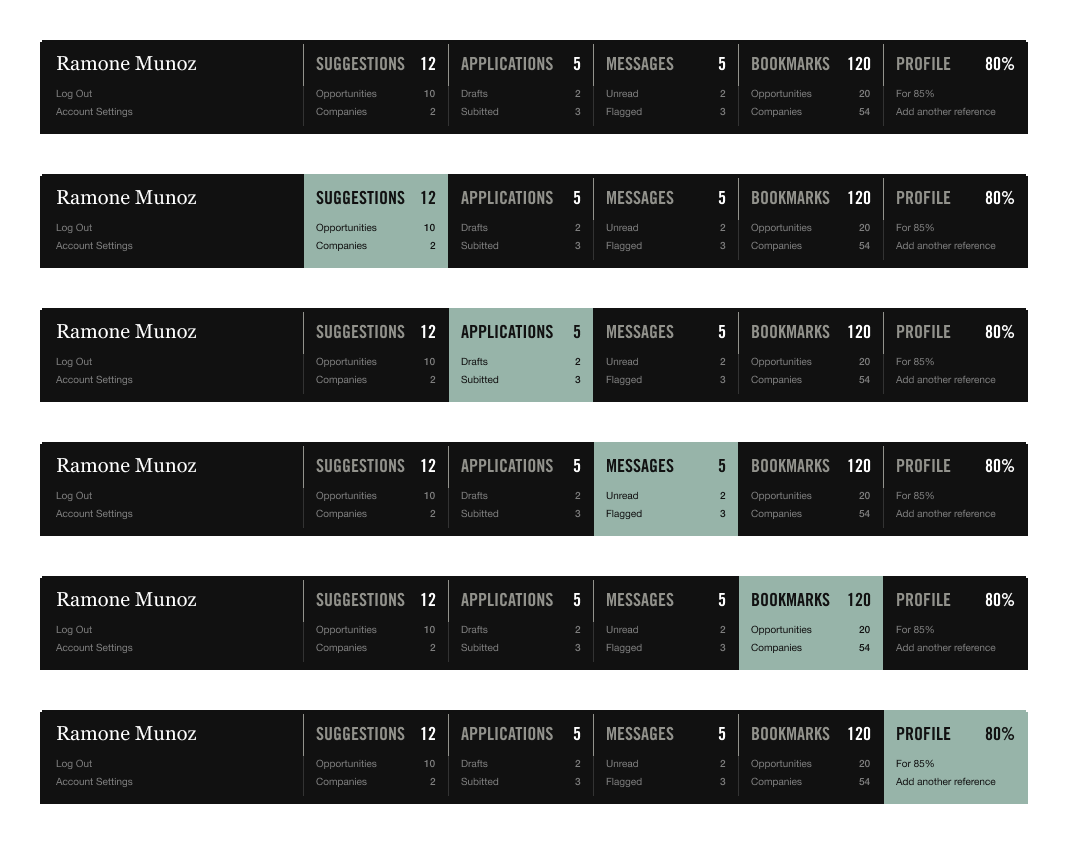
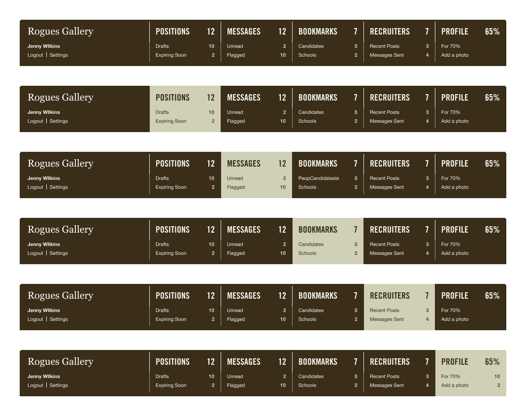
IDEO is a global design consulting firm headquartered in Palo Alto, California. They are strongly associated with the design thinking approach to designing products, services, environments, brands, and digital experiences. The KODA color palette was selected with both of our audiences in mind. Composed of earth tones, the palette is warm and approachable. It’s not too trendy or too conservative. It’s easy to look at for long periods at a time. And, most importantly, it bridges the gap between seekers and recruiters.
Use Pantone (preferred) colors or the equivalent CMYK mix. If using CMYK, please be sure to work with your print vendor to ensure that the final printed colors will approximate the Pantone colors as closely as possible. Do not use RGB/HEX colors for anything other than screen-based media.

Pantone 622c
#97B4A9
C 24
M 0
Y 29
K 4
R 185
G 218
B 205

Pantone 7519c
#564319
C 50
M 60
Y 100
K 48
R 87
G 67
B 25

–––
#F4F4EA
C 3
M 2
Y 7
K 0
R 244
G 244
B 234

–––
#111111
C 73
M 67
Y 66
K 83
R 17
G 17
B 17


