Appreciate / Panda_2
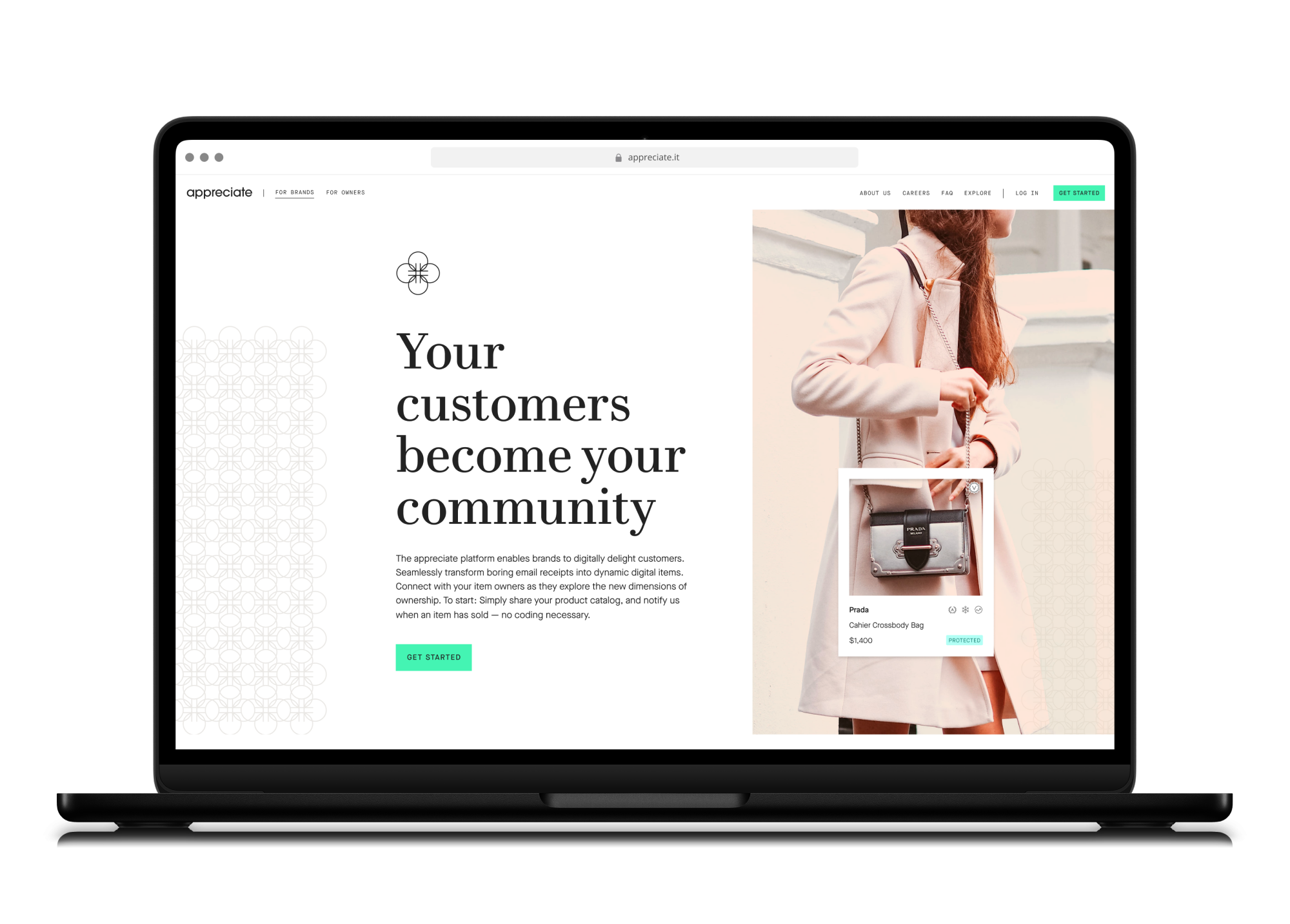
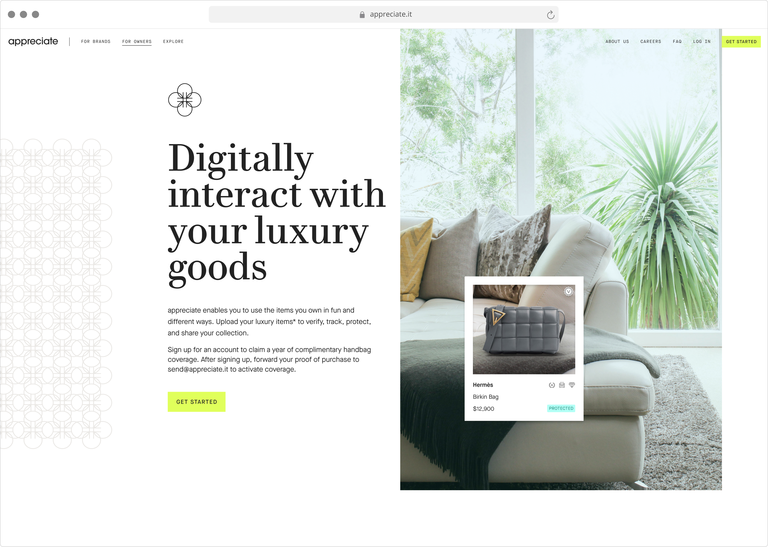
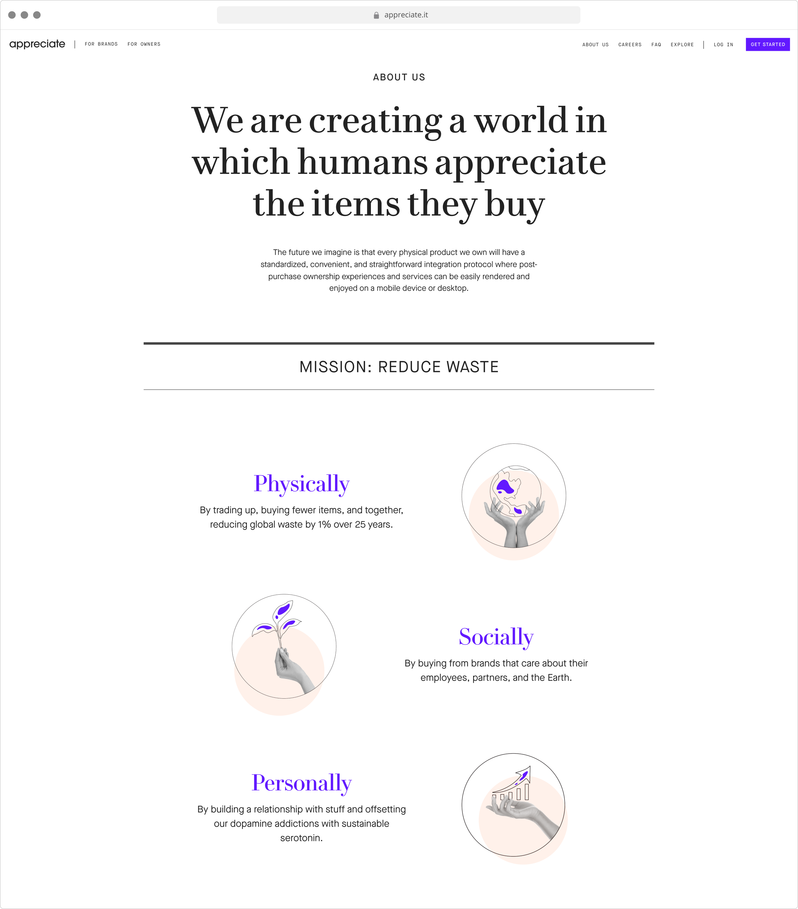
Below are a series of selected samples of the brand guideline presented as the final deliverable to the company. The work done prior to this can be found here: Panda Part 1.
Appreciate is/was an app/service based on the idea of putting aftermarket value on items that you buy – focusing on quality over quantity. Doing this would initially involve having a “digital twin” (NFT counterpart) of every item a customer buys.The appreciate color palette is derived from the personality of the brand and the feeling we want it to convey to users. There are four blues along with conpliments that can be layered in subtle unexpected ways. As a whole, the appreciate palette feels chic yet approachable.
When the logo is used in color, the light colors (first group) can be used against a dark color background (second group) and vice-versa. For prescriptive rules and examples, please refer to the logo color combinations section.

#3EB9FF
#3EB9FF
R 62
G 185
B 255
H 202
S 100
L 62

#44F4B3
#44F4B3
R 68
G 244
B 179
H 158
S 89
L 61

#FFC0A1
#FFC0A1
R 255
G 192
B 161
H 20
S 100
L 82

#8F00FF
#8F00FF
R 143
G 0
B 255
H 274
S 100
L 50

#6219FF
#6219FF
R 98
G 25
B 255
H 259
S 100
L 55

#E0FF5B
#E0FF5B
R 224
G 255
B 91
H 71
S 100
L 68

#222222
#222222
R 34
G 34
B 34
H 0
S 0
L 13

#7B7261
#7B7261
R 123
G 114
B 97
H 39
S 12
L 43

#3A3E55
#3A3E55
R 58
G 62
B 85
H 231
S 19
L 28
The secondary color palette includes nine colors. The brighter colors here are meant for eye anchors such as error states or special promotions. The lighter, desaturated colors are general purpose background colors.
This set is meant to be supplementary only and used sparringly. They are included as a plan-b for design professionals.

#B0E301
#B0E301
R 176
G 227
B 1
H 74
S 99
L 45

#FFCF27
#FFCF27
R 255
G 207
B 39
H 47
S 100
L 58

#FC008D
#FC008D
R 252
G 0
B 141
H 326
S 100
L 49

#AAAAAA
#AAAAAA
R 170
G 170
B 170
H 0
S 0
L 67

#EAE8E5
#EAE8E5
R 234
G 232
B 229
H 36
S 11
L 91

#E4F4E9
#E4F4E9
R 228
G 244
B 233
H 139
S 42
L 93

#EFEDDE
#EFEDDE
R 239
G 237
B 222
H 53
S 35
L 90

#FFFFF6
#FFFFF6
R 255
G 255
B 246
H 60
S 100
L 98

#F3F3F3
#F3F3F3
R 243
G 243
B 243
H 0
S 0
L 95
Below is an assortment of color combinations using primary and secondary colors for foreground and background.
All of these combinations have passed WCAG compliance for large text and UI. For smaller text, use the first and last rows.


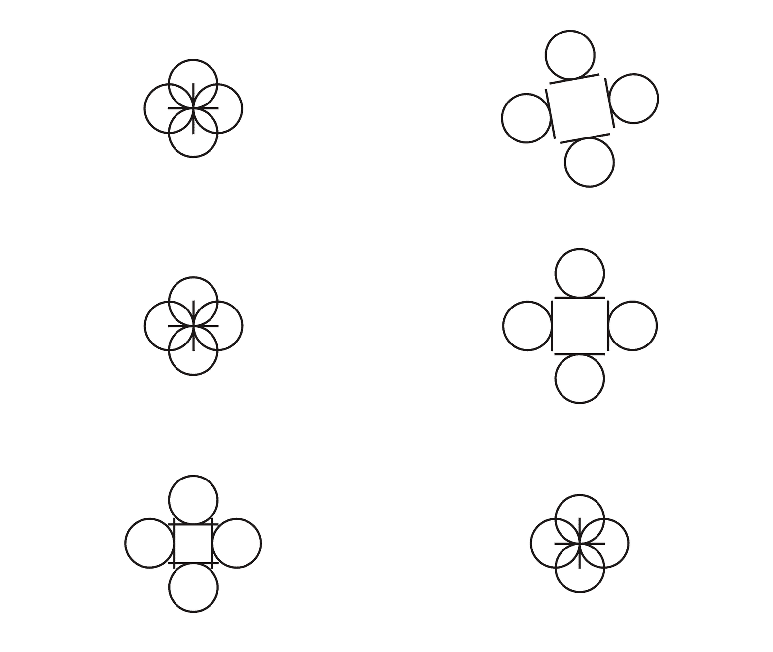
The appreciate 'a' can be rearranged in wasy that reflect luxury fashion brands. Below is a set of desaturated and color samples that help accent compositions that need a motif.


